Nature Photographers Network
This is the preserved archive of the original Nature Photographers Network. The community continues at naturephotographers.network.
Nashville Warbler
‹ PreviousAvian GalleryNext ›

Nashville Warbler

by Steve Balke

Gallery: AvianPosted October 1, 201097 views14 comments
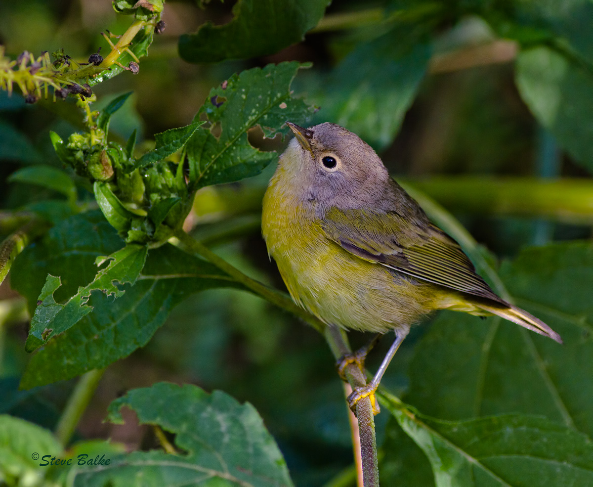
Nashville Warbler (Vermivora ruficapilla)

A very busy little bird stuffing himself here in preparation for his trip to Guatemala. I saw him catch a small caterpillar--but he was only a blur in the image. He seemed to be picking other food from these leaves too. I sure needed autofocus: he wasn't in one place for more than a second!

I like this image because of the detail in the head and body. I would have liked a bit more DOF. However, all of my attempts to do that provided images which were inferior to this one.

EOS 7D, 400 mm f/5.6: ISO 400, 1/640 s, f/5.6, 8.4 MP after cropping, usual NR, exposure adjustments and sharpening.

Comments

14 comments
Comment posted by Doug Gilham on October 1, 2010 at 6:57 PM
More DOF would have been nice to get the back leg and tail more focused, but this is still a fine image Steve. I've tried shooting warblers a few times and have not had much luck do to the constant foraging. I love how it's looking up, and nice detail and colors as well. Beautiful bird...well done. :toast:
Registered on September 20, 2009, 77 Posts, 489 Comments
Comment posted by Mia McPherson on October 1, 2010 at 7:06 PM
Steve,

I like the pose of the warbler and how the head is tilted up. I agree a bit more dof would have been nice, not an image killer though. I might desaturate the greens slightly over all, I really don't know this species well but it seems to me the yellows here have a greenish cast.

Like you I like the detail in the head & body
Registered on June 25, 2007, 491 Posts, 12566 Comments
Comment posted by Steve Balke on October 1, 2010 at 7:35 PM
Thank you for your comments, Doug and Mia. Since Mia mentioned a possible greenish cast to the yellow in the Warbler I thought that I should interject a comment at this early stage. I've been digging into the problem of detecting color casts (or incorrect colors) in images. The best method I've found is in "Photoshop CS4 for Nature Photographers" by E. Anon and J. Anon, pp. 262-263. One method they propose is to open a Hue/Saturation adjustment layer and drag the saturation slider to +100. Using that technique the vast majority of the yellow breast stays yellow here except for some small areas that appear to be dark shades and do look to me like they could be a dark green. That could be reflected light from the leaves. At very high saturation the head does become sort of a red color (!?). Then there is the question of whether we want the "true color" under some standard light of all this or the color that I actually observed in the early morning light. So, I don't know: I think I'll just let it be. I also checked the saturation of the green leaves using the info palette: they're not oversaturated....but I did brighten them up a bit from the original..... :smile:
All comments and suggestions on this or any other aspect are more than welcome!
Registered on June 18, 2009, 229 Posts, 2915 Comments
Comment posted by Brian Gatlin on October 1, 2010 at 7:36 PM
a nice looking Nashville, Steve. nice and sharp, which is always a challenge with any warbler. DOF is fine for me, as is the color balance--NAWA's upperparts are definitely greenish.
Registered on March 21, 2009, 202 Posts, 4187 Comments
Comment posted by Nate Chappell on October 1, 2010 at 9:23 PM
The larger view is a great intimate look at this species Steve. With warblers they are often moving about fast so sometimes you have to sacrifice depth of field to get the image sharp and I think it worked out well in this case, nice work. :toast:
Registered on February 1, 2006, 1158 Posts, 19528 Comments
Comment posted by David Haynes on October 1, 2010 at 10:41 PM
Steve,
I like te angle of this shot. Your are almost looking down on him. It provides a great perspective of the top of his head. Nce capture.
Registered on February 20, 2010, 110 Posts, 1511 Comments
Comment posted by Angela McCain on October 2, 2010 at 12:02 AM
Nice image. I liked your erudite explanation of color correction. Wish I understood it.
Registered on April 19, 2009, 367 Posts, 3589 Comments
Comment posted by Steve Balke on October 2, 2010 at 7:11 AM
Angela, sorry that my explanation was not understandable. I think the idea is a pretty simple one: if we increase saturation in our images to maximum, we expect that the image colors will saturate but we don't expect the color (i.e. the hue) to change. If the yellow breast of the bird becomes another color as saturation is increased then it means that some other color is contaminating the yellow. For this image the idea worked pretty well: the green vegetation stayed green and the yellow breast, for the most part, stayed yellow as I increased saturation. The surprise was that the color of the head showed a reddish hue on saturation. Looking at the image, the head color looks fine to me. So, I decided to let it be. So, this method may not be perfect and the ultimate decision is still subjective, but I think it is something to try when you are concerned about color contamination. Drop me an e-mail if some of the details are still fuzzy to you here. :wavey:
Registered on June 18, 2009, 229 Posts, 2915 Comments
Comment posted by Howard Cheek on October 2, 2010 at 8:39 AM
Excellent POV & classic pose, nice catchlight. I especially like the filtered light, fine details..
Well done & have a great weekend!
Registered on July 24, 2008, 1201 Posts, 10758 Comments
Comment posted by Ron Bielefeld on October 2, 2010 at 1:30 PM
Steve, a really nice shot of a tough bird to get in the open. I like the comp, sharpness, and detail. On my calibrated monitor, the yellows and other colors look fine, but the head has a magenta cast. That may explain why it turned redish when you saturated the image. It does not look wrong, so I would leave it as you did. It is probably the early morning light causing the color difference. To me that is perfectly fine. It is how the scene looked when the image was taken.
Registered on December 6, 2008, 360 Posts, 7132 Comments
Comment posted by Monica Siri on October 2, 2010 at 2:43 PM
Steve,
a beautiful bird so difficult to capture. I really like the pose and the detail is fine.
Very nice image. :wavey:
Registered on September 20, 2009, 132 Posts, 3764 Comments
Comment posted by Sally King on October 2, 2010 at 2:56 PM
Excellent image of this little warbler. I love that even his feet follow the same gray to yellow scheme. Very good details and pose.
Registered on December 2, 2008, 416 Posts, 4450 Comments
Comment posted by Richard Ditch on October 2, 2010 at 10:00 PM
I'd be happy getting something similar on a migrant Nashville here in AZ - they don't cooperate for me at all.

I think the color is being influenced by being so much in the shade.

I sometimes use the max saturation test on troublesome images as it often reveals slight color casts. Mostly I just rely on a lot of field experience as a birder and what "feels right" when I'm processing.

One other desperation test I'll try is to duplicate the base layer and apple "auto color" to it. Then I'll toggle the "auto" layer on and off to compare to the original. I rarely find the auto version to be what I want, but it can indicate a direction for fine tuning the original (you can even "sneak up" on the auto version by setting the layer opacity to zero and moving it up a point at a time).
Registered on November 1, 2003, 1031 Posts, 12705 Comments
Comment posted by Steve Balke on October 4, 2010 at 7:17 PM
Thank you all: consistently perceptive and helpful comments as usual! Special thanks to Richard Ditch for suggesting the use of auto color as yet another way to assess color in our images. :smile:
Registered on June 18, 2009, 229 Posts, 2915 Comments