Nature Photographers Network
This is the preserved archive of the original Nature Photographers Network. The community continues at naturephotographers.network.
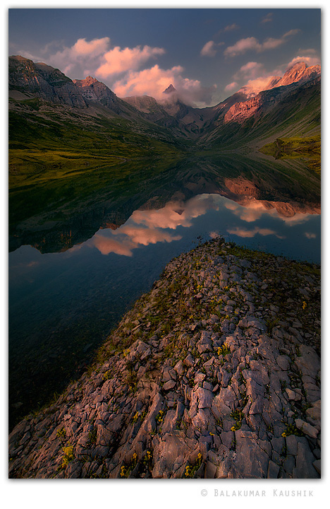
Glattalp dusk
‹ PreviousLandscape GalleryNext ›

Glattalp dusk

by Balakumar Kaushik

Gallery: LandscapePosted September 30, 2010150 views12 comments
Image was made before dusk few weeks back in 'Glattalp' region in Switzerland. The water was still and I could get some decent reflection.

Blend from 2 frames (one for the sky and the other for the rest).

Please share your views on the image/improvements - composition, especially processing. I guess there's some warm colour cast but is it too bothersome ?



Comments

12 comments
Comment posted by dean hebert on September 30, 2010 at 1:51 PM
Sweet image, great reflection! The blue in the sky seems different than the blue in the reflection.Might be an easy fix. :toast:
Registered on August 4, 2010, 70 Posts, 1132 Comments
Comment posted by Randy Wilson on September 30, 2010 at 2:28 PM
To me it looks warm where it should be warm and cool where it should be cool and great all over. The rock is a little pink, but it's plausibly pink, given the light coming off the peak and clouds.
Registered on June 25, 2009, 7 Posts, 85 Comments
Comment posted by Nicolaus Wegner on September 30, 2010 at 2:45 PM
Great photograph Balakumar. Processing is very clean. I suppose you could try to blue it up a bit in the sky, but that's really minor. The warm color cast works well for me. Very nice work.
Registered on February 21, 2010, 133 Posts, 1509 Comments
Comment posted by Dale King on September 30, 2010 at 2:48 PM
I really like how the reflections on the edges and the foreground are like pointers drawing your eye toward the center. Well done.
Registered on January 2, 2010, 5 Posts, 53 Comments
Comment posted by Michael J Greene, on September 30, 2010 at 3:47 PM
The thumbnail certainly doesn't do this one justice Balakumar. Your processing is really nice - tack sharp depth of field from FG to BG. The reflection is stunning and the fg is more interesting than what I would have thought viewing the thumbnail. Personally, its definitely too warm for my tastes (or has too much purple tint). The magenta in the sky is strong. Also, the reflection looks a bit brighter than the actual sky does. Overall, this is money though. Outstanding work.

Michael
Registered on June 18, 2009, 86 Posts, 2317 Comments
Comment posted by Daniel Rappaport on September 30, 2010 at 3:57 PM
Well composed. Great shapes and dusk colors.
Registered on September 9, 2009, 294 Posts, 2006 Comments
Comment posted by Kurt Budde on September 30, 2010 at 4:05 PM
Excellent work, wouldn't change a thing. I really like this composition.
Registered on May 19, 2008, 39 Posts, 246 Comments
Comment posted by Bruce King on September 30, 2010 at 5:56 PM
I like the near-to-far sharpness. I might bring up the shadows slightly but I'd leave the fg alone, it has a nice glow as is. I think I'd try to balance the sky with the reflection and not the other way around. Definitely a keeper though, without any changes to what you've posted. Beautiful work. :toast:
Registered on January 14, 2010, 276 Posts, 2212 Comments
Comment posted by Kurt Budliger on October 1, 2010 at 7:41 PM
Very nice shot don't know how I missed and why it hasn't generated more comments. I like it very much, great light and atmosphere. I'd almost prefer a horizontal of just the reflection and mountains with no foreground.
Registered on June 11, 2006, 113 Posts, 2116 Comments
Comment posted by Aaron Cowan on October 1, 2010 at 9:38 PM
Balakumar: As far as the color goes I feel that it is a bit warm but not overly distracting. The composition is very nice...The clouds enshrouding the peak is also quite nice. It's a little hard to tell but I think the horizon might be tilted CCW (based on the lake). It might just be an illusion though.
Registered on September 22, 2010, 8 Posts, 165 Comments
Comment posted by Tony Kuyper on October 1, 2010 at 10:54 PM
Stunning comp and amazing how everything seems to fit together. This sort of reminds me of Marc Adamus' work. Very nicely done.
Registered on November 1, 2003, 364 Posts, 22328 Comments
Comment posted by Balakumar Kaushik on October 2, 2010 at 2:25 AM
Thank you all for stopping by and sharing your thoughts.
Registered on January 4, 2008, 98 Posts, 1403 Comments