Nature Photographers Network
This is the preserved archive of the original Nature Photographers Network. The community continues at naturephotographers.network.
Mottled duck/ w reposts
‹ PreviousAvian GalleryNext ›

Mottled duck/ w reposts

by Ron Bielefeld

Gallery: AvianPosted September 10, 2010158 views23 comments
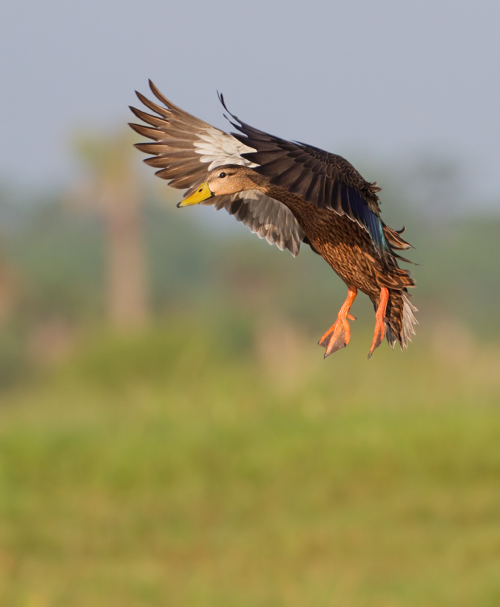
Most mottled ducks have been flightless for the last several weeks while they change out their primary flight feathers for fresh ones. They are starting to fly again in good numbers, especially the males who tend to molt before the females. This male was landing right in front of me this morning. Please view the larger version for max details.

Canon 7D
ISO 640
1/2000s
f/7.1
HH
approx. 45% of FF
NR on BG only

Comments

23 comments
Comment posted by Richard Ditch on September 10, 2010 at 7:19 PM
Nice action. But I'd prefer less NR as the results here look on the artificial side, with that "milky haze" look of NR.
Registered on November 1, 2003, 1031 Posts, 12705 Comments
Comment posted by Ron Dudley on September 10, 2010 at 7:31 PM
Ron, I love the effect of the wing position here with the head in good light cradled between the lighter right wing and darker left wing. I also like the foot position and the hint of color in the speculum. I'm waffling a little on the framing with all that room at bottom with the bird looking left and presumably flying diagonally since it is landing. I'm sure you made the best decision though, given the relatively large crop already and you would know what you had to the left.
Registered on March 30, 2007, 437 Posts, 10915 Comments
Comment posted by Ron Bielefeld on September 10, 2010 at 8:33 PM
Rich, thanks for the comment. Here is the image with no NR. The original only had 10% NR in Neat Image. 10% is not very much at all. I realize it is hard to tell, but does the NR version look much different? To me it looks about the same. Thanks for your input. I really like this shot, so I want to get it looking its best.
Registered on December 6, 2008, 360 Posts, 7132 Comments
Comment posted by Steve Balke on September 10, 2010 at 8:45 PM
You caught this duck in a great pose, Ron: nice view of the spread wings as well as the head and feet. It looks nice and sharp to me and I'm fine with the look of the background. The duck contrasts well against it. Possibly a little less exposure on the head and feet could bring out a bit more detail in those areas. :toast:
Registered on June 18, 2009, 229 Posts, 2915 Comments
Comment posted by Eric Diller on September 10, 2010 at 8:48 PM
well captured Ron...love the details!
Registered on October 2, 2009, 69 Posts, 434 Comments
Comment posted by Ron Bielefeld on September 10, 2010 at 8:54 PM
Ron, this one is for you. My original comp was based on where I remember the bird landing relative to the spot the bird is in in the image. He really landed almost straight down from where he is in the image. Also, I kind of liked the wing tips pointing toward the ULHC of the image. However, that does not really matter if the comp does not "feel" right. So here is a horz version, no NR. Is this better?
Registered on December 6, 2008, 360 Posts, 7132 Comments
Comment posted by Richard Ditch on September 10, 2010 at 8:58 PM
It is hard to judge at the small size, but I do think the repost without NR looks more natural.

I also prefer the extra space on the left as you framed in camera.
Registered on November 1, 2003, 1031 Posts, 12705 Comments
Comment posted by Ron Bielefeld on September 10, 2010 at 9:00 PM
Thanks Rich. Love the critical input keep it coming.
Registered on December 6, 2008, 360 Posts, 7132 Comments
Comment posted by Ron Dudley on September 10, 2010 at 9:05 PM
Didn't mean to put you on the spot Ron. For my tastes, given the way the bird is looking and the direction I "thought" it was flying the new comp works best for me. That said, I miss the bird being as large in the frame as it is in your vertical composition. One of those conundrums for me I guess. Either way I really like the image.
Registered on March 30, 2007, 437 Posts, 10915 Comments
Comment posted by Ron Bielefeld on September 10, 2010 at 9:45 PM
Ron, you did not put me on the spot. You made me think about the comp and that is a good thing. When it comes to comp it really is a personal choice, but I like playing with this kind of stuff. I like both comps really. Just depends on what you want to emphasize. Cheers.
Registered on December 6, 2008, 360 Posts, 7132 Comments
Comment posted by Ákos Lumnitzer on September 11, 2010 at 1:20 AM
Hey Ron
Love the pose man! It'sperfect. I do prefer the horizontal version. Three cheers!

:toast: :toast: :toast:
Registered on April 24, 2004, 25 Posts, 510 Comments
Comment posted by Rob Drummond on September 11, 2010 at 2:17 AM
Classic 'putting the brakes on" shot Ron - wonderful detail and light

cheers
Rob
Registered on November 8, 2003, 617 Posts, 8267 Comments
Comment posted by Mia McPherson on September 11, 2010 at 8:18 AM
Ron,

I like the horizontal comp best though I might still take a touch off the right side of the frame. I also like it better without NR on the background. The setting just gives a nice sense of place for me. Great pose, eye contact and details.
Registered on June 25, 2007, 491 Posts, 12566 Comments
Comment posted by Brian Gatlin on September 11, 2010 at 9:53 AM
Interesting discussion here. I'm having a very hard time choosing between the two comps--I like both a lot and am glad to see them. I also like the version w/o NR better. It's a great pose and I like the hints of the habitat in the bg.
Registered on March 21, 2009, 202 Posts, 4187 Comments
Comment posted by Muhammad Zaid Wani on September 11, 2010 at 10:14 AM
Stunning shot, Ron! I also prefer the horizontal version. Great work.
Registered on August 18, 2005, 23 Posts, 1406 Comments
Comment posted by Wayne Willison on September 11, 2010 at 10:29 AM
Love this image. Its got action, detail and a good bg. But since you're taking critiques on it I'll say the horizontal beats the vertical hands down, although I'd make the horizontal a tighter crop yet.
Registered on April 10, 2009, 292 Posts, 3967 Comments
Comment posted by David Haynes on September 11, 2010 at 12:28 PM
Ron,
I really ilke this shot as well. After looking at the repost I can't say I see much difference if at all. Did you crop this vertically or did you capture the shot like this. If you have more in front from a horizontal image I might add some canvas to the left side and crop some from the bottom. With the crop you've lost some of the fine feather details but it still comes across as good/not great to me. The head, wings, tail and feet are all you could ever ask for in a shot like this. I just can't think of anything else to make this better Ron. Lovely image. OK. I'm back. I posted this without reading everyone's input as well as your repost. I'm torn in this one. I like the size of the bird in the original and I think that gets lost in the repost. I'm split on this one Ron. I could go either way. Sorry!
Registered on February 20, 2010, 110 Posts, 1511 Comments
Comment posted by Ron Bielefeld on September 11, 2010 at 12:56 PM
OK, here is a crop that gives the horizontal and also a larger bird in the frame. Best yet? Thanks.
Registered on December 6, 2008, 360 Posts, 7132 Comments
Comment posted by Mia McPherson on September 11, 2010 at 1:04 PM
Ron,

Yes, I prefer the lastest repost above them all. The bird is a touch larger in the frame and I am sure on a larger version the details would be great.

Yes, this is the best of them all!

I'm glad you take critiques so well, it shows that you are very interested in learning to fine tune your skills and techniques and since you came ot NPN I can see that you are doing that well and quickly too. That alone makes it a pleasure to comment on your images.
Registered on June 25, 2007, 491 Posts, 12566 Comments
Comment posted by Ron Dudley on September 11, 2010 at 1:05 PM
Yup, for me it is "best yet" Ron. The duck seems about the same size in the frame as in your original post and I think this composition works better with the pose.
Registered on March 30, 2007, 437 Posts, 10915 Comments
Comment posted by Ron Bielefeld on September 11, 2010 at 1:19 PM
Awesome, thanks for taking the time to look, and look, and look, and look. Cheers. :smile:
Registered on December 6, 2008, 360 Posts, 7132 Comments
Comment posted by Brian Gatlin on September 12, 2010 at 9:22 AM
nice, Ron, I think that last one is indeed the best. :toast:
Registered on March 21, 2009, 202 Posts, 4187 Comments
Comment posted by Ronnie Gaubert on September 12, 2010 at 10:11 AM
Hello Ron,
Details look great. The extended wings with the head between them makes for a wonderful capture. I especially appreciate the warm light in a flight shot. A well executed image.
Ronnie
Registered on November 1, 2003, 810 Posts, 3495 Comments