Nature Photographers Network
This is the preserved archive of the original Nature Photographers Network. The community continues at naturephotographers.network.
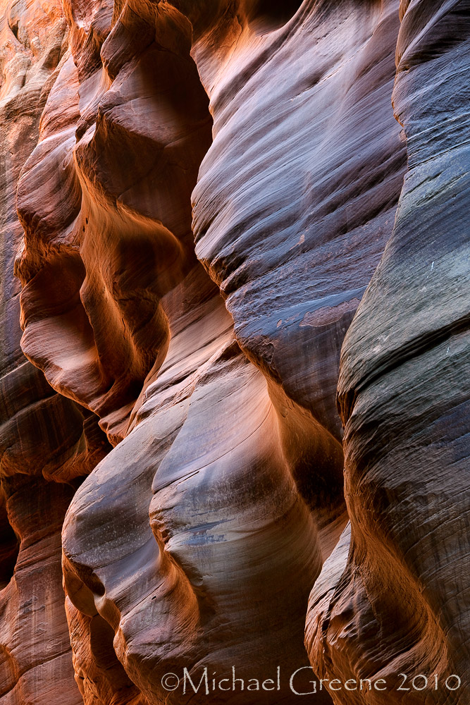
Glowing Faces
‹ PreviousLandscape GalleryNext ›

Glowing Faces

by Michael J Greene,

Gallery: LandscapePosted September 2, 2010216 views16 comments
Vermillion Cliffs Wilderness

A glowing slot canyon shot that I have been on the fence about since I captured it back in May. I am looking for some feedback and opinions here. I appreciate your time and comments. The large is included and certainly provides better detail. Thanks so much.

5DMK2
28-70 F/2.8

Comments

16 comments
Comment posted by Phil Pogledich on September 2, 2010 at 1:24 PM
It's a very nice shot that showcases the unique shapes of the canyon very well. As much as there is to like, however, I think I can see why you might be on the fence. There's almost too much going on here . . . lots of different shapes, layers, and tones, all perhaps making the image a bit less coherent than a more intimate capture may have been. There are a number of potential crops that help address that.
Registered on August 24, 2009, 123 Posts, 3099 Comments
Comment posted by Larry Fischer on September 2, 2010 at 1:36 PM
This is almost an abstract.
I very much like the color, composition, texture, propensity towards vertical lines yet with sensuous bulbous features and even fine oblique lines. Lots at which to look.
A+ in my book.
the fisch
Registered on July 28, 2008, 155 Posts, 874 Comments
Comment posted by Nicolaus Wegner on September 2, 2010 at 3:53 PM
Not sure why you have been on the fence about this one, I think it's great. A multitude of colors...bet you could bring them out more with some of TKs ps techniques.
Registered on February 21, 2010, 133 Posts, 1509 Comments
Comment posted by Morris McClung on September 2, 2010 at 5:03 PM
Ditto on the more abstract appearance of this one. I like it, but I do wish it had that one strong focal point that grabs me. As it is, my eye does wander around. Still, great color, light, and texture, and you could even call it, "Tortured Souls." The"faces" all seem bound by something, if that makes any sense?
Registered on May 7, 2007, 670 Posts, 19650 Comments
Comment posted by Ron Pederson on September 2, 2010 at 5:47 PM
Astonishing light, color and textures...well done. Perhaps some rework to the ULC to bring out textures/contrast?
Registered on August 12, 2010, 29 Posts, 108 Comments
Comment posted by Dean Sauskojus on September 2, 2010 at 6:17 PM
Fine shot as it is Michael, but I would try a vignette around the entire image to focus the viewer into the image more. When I say vignette I don't mean a strong vignette. To me you have to much light at the edges which pulls me out of the image especially the left side. And then I would play with the contrast a bit. Hope this helps. Nice work.
Registered on September 29, 2009, 137 Posts, 2659 Comments
Comment posted by John Williams on September 2, 2010 at 8:24 PM
It's colder than most shots from slots, and I like that for the variety. I play with the vignette idea and call it a keeper.
Registered on September 6, 2007, 221 Posts, 5985 Comments
Comment posted by Jay Nielsen on September 2, 2010 at 9:08 PM
I really like the combination of horizontal and vertical textures and patterns. To me it looks mystical and moody, I would say it is absolutly a keeper.
Registered on October 6, 2008, 137 Posts, 720 Comments
Comment posted by Rudy Ruberti on September 2, 2010 at 9:23 PM
Great shapes and color, and this has a very natural feel to it. Nicely done.
Registered on October 28, 2008, 179 Posts, 1875 Comments
Comment posted by Ben Horne on September 2, 2010 at 10:50 PM
The layers of flowing stone make for a very interesting shot. The shot is visually leaning heavily to the left though. Although this is just the result of perspective, My eye keeps dropping to the left side of the photo. I wonder if that might be what has you on the fence about this photo. The glow is wonderful.

Is this Buckskin Gulch? If not, it sure looks like it.
Registered on August 27, 2009, 51 Posts, 959 Comments
Comment posted by Kent Mearig on September 2, 2010 at 11:14 PM
Very sweet wall section with that back/side-glow. The crispness of details in the photo is also wonderful. I'm not sure about the ULC, but I think it adds to the depth and sense of place without being too distracting. I'm trying to find something to be picky about...but I can't.
Registered on September 4, 2006, 237 Posts, 4748 Comments
Comment posted by dean hebert on September 3, 2010 at 12:27 AM
Great shot.I might try to tame the light in the upper LC, it draws my eyes into the corner and away from the sweeping curves in the shadows.
Registered on August 4, 2010, 70 Posts, 1132 Comments
Comment posted by Michael J Greene, on September 3, 2010 at 11:59 AM
Thanks everyone for their comments. I really appreciate it. I am glad some people like the shot.

Larry, Nicolaus, Ron, Jay, Rudy & Kent - I am really glad you guys like it the way it is.

Phil and Morris - I understand what you both mean. The "face" in the upper left 1/3 of the image is what my primary focus/subject matter was for this composition. I figured the viewer would be drawn to that first and then have enough to keep them interested with the rest of the overlapping patterns, lines, and colors.

Ben - This is Buckskin Gulch. I do agree with it being slightly left weighted. As you know, it is not a very tight slot canyon so shots in many areas have to be relegated to one side of the cliffs. I would have liked to include more on the left, but the light was too strong any further over, hence the ULC.

Dean, John, Dean - I darkened all four corners of the image and edge burned the sides too. I extra darkened the ULC & also pulled some of the red out of it too. It's so hard to tell about the ULC. At this size, I not sure which looks better. I think at 100% resolution - the repost does look better though.

Thanks again everyone. I really appreciate your time and feedback.

Michael
Registered on June 18, 2009, 86 Posts, 2317 Comments
Comment posted by Mark Capurso on September 3, 2010 at 12:04 PM
I like it Michael. Compelling!

Mark Capurso
Phoenix AZ
Registered on January 4, 2008, 47 Posts, 321 Comments
Comment posted by Phil Pogledich on September 3, 2010 at 12:50 PM
The repost, while only subtly different, does seem considerably better to me. I think bringing down the brighness of the top left corner helped a lot. And hey, take my prognostications on whether this "works" for whatever they're worth . . . if 10 others disagree with me, I'm probably off base!
Registered on August 24, 2009, 123 Posts, 3099 Comments
Comment posted by Eva McDermott on September 5, 2010 at 5:23 PM
I love the light here Michael especially in the repost. Pretty spooky how these canyon walls take on a life of their own with the help of the light and shadow play. A chill went down my spine every time I saw faces or animals in Antelope Canyon when I visited a few years ago.
Registered on January 4, 2009, 1015 Posts, 13229 Comments