Nature Photographers Network
This is the preserved archive of the original Nature Photographers Network. The community continues at naturephotographers.network.
Lavender on Ivory
‹ PreviousFlora GalleryNext ›

Lavender on Ivory

by Bruce King

Gallery: FloraPosted August 26, 2010132 views17 comments
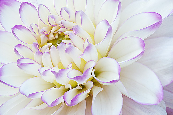
Been working this Dahlia pretty hard the past few days. Here's one basking in some nice evening light.I often compose this type of shot with the center of the blossom lower in the frame but I like the way the outer petals were arranged here. Slightly over sharpened maybe?
Comments welcome, thanks for looking.

D5000
Sigma 150 Macro
f/32 @ 0.6 sec
ISO 200

Comments

17 comments
Comment posted by Ramamohan Pai on August 27, 2010 at 12:26 AM
Unconventional comp (as you said) but it sure looks nice. The purple petal outlines really help this Dahlia stand out. Sharpening does not seem like an issue here to my eyes. Eye Candy :cool:
Registered on November 1, 2003, 550 Posts, 9037 Comments
Comment posted by Carol Hyman on August 27, 2010 at 1:59 AM
Bruce, I like the title and I like the image. I agree, the image appears to be slightly over-sharpened. Not sure what technique you used, but I use Smart Sharpen and then fade that with Luminescence to about 50%. If you select Lens Blur (this is in PS, I'm sure most versions), that helps eliminate those white lines.
Since you've elected to use a high-key approach, I would suggest lightening the lower RC.
Nice work.
Cheers,

Carol
Registered on January 18, 2007, 597 Posts, 8062 Comments
Comment posted by SandyRichardsBrown on August 27, 2010 at 3:31 AM

Bruce, your time paid off!
Excellent in every way - dof, colors, perspective..
Loving frames, I'd sure add one here! :smile:
Sandy r
Registered on November 24, 2003, 3937 Posts, 12909 Comments
Comment posted by Miro Susta on August 27, 2010 at 4:28 AM
Very creative. I like the soft feel of this image. Very well done Bruce. :toast: :toast:
Registered on August 18, 2006, 719 Posts, 3736 Comments
Comment posted by Bob Duff on August 27, 2010 at 5:47 AM
Really like the crisp clean graphical comp. Great job.
Registered on April 21, 2010, 160 Posts, 1675 Comments
Comment posted by Pat Sampson on August 27, 2010 at 9:41 AM
I like your comp and I certainly like the graphic quality that Bob mentioned. For my tastes it is a bit over sharpened but I think that's actually pretty subjective. I like this image very much as posted.

Pat
Registered on May 19, 2007, 953 Posts, 15989 Comments
Comment posted by Morris McClung on August 27, 2010 at 11:26 AM
Love the colors in this flower. I also like your comp and the wall to wall sharpness. Gorgeous shot.
Registered on May 7, 2007, 670 Posts, 19650 Comments
Comment posted by Paul Marcellini on August 27, 2010 at 12:57 PM
Love the color here, does appear a touch over sharpened. I like the comp though.
Registered on November 27, 2007, 250 Posts, 2468 Comments
Comment posted by Nathan Buck on August 27, 2010 at 3:11 PM
Very nice Bruce. I love the purple on white. I think I would do something (cloning) with the LRC.

Nathan
Registered on November 1, 2003, 1101 Posts, 13589 Comments
Comment posted by Muhammad Zaid Wani on August 27, 2010 at 7:31 PM
I like this a lot. Nicely done! :smile:
Registered on August 18, 2005, 23 Posts, 1406 Comments
Comment posted by Gary Yeoh on August 27, 2010 at 8:23 PM
Great job Bruce. The purple rim really outlines the petals nicely. Sharpening not an issue.
Registered on September 1, 2009, 588 Posts, 8184 Comments
Comment posted by Albert Darmo on August 27, 2010 at 10:26 PM
Hi Bruce :wavey: The sharp lines on the petal edges make this a great art photo. Van Gogh would be proud! Astounding light, color and composition :toast:
Albert Darmo. Canada
Registered on November 25, 2008, 1386 Posts, 11978 Comments
Comment posted by scott lanz on August 27, 2010 at 11:02 PM
Very beautiful. :toast:
Registered on November 14, 2003, 840 Posts, 12902 Comments
Comment posted by Ian Wolfenden on August 28, 2010 at 7:19 AM
Great composition, Bruce, and I love the graphic effect you've achieved here. It's the way you've placed the centre that catches my eye above all - lovely image !!
Registered on May 18, 2007, 1108 Posts, 7647 Comments
Comment posted by Bill Fach on August 28, 2010 at 2:22 PM
Bruce: I think this is outstanding. I like the sharpness and the comp is brilliant IMO. Superbly crafted image. >=))> :toast: :toast: :toast:
Registered on November 1, 2003, 1805 Posts, 26981 Comments
Comment posted by May Haga on August 29, 2010 at 11:20 AM
Very nice Bruce.
May
Registered on February 22, 2007, 714 Posts, 8470 Comments
Comment posted by Doug Benner on August 30, 2010 at 8:09 AM
Beautiful presentation. Love the sharpness - almost looks like a line drawing. Just wonderful.
Registered on December 8, 2003, 482 Posts, 1868 Comments