Nature Photographers Network
This is the preserved archive of the original Nature Photographers Network. The community continues at naturephotographers.network.
Tributaries + B&W
‹ PreviousFlora GalleryNext ›

Tributaries + B&W

by Bill Fach

Gallery: FloraPosted August 8, 2010106 views16 comments
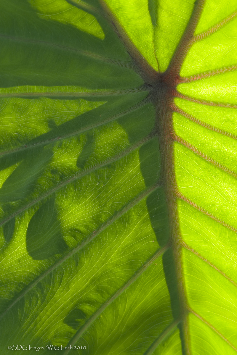
Sony A700
Minolta 200mm macro
ISO 200, 1/6 @ f22

Spotted this backlit elephant ear in our garden the other afternoon and could not pass it up. I also tried a conversion with my limited B&W skills. Any preferences? Any suggestions? All comments welcome. >=))>

Comments

16 comments
Comment posted by Bill Fach on August 8, 2010 at 11:23 AM
Here's the conversion.
Registered on November 1, 2003, 1805 Posts, 26981 Comments
Comment posted by Daniel & Loana on August 8, 2010 at 11:30 AM
I like the leaf texture very much. The light is wonderful. The B&W version works well.

D&L
Registered on October 7, 2008, 166 Posts, 3044 Comments
Comment posted by Pat Sampson on August 8, 2010 at 12:50 PM
The smaller image, much less the thumbnail, doesn't do this justice Bill. Love the backlight the textures and in this case the greens and yellows in the color version. Certainly nothing wrong with the black and white and it does bring out more of the texture but the colors appeal to me here. I suppose I might bring the contrast up a touch on the black and white but not sure. Strong composition as always.

Pat
Registered on May 19, 2007, 953 Posts, 15989 Comments
Comment posted by David W. Kelly on August 8, 2010 at 2:40 PM
Ilike them both Bill but am leaning towards the BW.
Registered on October 7, 2005, 883 Posts, 6590 Comments
Comment posted by Carol Hyman on August 8, 2010 at 4:51 PM
One danger in posting a fine image, Bill. We all have ideas on how to make the image just a scosh better :smile:

The patterns and composition are just grand.

I personally prefer the color version over the B/W.

My suggestion would be to use whatever channel is most appropriate and selected ext lights and add either a linear or a medium contrast to the lightest of the backlit area, or use that same selection and work with either levels or possibly exposure.

What a great image. I'm so glad you didn't pass it up. :toast:

Cheers,

Carol
Registered on January 18, 2007, 597 Posts, 8062 Comments
Comment posted by Luke Ormand on August 8, 2010 at 5:56 PM
Beautiful image and apt title - I prefer the color version
Registered on February 4, 2009, 1093 Posts, 7035 Comments
Comment posted by jamie pringle on August 8, 2010 at 6:41 PM
Beautiful side lighting really give this a great sense of depth. Wonderful detail in the veins and the shadows. Good choice on the bw conversion which I feel really stands out. :toast:
Registered on August 10, 2005, 323 Posts, 1216 Comments
Comment posted by Mark Windom on August 8, 2010 at 9:13 PM
You must have quite a garden...

I prefer the color version but with a little more work I think the B&W could win out. I'm not even close to being any kind of an "expert" but I think the B&W version looks a little flat...to my eye the blacks and middle grays are a little muddy and the lighter grays could use a little contrast boost as well. There's alot of potential in that leaf with all the lines, patterns and textures....
Registered on November 1, 2003, 176 Posts, 2302 Comments
Comment posted by Gary Yeoh on August 8, 2010 at 9:49 PM
Bill:
Love the texture in both versions but better demonstrated with the BW one. Personally like the BW version a little more than the color version. Well done :toast:
Registered on September 1, 2009, 588 Posts, 8184 Comments
Comment posted by Doug Benner on August 9, 2010 at 7:40 AM
Wonderful study of contrasting elements - expertly seen and presented. Although I like BW, I prefer the color version here.
Registered on December 8, 2003, 482 Posts, 1868 Comments
Comment posted by Debashis Bandyopad on August 9, 2010 at 10:38 AM
Gorgeous pattern and texture Bill and for those very reasons my vote goes to the BW one :toast: :toast: Both are very good though and your use of light and shadow is excellent.
Registered on June 24, 2007, 130 Posts, 1309 Comments
Comment posted by Morris McClung on August 9, 2010 at 9:57 PM
Color and B&W are so different to me that I can rarely decide if one is better than the other. They just speak such a different visual language. The color most always strikes me as organic, as this one does, and the B&W is all about line, tone, and light. Both of these work very well on their separate levels. :toast:
Registered on May 7, 2007, 670 Posts, 19650 Comments
Comment posted by Albert Darmo on August 9, 2010 at 10:24 PM
Hi Bill :wavey: Amazing graphic geometric lines :eek: The light, color. and detail are all marvelous :toast: The color version wins, in my opinion :cool: :smile:
Albert Darmo.Canada
Registered on November 25, 2008, 1386 Posts, 11978 Comments
Comment posted by Catherine Reilly on August 10, 2010 at 3:17 AM
Swirls and whorls and lines and light and green, green, green! Lots of interest in this image, Bill. I like it a lot.
Registered on August 16, 2006, 603 Posts, 9192 Comments
Comment posted by Brigitte Lorenz on August 10, 2010 at 4:54 PM
amazing texture and colors...I prefer the color version

Brigitte
Registered on January 10, 2009, 187 Posts, 1507 Comments
Comment posted by Ian Wolfenden on August 11, 2010 at 5:20 PM
I really like the B&W best, Bill. I feel the veins in the shadows come out there much more strongly and they make such an effective contrast with the sunny side of the leaf. It's a very srong composition either way.
Registered on May 18, 2007, 1108 Posts, 7647 Comments