Nature Photographers Network
This is the preserved archive of the original Nature Photographers Network. The community continues at naturephotographers.network.
Deadman's Cauldron +new version
‹ PreviousLandscape GalleryNext ›

Deadman's Cauldron +new version

by Lon Overacker

Gallery: LandscapePosted August 7, 2010313 views29 comments
Hey folks, sorry I've been away so long. Now I've got some images back from a trip to the Sonora Pass a couple weeks ago and I hope to be around a bit more in the coming weeks.

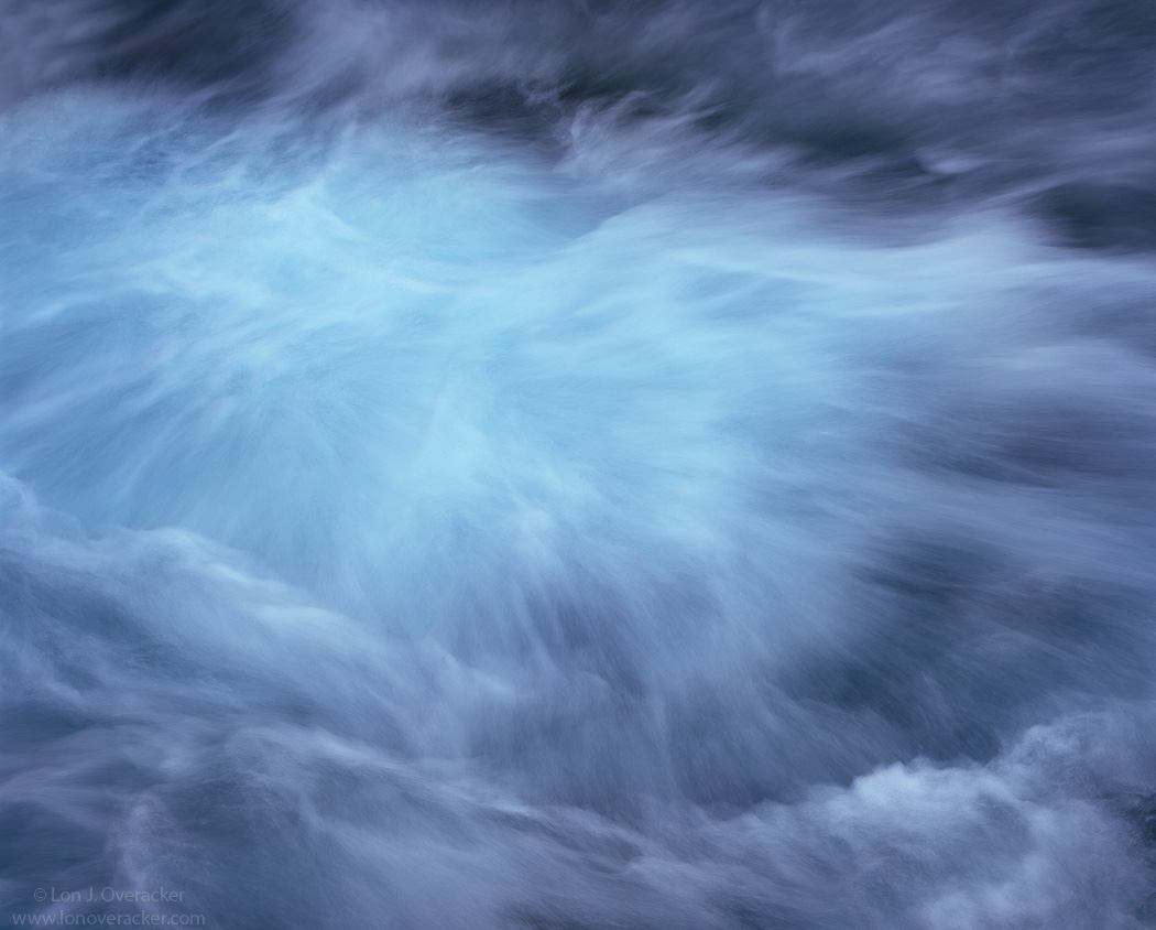
A bit of a natural abstract at the base of a small waterfall. It reminded me of a brewing cauldron the way the turbulent water swirls around and pushes up from the depths. The name of the creek that runs through Sonora Pass in the Sierra Nevada is called "Deadman's Creek." Hence the title.

Now I'm usually the one that comments on color casts, especially the blues and cyans in water. I've been quite amazed how over time one can really learn to "see" the nuances of color and then use them to help complete an image. In this case, I wanted to create some separation between the rising,turbulent center and the motion of the white water along the fringe and so I left the center portion a little on the greenish-cyan side.

If you've ever stared in to a pool of water at the base of the falls or in a rushing stream with whitewater, you can often see those emerald greens and aqua blues. So hopefully the colors aren't too far off and you find this believable. Actually the original slide is uniformly quite blue and there's a lot masking and tweaking going on with this one.

Anyway.... I would love to hear your thoughts and impressions.

4x5, 300mm, V100, f/22 @ 1/4s
Gobs of TK's masks

Thanks! Your honest comments always welcome.

Lon

edit: Interesting, the thumbnail seems much more cyan... curious, cause to me the image in the post doesn't seem as strong.

Comments

29 comments
Comment posted by Nicolaus Wegner on August 7, 2010 at 5:25 PM
Not as strong as your last work Lon, to be honest. I'd almost prefer the 'cauldron' in the center of the image. The colors are nice and subtle though. Looking forward to what else you have to share.
Registered on February 21, 2010, 133 Posts, 1509 Comments
Comment posted by Anthony Vincent on August 7, 2010 at 5:56 PM
ohhh, I might be against the masses here but I think this is really awesome. My style for sure and I like how you framed the "cauldron". The different hues of blue are special and unique to this comp. The slight vign. helps focus my attention to the center/ offset.

Im not sure but I can withstand some more sharpening really accentuating those water lines. Maybe an Unsharp mask at 20, 50, 0 will probably pop a bit too. Thats it for me and I thoroughly enjoy this one Lon
Great job and vision
:smile:
Registered on February 5, 2009, 199 Posts, 2775 Comments
Comment posted by Harley Goldman on August 7, 2010 at 7:14 PM
I really like the image. I am finding the colors a little on the heavy side, especially the darker outside. I like the artistic effect, but I would not mind comparing it to a little less saturated version. Still, it is a very compelling image.

BTW, to me, the cyan in the thumb looks pretty close to the bigger image.
Registered on November 19, 2003, 586 Posts, 11271 Comments
Comment posted by Cam Held on August 7, 2010 at 8:34 PM
For me, the colors and saturation seem perfect. Perhaps if there were elements in the photo other than water then the saturation might be a little much, but in an abstract like this, I think it works fine! Nice job with the masks, I'm no good with them! :wink: Great photo! :toast:
-Cam
Registered on November 12, 2009, 59 Posts, 398 Comments
Comment posted by Stan Rose on August 7, 2010 at 8:44 PM
I respectfully disagree. Ive ruined many a fine rapid/water shot with splotchy color. Fight the temptation Lon--FIGHT, man--DESATURATE. Its all about the textures. Forget the stinkin color :biggrin: :wink:
Registered on September 15, 2005, 836 Posts, 17099 Comments
Comment posted by Cam Held on August 7, 2010 at 8:54 PM
No, IT IS ALL ABOUT THE COLOR!!!!!! :wink: :biggrin: The human eye can see color, so why not use it to your advantage? I'll steal a metaphor: Its like an old lady driving a Ferrari around at 20 mph. If you have something, you should use it to the fullest! :wink: Sorry to disagree Stan! :biggrin:
-Cam
Registered on November 12, 2009, 59 Posts, 398 Comments
Comment posted by Tony Kuyper on August 7, 2010 at 8:59 PM
I'm so glad to see your continued exploration of water, Lon. You got me hooked on your last series. What a great and unique take on a waterfall. Works great for me comp and color-wise, but for some reason I feel I have to take a leak.
Registered on November 1, 2003, 364 Posts, 22328 Comments
Comment posted by Kah Kit Yoong on August 7, 2010 at 10:18 PM
The colours look fine to my eye and are in fact the most appealing part of the image IMO. The water motion doesn't really hold my attention however and overall it's the least compelling of your water images. To sum up, not bad but not one of your better shots.
Registered on September 27, 2006, 636 Posts, 10682 Comments
Comment posted by Stan Rose on August 7, 2010 at 10:21 PM

No, IT IS ALL ABOUT THE COLOR!!!!!! The human eye can see color, so why not use it to your advantage? I'll steal a metaphor: Its like an old lady driving a Ferrari around at 20 mph. If you have something, you should use it to the fullest! Sorry to disagree Stan!
-Cam

You're right, Cam--Ansel should have stuck with his color work... :wink:
Registered on September 15, 2005, 836 Posts, 17099 Comments
Comment posted by Paul Duval on August 7, 2010 at 11:28 PM
Well I must respectfully disagree ( with many a prior comment) we don't actually see anything we sense it. Our brains interpret, our eyes record with the rods and cones. So since sight is perceptual all of the baggage that goes along with our brain is tagged along with "sight". So reality isn't actually real it's perceptual. True artistic perception or vision is rare, which why is there are so many plain images I know I've taken plenty and so few great, fantastic, special or whatever superlative you choose to use; images. Sure it's a little on the blue side Lon, but it's your vision, I like the treatment of the turbulence at the base of the falls without the falls.

Paul

Sorry I lost control of the key board for a moment.
Registered on June 30, 2009, 508 Posts, 1907 Comments
Comment posted by Michael Anderson on August 8, 2010 at 12:05 AM
Lon, I really like this one. This scene sucks me in, just like it did for you in real life. The colors look perfect to me and the gradual change in color from the center to the edge is what is really compelling. The color change seems to blend so well with the emanating texture of the water.
Registered on January 31, 2006, 228 Posts, 3072 Comments
Comment posted by Vance Gese on August 8, 2010 at 12:22 AM
Man, Lon this is superb. The textures and details you have achieved with your processing or development are absolutely stunning. Add the color, which look very natural to me, and you have an incredible abstract image in my opinion. The hours you must have spent on this were very well spent. Exquisite work.
Registered on November 13, 2008, 298 Posts, 6629 Comments
Comment posted by Andreas Resch on August 8, 2010 at 3:46 AM
Hey Lon - stick with your trees and leave the water shots to me ... ;) ... *jk*. Sometimes and takes nothing else but a little bit of dynamic water to create an awesome shot. I often find myself just sitting beside a creek and finding a composition while playing with the shutter speeds. Must be hard on a 4x5 as you don't have the chance to select one great shot of many. In shot like this one EVERY shot looks different and feels different.
Anyway - you got a lovely one here with a nice freeze of motion. The colors don't bother me too much. As you know I have that saturated water in my images as well. I might try one thing. Move all the colors more towards green so that the purple ones become more blue and the cyan ones become more green. This would look more natural to me as these colors are typical for our creeks in the Alps here - but maybe I'm just biased.
Registered on November 14, 2007, 322 Posts, 6101 Comments
Comment posted by Stuart Williams on August 8, 2010 at 5:12 AM
lon, it's the magentas & purples on the edges that i find less believable than the cyans and aquas in the center. (on the coast here in mozambique we obviously have aquas and cyans in abundance so i find them more believable!), sill i like the explosion of water from the centre as well.
Registered on December 7, 2007, 247 Posts, 4792 Comments
Comment posted by Dietrich Gloger on August 8, 2010 at 7:46 AM
The color separation really works well here to emphasise the center. The water action further creates separation due to the different textures and flow directions .These two aspects create a lot of dynamics and movement and this is what really works well here for me. And I don't find the colors unbelievable as such.
Som "philosophical" considerations:
As a stand alone image this is maybe a bit "lost", but I think in a series or as a triptych this can work great. Like Andreas said - every shot looks different so this could be a project to portray these differences. Water shots I have tried often work for me because of the pattern and structure as such. Based on the interest we have in seeing and exploring something that was "frozen" and cannot observed actually without the aid of the camera. However, from a story-telling point of view - such images may lack something - the purpose and intention. In combining them I think one can create that purpose.
I would never suggest that you make your compositions without intention. And I do not say this image does not show intention. The statement is a general observation I made from *my* images that feature only water. I tried triptychs and liked the combined impact more - in most cases.
Just some food for thought... :wavey:
Edit: - when I launched my comment, and the browser window displayed the image again - it had immediate impact again. I just felt to let you know this in addition... :wink:
Registered on January 26, 2007, 360 Posts, 9876 Comments
Comment posted by Greg Cope on August 8, 2010 at 11:09 AM
Quite interesting. This seems like an image that grows on you - the more I look at it the more intriguing and captivating it becomes.
Registered on January 22, 2007, 212 Posts, 2737 Comments
Comment posted by Paul Breitkreuz on August 8, 2010 at 11:53 AM
Lon, to me this seems dead-on for color & saturation. In fact, I might be tempted to push the saturation up ever so slightly to see what it looks like. I see no need to adjust the color at all, that looks fine, maybe just a light kick in the snap to the eye. On the other hand, if you want to leave the effect of calmness, then this works as is, but as turbulent as the scene is to boost the dramatic side maybe a little saturation to again see how things look overall. Oh by the way, the comp is perfect IMO as an abstraction look of this powerful cauldron of water. :cool:
Registered on February 25, 2006, 525 Posts, 8448 Comments
Comment posted by Chris Chamberlain on August 8, 2010 at 12:01 PM
This kind of image isn't about believability for me. It's obviously water, but also looks like smoke, and is definately abstract enough to offer some "artistic Liscense". I actually really like the darker tones and color around the edges more, but also like the cyan in the center. If there was somthing abvout the color that strikes me as less than natural, it would be the cyan in the center. But it doesn't and I enjoy it thoroughly. I think this stands on it's own pretty well, but Didi makes a good point about having it in a suite, or triptych.

Chris
Registered on March 13, 2007, 500 Posts, 8365 Comments
Comment posted by Preston Birdwell on August 8, 2010 at 1:43 PM
Lon,

This is a great detail shot. One thing that always amazes me about your water shots is that you appear to be able to predict how the flow will look at long exposure times; something I am not very good at. I would probably have walked right by this.

The comp works well for me. I will look at this my calibrated monitor later today. If I have comments regarding color, I'll shoot an e-mail.

Well done!

--P
Registered on November 1, 2003, 471 Posts, 5188 Comments
Comment posted by Lon Overacker on August 8, 2010 at 3:18 PM
Thank you everyone for your honest and insightful comments. I've re-worked this from scratch and now I can see how blue-ish/purple this was especially around the fringe. I think this is closer to the actual water color. Or at least how I want it to be. :wink:

Stan - We're always preaching that we should do what makes us happy and not do our work for someone else, so I'll respectfully say I won't fight the urge... :wink: Color is/was part of my vision for this image, as well as the texture and certainly motion of the water - they all work together. So I still wanted to keep the color, but to some other comments, I tried to move the cauldron to a more green/cyan than a blue/cyan and the outer edges more neutral.

But Stan, you are right about the "blotchy color." It's one of the more difficult things to do in terms of selectively editing an image like this, as opposed to selecting a rock or something. I do still think the color is a little blotchy if you really look at it...

Tony - no comment. Can't say I've ever had that response to an image before... :eek:

Anthony - I tried some selective sharpening on this repost, but honestly, sharpening water is like sharpening sky.... I usually leave it alone. However, I can't be for certain that the water is actually sharp. Very tough to focus on moving water on the ground glass.

Thanks to everyone else for their comments and observations. Here's the larger version

Lon
Registered on November 24, 2006, 521 Posts, 19147 Comments
Comment posted by Chris Chamberlain on August 8, 2010 at 4:23 PM
I think this repost is much better! I didn't have any issues with the original. But, Like you, now seeing the nuetralized version makes the intensity of the color in the original more apparent. I have the same problem, that after working an image for too long, it's hard to see where it's gone sometimes. It's only when pointed out to me buy others with fresh eyes, that I come to see it myself.

Chris
Registered on March 13, 2007, 500 Posts, 8365 Comments
Comment posted by Morris McClung on August 8, 2010 at 5:30 PM
There's a dizzying disorientation to this one. Really gives me the feeling of motion. Excellent conveyance of that aspect. Another one I would love to see large.
Registered on May 7, 2007, 670 Posts, 19650 Comments
Comment posted by Harley Goldman on August 8, 2010 at 6:18 PM
Beautiful job on the repost. You nailed it!!!
Registered on November 19, 2003, 586 Posts, 11271 Comments
Comment posted by Stan Rose on August 8, 2010 at 8:01 PM
YES!! Exactly--i wasnt saying go B&W, all i was saying was the color discontinuites/neon look were too strong in the original--due to pp: been there, done that! You solved the problem perfectly in the repost. Case closed. :wink:
Registered on September 15, 2005, 836 Posts, 17099 Comments
Comment posted by Rick Lundh on August 9, 2010 at 12:11 AM
Lon,
I love the second version's color much more! I love the motion of the water as well, and I love that this is a split second in time that can never be duplicated. Really cool image here. Somehow, it feels a little dark to me...like it needs to pop more. I dont know how the levels are, and how close the lights are to blowing...but if they are, then copy those brightest spots onto another layer, then do another levels adjustment to bring up the rest of the contast some. Just a suggestion...its such a really beautiful image either way.
Registered on April 28, 2004, 774 Posts, 4351 Comments
Comment posted by Stuart Williams on August 9, 2010 at 1:53 AM
re-post is much much better but i still detect and continue to have unease about purple/magenta on edge. i'd go further still ....
Registered on December 7, 2007, 247 Posts, 4792 Comments
Comment posted by Justin Reznick on August 9, 2010 at 5:22 PM
I love water impressions and this is excellent Lon! I love the centered nature of the source, the flow contained within the image. I also love the range of color.
Registered on November 24, 2009, 79 Posts, 515 Comments
Comment posted by Floris van Breugel on August 9, 2010 at 7:20 PM
I like your trees more, but this is still a beautiful abstract exploration of water. The repost works much better for me - the textures come through more. If you want to get the textures to pop even more (I'd go for just a bit more in some areas) try this (sorry if you already know the technique): USM at high radius (20-70 pix for a 21MP image... so whatever that translates to for your scans), and a very small amount (I actually go with a high amount and then use a mask to paint in the texture only where I want it). Works great for adding more structure to water and clouds (I used it on my Yosemite flood image earlier this year).
Registered on December 19, 2008, 306 Posts, 4840 Comments
Comment posted by Kyle L. Krause on August 9, 2010 at 7:24 PM
Hey Lon,

Excellent image, Very artistic. I prefer the second version, colors seen more natural. I get a little dizzy looking at it. Nice stuff. :biggrin:
Registered on June 15, 2010, 29 Posts, 605 Comments