Gallery: LandscapePosted August 3, 2010317 views24 comments
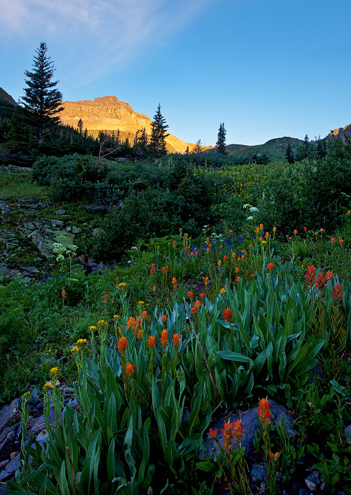
Last week at Yankee Boy Basin, San Juans, CO.
5Dmkii; 17-40; 1/2s at f/18
C&C Welcome!
SEE REPOST BELOW!
Comments
24 comments
Comment posted by Jay Nielsen on August 3, 2010 at 6:44 PM
Very nice processing for a difficult exposure situation. The flowers are beautiful and the sunlit peak "peeking" above is very nice. I am on an uncalibrated montior right now but the rocks in the foreground seems quite saturated, almost purple, could just be my monitor though.
Registered on October 6, 2008, 137 Posts, 720 Comments
Comment posted by Floris van Breugel on August 3, 2010 at 7:26 PM
There's something very appealing about this one to me. The fact that the flowers are concentrated in the foreground, the green/red contrast with the blues in there, and the repetition of the leaves, simplifies the foreground a lot. The one distant orange peak adds depth and context. I'm on a crappy monitor, but the blues (particularly the rocks in the foreground) look over saturated.
Registered on December 19, 2008, 306 Posts, 4840 Comments
Comment posted by Stan Rose on August 3, 2010 at 7:50 PM
Yeah--funny i just noticed that...ill get a repost out later.
Registered on September 15, 2005, 836 Posts, 17099 Comments
Comment posted by Ron Pullen on August 3, 2010 at 8:01 PM
Very nice, Stan. Don't you just love Yankee Boy Basin? Exciting drive too. Ron
Registered on December 18, 2005, 74 Posts, 1413 Comments
Comment posted by Steve Sieren on August 3, 2010 at 8:21 PM
That is a lot of flowers you have there, hear that's a great place for them. I know it's in shadow but the color cast seems a bit strong for me Stan.
Registered on January 2, 2008, 360 Posts, 5321 Comments
Comment posted by Tony Kuyper on August 3, 2010 at 11:41 PM
Almost garden-like in the lushness here. I'm a little undecided about the glowing peak. It tends to pull my eyes off the flowers, but maybe that's your intention.
Registered on November 1, 2003, 364 Posts, 22328 Comments
Comment posted by Rick Goldwasser on August 4, 2010 at 12:48 AM
Great fg floral arrangement - everything looks really healthy! Too bad you couldn't order up a few clouds but I guess you can't have it all. Love this place - never get any decent photos from it but it's a great spot to hang out.
Registered on May 10, 2009, 127 Posts, 970 Comments
Comment posted by Dietrich Gloger on August 4, 2010 at 1:06 AM
A very nice mountain scene Stan! I like how you designed the fg - the diagonal grouping of the flowers creates a lot of interest. I also like your processing on this one - dark, but the details come through where it's necessary.
Registered on January 26, 2007, 360 Posts, 9876 Comments
Comment posted by Anil Rao on August 4, 2010 at 2:09 AM
This has turned out really well. What I like most about the picture is the apparent simplicity of the composition, that allows one to examine the scene at leisure without being forced to see things in any specific manner. From my understanding this is not simple to do and hence my appreciation for the design.
The color on the foreground rocks is a little strong but you have noted that already. Everything else seems perfect to my eyes.
Registered on November 15, 2003, 234 Posts, 4923 Comments
Comment posted by Stuart Williams on August 4, 2010 at 7:54 AM
very good stan - but don't like the colour cast of the rocks. some cloud matter would have helped offset the bright peak a touch. that all being said, this is super - very much like the composition and flowers.
Registered on December 7, 2007, 247 Posts, 4792 Comments
Comment posted by Bill Maile on August 4, 2010 at 8:32 AM
Nice comp and lovely scene Stan. I agree with the FG rocks of course and look forward to the repost. The bright top doesn't bother me, though some nice big clouds would have been cool--but we can't control that part!
Registered on March 2, 2009, 984 Posts, 2518 Comments
Comment posted by Arnab Banerjee on August 4, 2010 at 11:08 AM
fix the blue cast and this is a winner. and yes, yankees can use a little cheer as they are falling off from no 1 spot
Registered on January 3, 2007, 313 Posts, 2270 Comments
Comment posted by Luis Argerich on August 4, 2010 at 11:20 AM
Beautiful and crisp I'm really inspires by the point of view you chose here.
Registered on December 22, 2009, 91 Posts, 1349 Comments
Comment posted by Walt Sterneman on August 4, 2010 at 2:14 PM
Very nice picture Stan. I also like the depth that the ligh on the mountain conveys.
Registered on March 24, 2010, 73 Posts, 1268 Comments
Comment posted by Kyle L. Krause on August 4, 2010 at 5:32 PM
Stan,
Strong composition, love all the colors in the flowers. nice find, well done.
Registered on June 15, 2010, 29 Posts, 605 Comments
Comment posted by Stan Rose on August 4, 2010 at 7:54 PM
Definitely had the WB off (must remember to use the gray card...must remember...) Thanks for catching that!
Registered on September 15, 2005, 836 Posts, 17099 Comments
Comment posted by Justin Peterson on August 4, 2010 at 10:24 PM
This is a masterful composition, Stan. Nice job on the repost...the WB is spot on now.
Registered on January 20, 2008, 33 Posts, 298 Comments
Comment posted by Chris Chamberlain on August 5, 2010 at 1:21 AM
Nice! This is just oozing with beautiful saturation. Seems kind of safe for you, are you mellowing???
Chris
Registered on March 13, 2007, 500 Posts, 8365 Comments
Comment posted by Stan Rose on August 5, 2010 at 1:48 AM
Yeah, and my back is killing me too, Chris!
Dont worry though--i plan on hitting the dunes pretty soon, and i aint gonna bring back any ordinary comps--that i can promise you!
Registered on September 15, 2005, 836 Posts, 17099 Comments
Comment posted by Doug Koepsel on August 5, 2010 at 1:10 PM
Stan,
Nice composition with the angular patch of spear-like leaves, and those red paintbrush really jump from the shadows. Repost is a much nicer.
Registered on April 1, 2010, 196 Posts, 1592 Comments
Comment posted by Vance Gese on August 5, 2010 at 5:01 PM
Stan, your repost is fantastic. Beautiful composition and the colors are spot on. Superb work.
Registered on November 13, 2008, 298 Posts, 6629 Comments
Comment posted by John Mumaw on August 5, 2010 at 7:47 PM
It's amazing what a simple correction can do for an image.
I was waiting for this to appear, and now feel that it's the finest image you got from your recent trip.
Registered on September 9, 2005, 62 Posts, 2289 Comments
Comment posted by Eva McDermott on August 5, 2010 at 10:21 PM
Love the repost Stan. Color really pops in the foreground.
Registered on January 4, 2009, 1015 Posts, 13229 Comments
Comment posted by Morris McClung on August 5, 2010 at 10:25 PM
Funny, but I kind of like the warm/cool contrast of the first one. Oh well, there's no accouting for tastes. The warmer tones did help brighten up the foreground a touch and it is very balanced and natural now. Great comp and light!
Registered on May 7, 2007, 670 Posts, 19650 Comments

Comments
24 commentsThe color on the foreground rocks is a little strong but you have noted that already. Everything else seems perfect to my eyes.
Strong composition, love all the colors in the flowers. nice find, well done.
Chris
Dont worry though--i plan on hitting the dunes pretty soon, and i aint gonna bring back any ordinary comps--that i can promise you!
Nice composition with the angular patch of spear-like leaves, and those red paintbrush really jump from the shadows. Repost is a much nicer.
I was waiting for this to appear, and now feel that it's the finest image you got from your recent trip.