Nature Photographers Network
This is the preserved archive of the original Nature Photographers Network. The community continues at naturephotographers.network.
Impressions Of Spring
‹ PreviousFlora GalleryNext ›

Impressions Of Spring

by Youssef Ismail

Gallery: FloraPosted August 1, 2010120 views14 comments
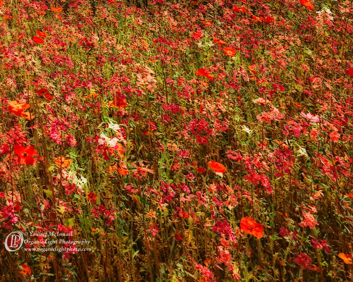
Here is another 4x5 photograph. This one is wider for the same field of Fireweed and Icelandic Poppies. This was again taken under partial sunlight, sun was on the fringe of a cloud, and was somewhat of a disappointment when the films came back. The lighting was harsher on the film than I remembered in the field. So I applied a blur layer in the Darken Light mode to somewhat subdue the lighting. That step tended to remove some of the detail in the image, which is what I really was looking for, a more impressionistic feel of this field.

JPEG compression further killed some of the detail, so I included a Larger version, but both had to be saved at level 5 just get under the size limit. 4x5 makes BIG files. :wink:

Your Impressions of this photo, is much appreciated.

4x5, 150mm, f32, 1/15, Fuji Provia 100F

Comments

14 comments
Comment posted by Mark Windom on August 1, 2010 at 10:32 PM
Actually I really like the effect that compression has had on this and wonder how further softening or ortonizing would look.....more of an abstract quality.
The 4X5 trannie must look great on the light table....I miss my LF days.
Nice image as always.
Registered on November 1, 2003, 176 Posts, 2302 Comments
Comment posted by Pat Sampson on August 1, 2010 at 11:18 PM
Youssef,

I like this very much just as you've posted it. It reminds me some of the Pointillism of Seurat more than any of Monet's work or the other Impressionist work I've seen. I actually prefer that. The mood seems somber to me and that also appeals to me. I'd be very pleased if this were in my portfolio. I've got no suggestions.

Pat
Registered on May 19, 2007, 953 Posts, 15989 Comments
Comment posted by Gary Yeoh on August 1, 2010 at 11:27 PM
Beautiful florascape and color palette. The scattered while flowers draws the viewer's attention to look close and explore this wonderful image. :toast:
Registered on September 1, 2009, 588 Posts, 8184 Comments
Comment posted by Ian Wolfenden on August 2, 2010 at 6:25 AM
Love the rich feel of this, Youssef - the image is so suggestive of the bounty of nature ( it also reminds me somewhat of Islamic carpets with their glorious, complex patterns and colours ).
Registered on May 18, 2007, 1108 Posts, 7647 Comments
Comment posted by Bill Fach on August 2, 2010 at 8:21 AM
Youssef: Frame filling fantastic. This is one dense stand of flowers. I like everything about this one from comp to subject to processing and presentation. The larger version is especially compelling. Really nice work. >=))>
Registered on November 1, 2003, 1805 Posts, 26981 Comments
Comment posted by Youssef Ismail on August 2, 2010 at 10:39 AM
Ian, I never thought of it in those terms. It does have that intricate feel of an Afghan Rug. Thanks for that insight.
Registered on November 1, 2003, 474 Posts, 5555 Comments
Comment posted by Mike Gallo on August 2, 2010 at 2:16 PM
Beautiful in every way......outstanding image :toast:
Registered on September 14, 2005, 182 Posts, 1471 Comments
Comment posted by Harley Goldman on August 2, 2010 at 5:17 PM
This has a real nice impresionist painterly look to it, with popping colors. What Pat said, that Pointillism stuff. :confused: :biggrin:
Registered on November 19, 2003, 586 Posts, 11271 Comments
Comment posted by Morris McClung on August 2, 2010 at 8:22 PM
I would really like to see a large print of this one. Great color and rhythm
Registered on May 7, 2007, 670 Posts, 19650 Comments
Comment posted by Doug Benner on August 3, 2010 at 6:23 AM
I really like the abstract quality of this.
Registered on December 8, 2003, 482 Posts, 1868 Comments
Comment posted by John&Patty Benway on August 3, 2010 at 6:42 AM
Amazing color and detail throughout Youssef, and beautifully presented.
John
Registered on May 12, 2006, 626 Posts, 8700 Comments
Comment posted by Albert Darmo on August 4, 2010 at 6:02 PM
Hi Youssef :wavey: It does look like an impressionist painting! Sublime detail and color. spectacular
:toast: :toast:
Albert Darmo. Canada
Registered on November 25, 2008, 1386 Posts, 11978 Comments
Comment posted by Kathy Odiorne on August 4, 2010 at 11:07 PM
Wow! What a splash of color!. I can really appreciate the detail in the larger version. Would be cool printed large :toast:
Registered on November 1, 2003, 211 Posts, 1471 Comments
Comment posted by Larry Lynch on August 6, 2010 at 9:03 AM
Beautiful colors and the diagonal flow makes it stronger. Beautifully done.
Registered on September 16, 2006, 773 Posts, 9940 Comments