Nature Photographers Network
This is the preserved archive of the original Nature Photographers Network. The community continues at naturephotographers.network.
The Gates of Calypso II
‹ PreviousLandscape GalleryNext ›

The Gates of Calypso II

by Michael Anderson

Gallery: LandscapePosted July 31, 20101,118 views29 comments
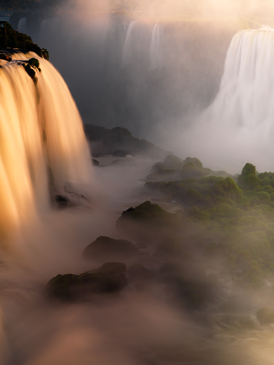
This is a new version of my previous post http://www.michaelandersongallery.com/photo/iguazu-falls-sunset/

I took this version a day later with better light, a warmer white balance and a different camera. The previous version was shot with a Canon 5D MkII and this one was shot with my Hasselblad H2D. The difference in ambient light and white balance create very different moods, but I'm curious to know if you guys have a preference for one or the other.

Thanks for looking!

Comments

29 comments
Comment posted by Eva McDermott on July 31, 2010 at 11:47 PM
I prefer the original "blue" post. It seems more moody to me, but a personnal preference for sure. I also like the stronger, more organized structure of the "blue" version. BTW - Both are beautiful in their own right.
Registered on January 4, 2009, 1015 Posts, 13229 Comments
Comment posted by Richard Olsen on July 31, 2010 at 11:58 PM
I like the layering on this photo, but to hang on my wall....I'll take the 1st! It was a photo that made me say "I've got to go there!!"
Registered on October 19, 2006, 306 Posts, 1571 Comments
Comment posted by Abdullaziz Bin Ali on August 1, 2010 at 12:02 AM
Beautiful Work Michael
both of them are lovely
but I noticed most of your pictures have the taste of warmness
so, if you have blue colors. it is like kind of having various conditions from nature.
all the best Mike

:wink:
Registered on May 31, 2009, 112 Posts, 1590 Comments
Comment posted by Ben Horne on August 1, 2010 at 12:06 AM
It's very interesting to see both versions. I must say that I really prefer the blues in the first. It adds to the unreal feel of the place -- an almost dreamlike quality.
Registered on August 27, 2009, 51 Posts, 959 Comments
Comment posted by Kah Kit Yoong on August 1, 2010 at 12:16 AM
I think this one will have more widespread appeal but I prefer the more mysterious cooler toned version.
Registered on September 27, 2006, 636 Posts, 10682 Comments
Comment posted by Chris Chamberlain on August 1, 2010 at 12:17 AM
Hi Mike,

This is awesome! I like everything about this, and have no nits at all. Having said that, I prefer the first cooler version by a significant amount! So that one must be awesomer!!!!

Chris
Registered on March 13, 2007, 500 Posts, 8365 Comments
Comment posted by Scott Smorra on August 1, 2010 at 12:37 AM
I like both of these photos, Mike. Each is very unique. I prefer the "blue" version since you can see deeper into the scene.
Registered on November 2, 2009, 161 Posts, 2143 Comments
Comment posted by Floris van Breugel on August 1, 2010 at 1:01 AM
Lovely image, again. They both have incredibly different moods, and I imagine different folks will prefer one over the other in particular with regard to the 'end use'. Personally, I love cooler blues, so my preference is with the cool white balance. I do sometimes play with (subtle) white balance blending - ie. processing with a cooler white balance for a portion of the image... maybe that would be a way to get the warmth from this one on the main falls into the cooler tones of the other to some extent? Having warm and cool tones adds a lot of depth - this image has almost no blues, and I think just a subtle adjustment there would add more depth.
Registered on December 19, 2008, 306 Posts, 4840 Comments
Comment posted by Jack Graham on August 1, 2010 at 1:13 AM
Michael.... This one is a wonderful shot... the cooer tone image has moremeed interest for me!
JG
Registered on November 26, 2003, 158 Posts, 574 Comments
Comment posted by Kent Mearig on August 1, 2010 at 1:31 AM
Wow, I don't know how I missed the first one, but they both are definitely images that I want to just sit back and soak in. I don't really want to think about anything, or compare and contrast, when I'm looking at these, but I guess I would have to say that my framing preference is for the earlier post. Honestly, my color choice would be somewhere between the two, but I really value both your interpretations.
Registered on September 4, 2006, 237 Posts, 4748 Comments
Comment posted by Jay Nielsen on August 1, 2010 at 3:08 AM
Wow beautiful image, the mist everywhere creates such a mysterious and luxurious feel. I do like the warm tone of the sunlight on the left falls. Maybe some selective warming of the cooler tone image would be the best of both worlds.
Registered on October 6, 2008, 137 Posts, 720 Comments
Comment posted by Mohsen Al-Dajani on August 1, 2010 at 6:03 AM
Such scene is greatly appreciated in my country..more than you think. :eek: cause it is impossible to see like this around my country :mad: thanks for sharing this Mike.
Registered on August 23, 2007, 160 Posts, 432 Comments
Comment posted by Mark Pelton on August 1, 2010 at 8:16 AM
Both are wonderful images, but I prefer the earlier version and I can't really expain why, because the diferences are largely just the color balance (although you have more detail in the first) . Normally I prefer a warmer color balance, but the cool blue in the previous version is really nice. Which was closer to reality ? or were there just that much difference in the light color the 2 days?
Registered on November 25, 2003, 380 Posts, 4647 Comments
Comment posted by Joseph Kayne on August 1, 2010 at 8:32 AM
I really enjoy the light in this one!!! Would like to see just a little more roon at the top. Very minor..lovely image. J.
Registered on November 1, 2003, 573 Posts, 2619 Comments
Comment posted by Tony Kuyper on August 1, 2010 at 9:36 AM
I think they are both excellent, Mike, and work equally well as images. Sometimes there is an obvious shift in color balance that needs to be corrected, but in these two images, it looks right. Wonderful image.
Registered on November 1, 2003, 364 Posts, 22328 Comments
Comment posted by Dan Baumbach on August 1, 2010 at 10:55 AM
I can't pick. They're both stunners. I can drive down to Golden and look and some prints and give you an opinion, if you're interested. :)

- Dan
Registered on November 1, 2003, 473 Posts, 7980 Comments
Comment posted by Vincent Grafhorst on August 1, 2010 at 1:36 PM
Both are very , very cool images, but I prefer the mood, coloration and lighting in this version. I would only have liked to see this a tiny bit wider perhaps. :toast: :toast:
Registered on February 24, 2006, 504 Posts, 7203 Comments
Comment posted by Anthony Vincent on August 1, 2010 at 2:35 PM
I love how such simple elements (massive amounts of water, light and shapes) make for such dynamic and mood enhancing shots. I have really enjoyed your travels to these places and thanks for sharing your methods of doing so with me.
Fantastic and gorgeous
Registered on February 5, 2009, 199 Posts, 2775 Comments
Comment posted by Luke Ormand on August 1, 2010 at 2:45 PM
I really like the lighting here - especially the subtle greens and purples in the bottom of the frame. The processing of this is beautiful.
Registered on February 4, 2009, 1093 Posts, 7035 Comments
Comment posted by Ant on August 1, 2010 at 4:51 PM
I like the sense of space and depth that this image conveys, and the soft tonal transitions...
Registered on April 13, 2009, 27 Posts, 474 Comments
Comment posted by Morris McClung on August 1, 2010 at 5:04 PM
Wow, they really speak different languages, don't they? The cool first version makes it seem more pristine, whereas the second warmer version more earthy for lack of better terms. Both work for me, with maybe a slight leaning to #1 :toast:
Registered on May 7, 2007, 670 Posts, 19650 Comments
Comment posted by Dean Sauskojus on August 1, 2010 at 7:04 PM
I like the added action of the water in the blue one at the bottom of the falls. Both are very likable shots. Well done Michael!
Registered on September 29, 2009, 137 Posts, 2659 Comments
Comment posted by Josh Anderson on August 1, 2010 at 7:19 PM
Michael, fantastic work on both. Not sure I could pick one over the other.

~ja
Registered on June 2, 2005, 493 Posts, 2996 Comments
Comment posted by Tien-Chien Chen on August 1, 2010 at 7:27 PM
Mike, I think Floris has a good suggestion to cool-toned the distant falls a bit (it doesn't always work for me though since sometimes it just creates confusion from viewer's perspective). Both tones work fine with me, but I like the 5D crop which seems to me add a little bit more depth and more elegant, very personal I think :-)
Registered on September 2, 2005, 34 Posts, 225 Comments
Comment posted by Vance Gese on August 1, 2010 at 11:29 PM
Both are awesome images Mike, invoking the power of these falls that you must have experienced. If I had to choose, the bluer version would be my choice, more for the greater textures seen in the falls and mist. Spectacular work.
Registered on November 13, 2008, 298 Posts, 6629 Comments
Comment posted by Youssef Ismail on August 1, 2010 at 11:38 PM
Michael,

Your work is always very inspirational. You bring up desires to travel and photograph that I put to sleep a long time realizing that I would never have the means to do so, and so I concentrated on my own "backyard". Thanks for giving us a glimpse of our amazing world.
Registered on November 1, 2003, 474 Posts, 5555 Comments
Comment posted by Ricardo La Piettra on August 2, 2010 at 12:35 PM
IMHO this one is the best of your Iguazu collection Mike. The light on the main fall is beautifull. :toast:
Registered on July 22, 2009, 62 Posts, 730 Comments
Comment posted by Mark Metternich on August 2, 2010 at 7:56 PM
DREAMY! :toast:
Registered on June 19, 2009, 276 Posts, 6240 Comments
Comment posted by Kyle L. Krause on August 2, 2010 at 11:30 PM
Mike,

Both are Incredible images. Definitely the blue version for me. Very inspiring, well done.
Registered on June 15, 2010, 29 Posts, 605 Comments