Nature Photographers Network
This is the preserved archive of the original Nature Photographers Network. The community continues at naturephotographers.network.
Mt Wrather + Repost
‹ PreviousLandscape GalleryNext ›

Mt Wrather + Repost

by Kent Mearig

Gallery: LandscapePosted June 25, 2010411 views29 comments
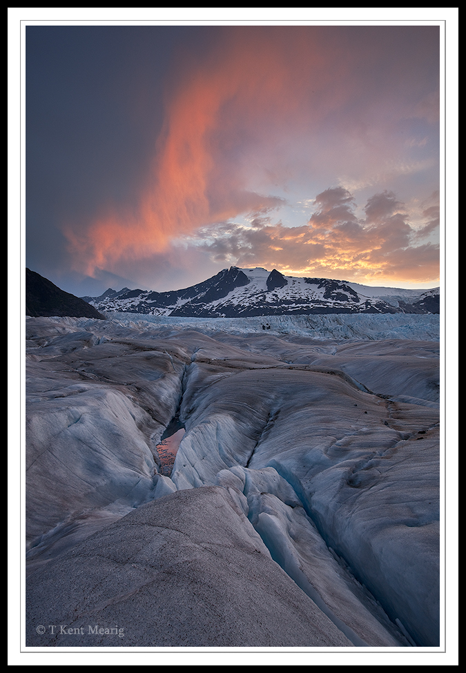
Even a few weeks before the solstice, seeing these clouds light up from this location required an alarm set for one a.m. followed by a pretty grueling hike. A younger cousin of mine had enlisted my assistance for the completion of a senior project focused on photography, so most of my attention was aimed at providing him the best chances of recording once-in-a-lifetime photos. In a moment to myself (also scouting vantage points) I hand-held my camera for this image. The sky and ice were reconciled to some degree by double processing the RAW file. Photos or none, it was quite the experience.

Comments

29 comments
Comment posted by Shaun Mazurek on June 25, 2010 at 6:29 PM
Perhaps it is just my monitor but I want to see just a slight increase in the contrast. The composition is very well balanced with great leading lines in your forground matched with the alpen light on the edge of the clouds. It looks like the hike was well worth it as this is a very nice image. Can i ask what your ISO was ?
Registered on June 12, 2010, 21 Posts, 162 Comments
Comment posted by Kent Mearig on June 25, 2010 at 6:33 PM
Shaun - I was using ISO 400 on the 5Dm2 to take the photo at 17mm, f/14, and 1/40 of a second.
Registered on September 4, 2006, 237 Posts, 4748 Comments
Comment posted by Guy Tal on June 25, 2010 at 6:42 PM
Stunning image, Kent. It's subtle at first glance but once the detail sets in, it is truly impressive.

Guy
Registered on November 1, 2003, 566 Posts, 15507 Comments
Comment posted by Anthony Vincent on June 25, 2010 at 6:55 PM
Nice shot Kent. I do like the non- intense vibrancy of this one. It really portrays the dangers of the landscape.
Still it has just the right touches of color throughout. No tripod?
Well done
Registered on February 5, 2009, 199 Posts, 2775 Comments
Comment posted by Kent Mearig on June 25, 2010 at 7:01 PM
Thanks for letting me know that you can see past the initial subtlety to the magnificence of the place. On the other hand and upon further reflection, I think this does need a little bit more punch to match what it was like to be a first hand witness. I'll try to re-post later today or tomorrow.

Anthony - My cousin's borrowed tripod broke the day he arrived in Juneau, so he was using mine on most of our outings.
Registered on September 4, 2006, 237 Posts, 4748 Comments
Comment posted by Stan Rose on June 25, 2010 at 7:12 PM
I like it, the processing looks fine to me, appropriately subtle. The warm-cloud/cool ice is a winning combo.
Registered on September 15, 2005, 836 Posts, 17099 Comments
Comment posted by Anthony Vincent on June 25, 2010 at 7:15 PM
ahhhh, so kind Kent :smile:
Looks great
Registered on February 5, 2009, 199 Posts, 2775 Comments
Comment posted by Kah Kit Yoong on June 25, 2010 at 7:18 PM
Looking forward to the repost. This already looks rather striking with its fire and ice theme, even at thumbnail size. The shapes and textures in the foreground are wonderful as is the cool cloud formation.
Registered on September 27, 2006, 636 Posts, 10682 Comments
Comment posted by Wayne Willison on June 25, 2010 at 7:42 PM
I can't imagine an improvement. The colors highlight the textures just right imo. Fabulous comp as well.
Registered on April 10, 2009, 292 Posts, 3967 Comments
Comment posted by Ben Horne on June 25, 2010 at 7:49 PM
Your processing is very natural. I get the feeling that I am witnessing the scene in person. It's great that you caught the reflection of the pink cloud in that small area of ice/water.
Registered on August 27, 2009, 51 Posts, 959 Comments
Comment posted by Eva McDermott on June 25, 2010 at 8:07 PM
The delicate details of the larger version keep me looking Kent. The light and color in the sky and reflection in the glacial stream are truley stunning. Beautiful work. Having been on a glacier walk (in Jasper NP, CA), this view makes me want to go back and see one at sunrise.
Registered on January 4, 2009, 1015 Posts, 13229 Comments
Comment posted by Shane McDermott on June 25, 2010 at 8:18 PM
Hi Kent

Really like this one. All the lines, shapes and subtle tonalities just come together so beautifully. The comp is spot on to me. The only think I would consider doing would be to try to achieve a great degree of color separation. There looks to be a blue color cast (which of course there is in that light}, but I think the pinks offer more glow if this color cast where reduced, especially in the sky. Otherwise, fabulous image.

Shane :toast: :toast:
Registered on November 12, 2007, 49 Posts, 1074 Comments
Comment posted by Morris McClung on June 25, 2010 at 8:36 PM
The neutral colors are great in this one. I agree about a touch more contrast as it seems the slightest bit flat. Pretty outstanding for a handheld shot!
Registered on May 7, 2007, 670 Posts, 19650 Comments
Comment posted by Kent Mearig on June 25, 2010 at 8:44 PM
I see quite a few comments now from people who are pleased with the original presentation, so now I'm interested to see if there's something added in this newer version. Which do you prefer, and if you have time, why?
Registered on September 4, 2006, 237 Posts, 4748 Comments
Comment posted by Walt Sterneman on June 25, 2010 at 8:57 PM
Nice shot Kent. I just returned from that area. It was my first visit and I was very impressed. I'll have to come back some day.

This is a nice shot for HH, everything seems to be pretty sharp.
Registered on March 24, 2010, 73 Posts, 1268 Comments
Comment posted by Rudy Ruberti on June 25, 2010 at 9:03 PM
I like the additional saturation/contrast in the repost. I think it really brings out beauty of the shot. At first I found the dark ridge on the left a little distracting, but I think it adds some depth.
Registered on October 28, 2008, 179 Posts, 1875 Comments
Comment posted by Joseph Kayne on June 25, 2010 at 9:50 PM
:toast: :toast: :toast: :jump:
Registered on November 1, 2003, 573 Posts, 2619 Comments
Comment posted by Tony Kuyper on June 25, 2010 at 10:08 PM
Gorgeous, Kent.
Registered on November 1, 2003, 364 Posts, 22328 Comments
Comment posted by Shaun Mazurek on June 25, 2010 at 11:35 PM
Hello Kent,

Both posts are amazing but the slightly more contrasty version really expresses the drama (at least on mt monitor and perhaps more to my bias). It is hard to judge based on the 700 pixel limit image but I see no disadvantage to the 400 ISO on the 5D Mark 11. This looks sharp and noise free. The texture and balance just really work here. Great job. :biggrin:
Registered on June 12, 2010, 21 Posts, 162 Comments
Comment posted by Vance Gese on June 26, 2010 at 12:47 AM
Fantastic Kent. Love that reflection in the pool of icemelt. Amazing image.
Registered on November 13, 2008, 298 Posts, 6629 Comments
Comment posted by Dietrich Gloger on June 26, 2010 at 3:49 AM
This is great Kent. Particular the foreground looks amazing. Almost worth a more abstract image of its own, but it works so well combined with the landscape in the bg.
Registered on January 26, 2007, 360 Posts, 9876 Comments
Comment posted by Ricardo La Piettra on June 26, 2010 at 9:10 AM
Im with the second version Kent, mainly because i like the added saturation to that cloud. Outstandig image and beautiful moment captured.
Registered on July 22, 2009, 62 Posts, 730 Comments
Comment posted by Wade Hardy on June 26, 2010 at 10:27 AM
I prefer the 2nd version with the slightly added punch and I especially like the fg - it really makes the shot for me.
Registered on May 2, 2006, 121 Posts, 1824 Comments
Comment posted by Dan Baumbach on June 26, 2010 at 11:20 AM
They're both beautiful but I think the additional saturation makes the second one even better.

- Dan.
Registered on November 1, 2003, 473 Posts, 7980 Comments
Comment posted by Shane McDermott on June 26, 2010 at 1:30 PM
HI Kent

Definitely the second one, for the exact reasons I had suggested in my original post. The cloud color seems more vibrant and pure, maybe you removed a color cast or just increased saturation? Either way it is much improved. The warmer more dramatic sky color and contrast pulls my eye back and forth, Fg to Bg and back again, very intriguing, making me want to stay with the image.

Well Done, Shane :toast: :toast:
Registered on November 12, 2007, 49 Posts, 1074 Comments
Comment posted by Lon Overacker on June 26, 2010 at 5:12 PM
Kent,

Wonderful icy landscape. The second version for sure because it has more pop with the added contrast and saturation; yet it still remains very natural looking to me. Also, that little tiny pool of reflected color really jumps out in the second version. Now normally I might make a comment about a 50/50 comp, and I'm making a comment now.... but I think the comp works very well here and I'm enjoying the comp, colors and the strength of the landscape. Well done.

Lon
Registered on November 24, 2006, 521 Posts, 19147 Comments
Comment posted by Kevin Trinkner on June 26, 2010 at 10:55 PM
I really like this Kent, nice soft light yet great detail. Very nice.
Registered on June 30, 2008, 203 Posts, 2641 Comments
Comment posted by Balakumar Kaushik on June 27, 2010 at 1:16 AM
Beautiful image Kent. The FG textures and undulations are lovely.
Personally, I would still go with the processing of original post - very natural, subtle.
:toast: :toast:
Registered on January 4, 2008, 98 Posts, 1403 Comments
Comment posted by Dorin Bofan on June 27, 2010 at 3:37 PM
The contrast between the warm colors in the sky and the blue of the ice, but also the shape similarity between the left cloud and the lower right cracks make for a superb image and a great example of a 50/50 comp.
Registered on April 30, 2007, 122 Posts, 3086 Comments