Nature Photographers Network
This is the preserved archive of the original Nature Photographers Network. The community continues at naturephotographers.network.
Look Ma, No Trees!
‹ PreviousLandscape GalleryNext ›

Look Ma, No Trees!

by Lon Overacker

Gallery: LandscapePosted June 3, 2010425 views37 comments
Ok, all trees and no rock make Lon a dull boy.

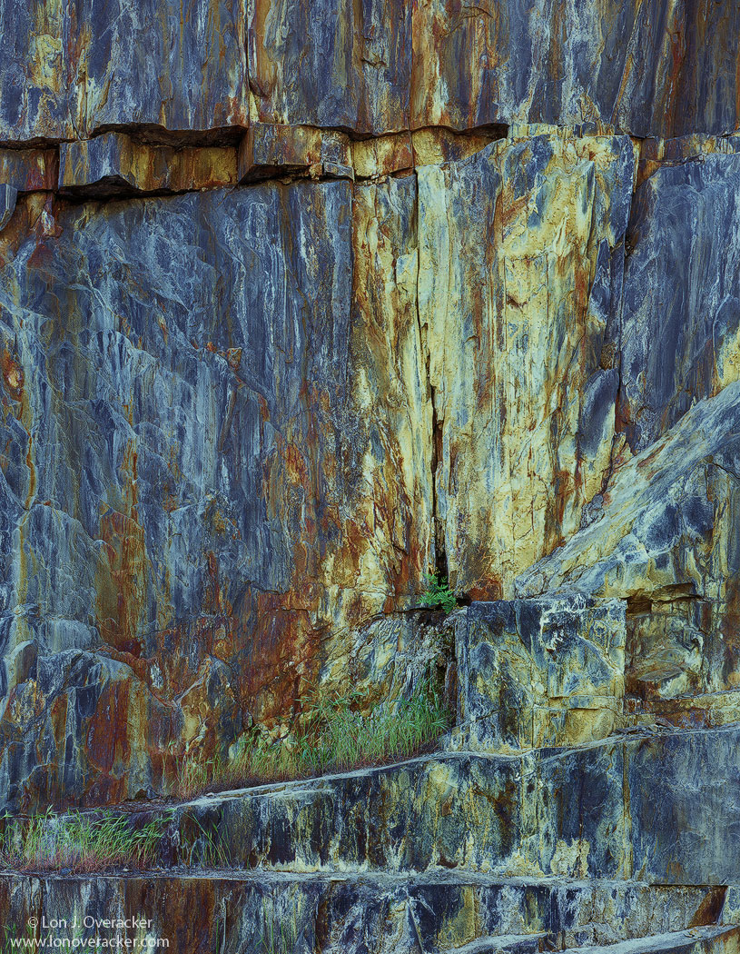
This was captured during the same Mother's Day weekend trip along the Merced River canyon. I almost always stop along this very large wall and it's been photographed by a number of other NPN'ers.

Simple comp with a great amount of detail, texture and colors in the original piece of film. I hope this comes across well and natural.

thanks for your comments on the previous image and I look forward to your honest critiques and suggestions with this one.

4x5, V100, Nikkor 210, f/16 @1s

Thanks!

Lon

Comments

37 comments
Comment posted by Mat Malone on June 3, 2010 at 1:57 AM
Your eye for these is always so on. Really cool rock formation. I like the diagonal lines going back and forth. But it looks like the WB is off, too green and too blue -- or is that just how you saw it?
Registered on December 15, 2008, 91 Posts, 882 Comments
Comment posted by Jeremy Cram on June 3, 2010 at 2:12 AM
Beautiful work Lon. The textures are really amazing and the color is awesome. I like how all the subtle diagonal lines go to the middle, really a great photograph.
Registered on June 4, 2006, 204 Posts, 818 Comments
Comment posted by Justin Reznick on June 3, 2010 at 2:17 AM
Great steps leading up the rock wall, incredible array of colors!
Registered on November 24, 2009, 79 Posts, 515 Comments
Comment posted by Lon Overacker on June 3, 2010 at 2:19 AM
thanks Matt. Ya know, right at the last minute I wondered if this was a little green - perhaps a bit oversaturated as well. Here's a toned down version, pulled back on the blues slightly and also dropped the green a few points in a mids levels layer.

Is this a little better? Any preference?

thanks folks!

Lon

edit: while this version looks a little flatter, it's probably closer to reality... :smile:
Registered on November 24, 2006, 521 Posts, 19147 Comments
Comment posted by Mat Malone on June 3, 2010 at 2:49 AM
Repost works much better for me. Beautiful work.
Registered on December 15, 2008, 91 Posts, 882 Comments
Comment posted by Verena & Georg Pop on June 3, 2010 at 3:06 AM
I prefer the first version, Lon.
anyways, its a very carefully/skillfully cut out piece of that wall. it still holds the feeling of being a massive rock. with images like this and many of your others, it is about what to NOT include and you have lots experience and talent in doing that.
georg
Registered on July 5, 2006, 272 Posts, 2823 Comments
Comment posted by Stan Rose on June 3, 2010 at 3:32 AM
Cool! It kind of reminds me of a stand of petrified trees! :wink: :biggrin:
I like the saturated version better.
Registered on September 15, 2005, 836 Posts, 17099 Comments
Comment posted by Markus Zaiser on June 3, 2010 at 4:19 AM
wow lon this is a real beautiful rockwall you captured, great colours and texture. analog rocks
Registered on September 4, 2008, 31 Posts, 179 Comments
Comment posted by Kevin Trinkner on June 3, 2010 at 7:42 AM
Love the rugged textures and wonderful color contrasts. Nice work Lon.
Registered on June 30, 2008, 203 Posts, 2641 Comments
Comment posted by Bruno Silva on June 3, 2010 at 9:29 AM
sharp eye to see this, Lon!! love the detail and textures here, cracks in the rock too. I´m with stan here, I too prefer the first version, find it very painterly. fabulous nature abstract/capture!!!
Registered on May 6, 2009, 132 Posts, 1406 Comments
Comment posted by Ricardo La Piettra on June 3, 2010 at 9:34 AM
It´s interesting how some lines and cracks on the rock leads the eye straight to that little green bush, wich is great. Abstract or detailed photos like this shooted in LF film are unmistakable. I prefer the first version. Stunning image Lon.
Registered on July 22, 2009, 62 Posts, 730 Comments
Comment posted by Mel Ladewig on June 3, 2010 at 9:57 AM
Lon, I also like the saturation level of the first image better, but I think the color balance issue may be in cyan and blue rather than green and blue and I mostly see it in the yellow bit. Obviously they're all very closely related, but I think a slight reduction in cyan with a smaller increase in yellow in mid tones, plus a little adjustment to the yellows in selective color might quickly resolve the issues while keeping more punch in the image than the second possesses.

From the standpoint of structure and content I like the image, especially the swirling layers in the gneiss on the left.

Mel-
Registered on July 24, 2005, 114 Posts, 1205 Comments
Comment posted by Luis Argerich on June 3, 2010 at 10:02 AM
To me it is a beautiful combination of textures, patterns and colors. A Great abstract Lon. I really prefer the first version a lot. :toast:
Registered on December 22, 2009, 91 Posts, 1349 Comments
Comment posted by Stuart Williams on June 3, 2010 at 10:20 AM
lon - i prefer the re-post - but i love this formation. i think stan hit my thought - like petrified wood.
Registered on December 7, 2007, 247 Posts, 4792 Comments
Comment posted by Vance Gese on June 3, 2010 at 10:40 AM
Phenomenal Lon. Your composition is perfect to my eye, and the color and textures are gorgeous. I'm still shaking my head in wonder at the beauty of this. Maybe many here on NPN have photographed this rock face before, but to me your image is unique and absolutely stunning art.
And thank you for your encouraging note.
Registered on November 13, 2008, 298 Posts, 6629 Comments
Comment posted by Julian Barkway on June 3, 2010 at 12:36 PM
Nature imitating modern art. I love it!
Registered on January 18, 2007, 344 Posts, 1961 Comments
Comment posted by Kah Kit Yoong on June 3, 2010 at 1:03 PM
This rock must have given a lot of pleasure to many photographers. I find the 'steps' at the bottom as well as that slice top left that looks displaced rather interesting in addition to those lovely textures and colour.
Registered on September 27, 2006, 636 Posts, 10682 Comments
Comment posted by Jimmy Gekas on June 3, 2010 at 1:55 PM
Cool wall and colors. The repost is better, imho. You're comp here is wonderful. :toast:
Registered on July 26, 2007, 244 Posts, 2807 Comments
Comment posted by Dean Sauskojus on June 3, 2010 at 1:59 PM
The first seems warmer Lon, so that's the one I prefer. This has a real nice painterly look Lon. I could gaze at this for quite awhile. I find it interesting how the lines in this image lead to the little green plant. A masterpiece Lon.
Registered on September 29, 2009, 137 Posts, 2659 Comments
Comment posted by Andreas Resch on June 3, 2010 at 2:09 PM
That's some nice food for your LF gear. Great study, Lon. I'm glad you already took care of the color cast as it was a bit strong in the original. The repost is much better.
Registered on November 14, 2007, 322 Posts, 6101 Comments
Comment posted by Chad Delany on June 3, 2010 at 4:23 PM
I really like the first photo but am with Mel in thinking that perhaps the cyan needs to be slightly adjusted. Great color otherwise with an interesting composition.
Registered on January 27, 2010, 17 Posts, 21 Comments
Comment posted by Paul Marcellini on June 3, 2010 at 4:51 PM
I think I'm with Mel. The second is better, but not quite right to me. Love the comp though, really a wonderful image as always.
Registered on November 27, 2007, 250 Posts, 2468 Comments
Comment posted by Lon Overacker on June 3, 2010 at 5:56 PM
Thanks for the comments folks. Sounds almost split down the middle on the sat/color question. so, I'm trying a compromise here - down the middle. I think I'm done playing with this one for a while. gotta keep myself from going processing batty.

Pulled the sat down a little more, including dropping the cyan in TK's Sat masks.

Thanks again!
Registered on November 24, 2006, 521 Posts, 19147 Comments
Comment posted by Dan Baumbach on June 3, 2010 at 8:11 PM
I like the first saturated version. The others are nice too. I'd have to see prints to really make a decision.

Why don't you come visit and bring some prints.

- Dan.
Registered on November 1, 2003, 473 Posts, 7980 Comments
Comment posted by Richard Bernabe on June 3, 2010 at 8:35 PM
The third one's a charm for me, Lon. Fascinating colors and form on that rock!
Registered on November 24, 2004, 180 Posts, 1545 Comments
Comment posted by Tony Kuyper on June 3, 2010 at 9:03 PM
Careful, Lon, you're going to be a crack addict before you know it. We all start off with the intention of doing it just once, but before you know it, we're getting high on rock and crack(s) all the time. Admit it, the trees were fun, but this really gets your juices flowing, doesn't it? A little more blue, a little more magenta. Saturation up, saturation down. Lots of ways to go with this . . . and it all looks good. Right! Everybody loves you when you doing rocks, and it's hard to go wrong with the processing.

Umm, I'm just going to toss it out, but maybe you'd like to try a little sandstone sometime. I mean . . . well . . . it's not all that great, but it's sort of a different kind of high. Same technique for shooting and all, but you'll get lots of different colors. Lots and lots. :jump: Oh . . . and you can really go wild on the processing. It's basically wide open in PS. It's like . . . well . . . being Mother Nature . . . if you know what I mean, 'cept this time around you get to choose the colors. Don't get me wrong. Trees are nice. Trees are pretty. Just . . . well . . . think about it, OK? You know how to get a hold of me.
Registered on November 1, 2003, 364 Posts, 22328 Comments
Comment posted by Morris McClung on June 3, 2010 at 9:26 PM
Outstanding abstract!
Registered on May 7, 2007, 670 Posts, 19650 Comments
Comment posted by Harley Goldman on June 3, 2010 at 11:20 PM
You know I like this one a lot and I like the first version. I might consider masking the yellow rock and pulling a little blue out of that, but leave the rest. You did well in Yosemite after all. Whiner. :biggrin:
Registered on November 19, 2003, 586 Posts, 11271 Comments
Comment posted by Steve Sieren on June 3, 2010 at 11:35 PM
Lon, I like the design you chose but since I've been there I think it could be warmer but that's just how mine was processed so I'm biased on the coolness. The details are superb!
Registered on January 2, 2008, 360 Posts, 5321 Comments
Comment posted by Mark Pelton on June 4, 2010 at 9:22 AM
Gorgeous rock and composition, Lon.
Registered on November 25, 2003, 380 Posts, 4647 Comments
Comment posted by Dietrich Gloger on June 4, 2010 at 10:40 AM
I think I remember this one. Not sure but you might have posted a shot of this particular wall already? Anyway the texture is amazing and its framed perfectly. And yeah - its interesting to see your eye and mind carving out a composition out of rock.
Registered on January 26, 2007, 360 Posts, 9876 Comments
Comment posted by Mohsen Al-Dajani on June 4, 2010 at 3:57 PM
Your images force me to think about going 4x5 everytime I saw them...I am very close from getting my first 4x5 camera and my eye is on the new Shen Hao XPO. Well done as usual.
Registered on August 23, 2007, 160 Posts, 432 Comments
Comment posted by Ian Haskell on June 4, 2010 at 4:39 PM
Different and cool. Never expected this from the thumbnail.

Ian
Registered on October 30, 2008, 24 Posts, 673 Comments
Comment posted by Michael Anderson on June 4, 2010 at 9:20 PM
Beautiful abstract Lon! It almost looks like a water reflection. The blue tones contrast really well with the rusty streaks. This one really pulls me in with it's unique composition and the wavy optical effects of the lower diagonals.
Registered on January 31, 2006, 228 Posts, 3072 Comments
Comment posted by Paul Breitkreuz on June 4, 2010 at 9:26 PM
:cool: Super nice one, Lon. Just back an hour ago and thought I'd take a quick look here. I've always found that the geological captures like this image can be especially rewarding. In many cases it can be the colors that brings on the real attraction, especially the lichen laced ones. But overall, just the textures, shapes, types of rock or other geological structures can add so much to the genre. This particular one captures all of it. The multitude of striations traveling in various directions makes it very unique IMO.
Also it looks like the 210 lens fit the scale nicely as well, at first glance I thought just maybe the big old 450 was used.... :biggrin:
Registered on February 25, 2006, 525 Posts, 8448 Comments
Comment posted by Chris Chamberlain on June 4, 2010 at 11:51 PM
Man, that must have been a really big bird!!! Just kidding :wavey: I drove down through the canyon last rip. I don't know if I saw this exact spot, but did se a lot of exposed walls similar to this. I thought thay were really amazing, and interesting as well. Not sure where all this coloration comes from. You got a good little section here. I like all three, but thought the first looked fine. Nice work, man!

Chris
Registered on March 13, 2007, 500 Posts, 8365 Comments
Comment posted by Eva McDermott on June 5, 2010 at 12:14 PM
I like the first version Lon. The lines textures and colors are spectacular especially in the larger view. Beautiful!
Registered on January 4, 2009, 1015 Posts, 13229 Comments