Nature Photographers Network
This is the preserved archive of the original Nature Photographers Network. The community continues at naturephotographers.network.
Spring Dance (x2)
‹ PreviousFlora GalleryNext ›

Spring Dance (x2)

by Phil Pogledich

Gallery: FloraPosted May 23, 2010358 views19 comments
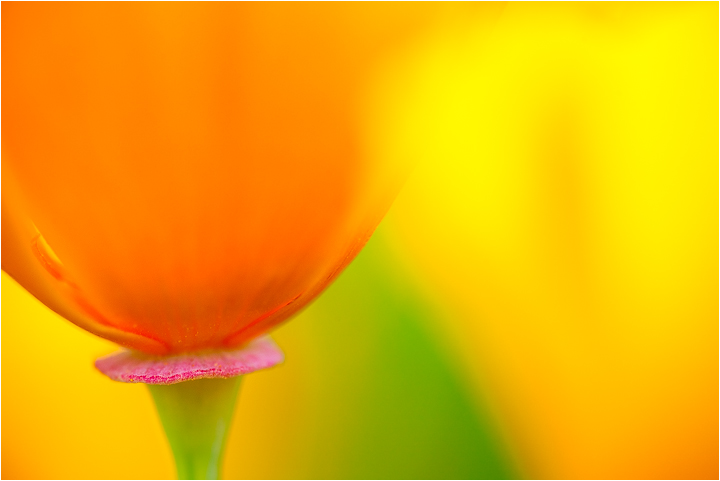
My initial contribution to this week's theme. Not much of a story behind this . . . just one of the shots that I happen to like from some time in the field about six weeks ago. I greatly appreciate your thoughts and comments.

Canon 5D, Tamron 90mm for 1/200 at f/4 (ISO 200). As with many of my other shots, I used a diffuser to soften the direct light in this mid-morning capture.

Comments

19 comments
Comment posted by Phil Pogledich on May 23, 2010 at 3:01 PM
Here's a version with less saturation . . . I didn't add much saturation to the original prior to posting, but I've been going back and forth on whether it (the original) is still a bit too strong.
Registered on August 24, 2009, 123 Posts, 3099 Comments
Comment posted by David W. Kelly on May 23, 2010 at 3:28 PM
Phil I like the splash of color in this image and I like the saturation in the first one the best, at least on my monitor. Nice image.
Registered on October 7, 2005, 883 Posts, 6590 Comments
Comment posted by John&Patty Benway on May 23, 2010 at 3:38 PM
Nice blend of colors Phil, tough choice between 1 & 2, think I like the original, anyway, beautifully done.
John
Registered on May 12, 2006, 626 Posts, 8700 Comments
Comment posted by Bob Duff on May 23, 2010 at 3:45 PM
I like it. I particularly like the disk at the bottom of the poppy being the only part being sharp. Well done.
Registered on April 21, 2010, 160 Posts, 1675 Comments
Comment posted by Bob&Charly Nelson on May 23, 2010 at 4:40 PM
:cool: Another WOW image...Well set up, taken and displayed Phil. SUPER!
Bob :wavey:
Registered on October 27, 2005, 289 Posts, 4202 Comments
Comment posted by Pat Sampson on May 23, 2010 at 6:07 PM
Love the composition and for my tastes the more saturated color. Gorgeous image.

Pat
Registered on May 19, 2007, 953 Posts, 15989 Comments
Comment posted by Ramamohan Pai on May 23, 2010 at 6:13 PM
Phil, The difference between both seems to be subtle. Some rocking colors here. Love the selective focus on the red rim :cool: . Awesome photo.
Registered on November 1, 2003, 550 Posts, 9037 Comments
Comment posted by Bill Fach on May 23, 2010 at 9:01 PM
Phil: I'll take one of each. Great comp and DOF/POF choice. Many kudos. >=))>
Registered on November 1, 2003, 1805 Posts, 26981 Comments
Comment posted by Gary Yeoh on May 24, 2010 at 5:51 AM
Phil:
Very impressive images. Both are equally good. Like the selective focus on the red disk. :toast:
Registered on September 1, 2009, 588 Posts, 8184 Comments
Comment posted by Laura Stafford on May 24, 2010 at 1:27 PM
Wonderful colors, and I love the soft light.

Laura Stafford
Registered on November 3, 2009, 52 Posts, 375 Comments
Comment posted by Nathan Buck on May 24, 2010 at 3:36 PM
I think I like the second version just a bit more Phil, but they are both great. Very nice.

Nathan
Registered on November 1, 2003, 1101 Posts, 13589 Comments
Comment posted by David Sparks on May 24, 2010 at 3:43 PM
Awesome colors and I love the selective focus on the red rim. If forced to choose, I would select the original.
Registered on May 26, 2007, 290 Posts, 4270 Comments
Comment posted by Daniel & Loana on May 24, 2010 at 4:34 PM
Wonderful combination of colours.

Congrats

D&L
Registered on October 7, 2008, 166 Posts, 3044 Comments
Comment posted by Mike Gallo on May 24, 2010 at 5:40 PM
The colors are WOW........I like both versions but the second one would be my choice for some reason........the pof is awesome as well :toast:
Registered on September 14, 2005, 182 Posts, 1471 Comments
Comment posted by Cheryl Molennor on May 24, 2010 at 7:05 PM
Very nice, colors are great as well on both images
Registered on June 30, 2009, 300 Posts, 5051 Comments
Comment posted by Robert Dayton on May 24, 2010 at 7:17 PM
This is certainly theme fitting, Phil. All of the colors work so
well together. Good placement of the main subject off center.
Registered on November 11, 2008, 281 Posts, 3958 Comments
Comment posted by Albert Darmo on May 24, 2010 at 9:45 PM
Hi Phil :wavey: A creative composition. with very interesting lines and vibrant color. I'll take one of each,,,,, :toast:
Albert Darmo Canada
Registered on November 25, 2008, 1386 Posts, 11978 Comments
Comment posted by Dean Sauskojus on May 25, 2010 at 2:13 AM
Pretty exceptional Phil. All those different colors are pleasing to look at. Really nice job.
Registered on September 29, 2009, 137 Posts, 2659 Comments
Comment posted by Philip Southard on May 25, 2010 at 11:52 AM
Phil, nicely composed and some great color. :cool:
Registered on July 15, 2007, 258 Posts, 3892 Comments