Goldfinch Revisited
by Peter Conway
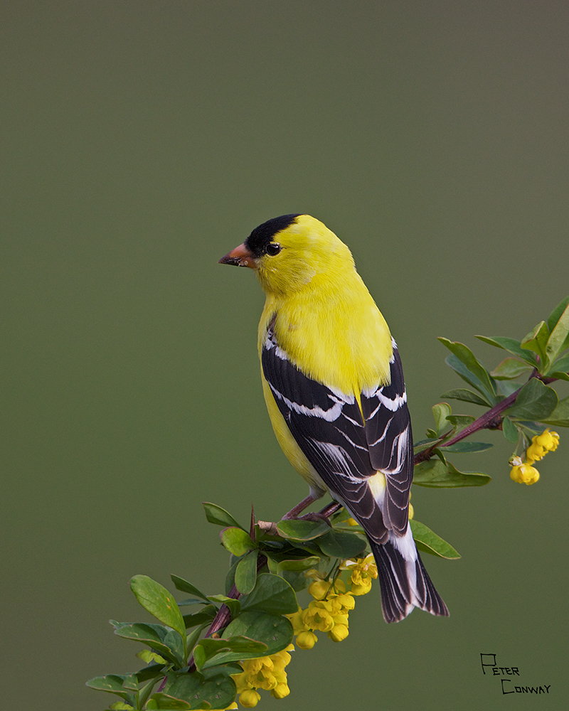
Mark IV, 800mm, ISO 800, f/6.3, 1/640th, natural light
FIrst of all, thanks for all the help and suggestions on the previous post of this. I like this better than any other photo I have taken of an American Goldfinch so I went back to work on it and I think I learned quite a bit.
I tried numerous different compositions and this one reflects what many of you suggested, the bird is higher in the frame. I might like to see it a bit more to the right as well but that would mean cropping the flowers or putting more negative space above and to the left, which I didn't like. I also didn't like a square or horizontal presentation.
I started over with the processing and did the usual sharpening etc. Then I selectively reduced the exposure on the bird just a little bit (.10) I dropped the saturation of the yellows too. I then dropped the saturation of the entire photo except the yellow flowers. I also added vibrancy to the yellow flowers.
I think that's it. I was amazed at how much saturation I had to pull from this photo, are yellows more prone to that?
So, how do you like the comp, the look of the yellows, and the overall impact of teh photo?
Thanks in advance, all comments appreciated.
Peter

Comments
18 commentsThis does accurately represent the vibrant yellow color of the bird. My question relates to saturation level and amount of detail in the yellow, which I think is good.
Yellow is my wifes favorite color and she wants a print for our house. It is much like a sale except I pay for it.
cheers
Rob
beautiful image as posted.
This was definitely worth the rework, I love it.
Your wife has excellent taste!
Yellows and reds do need some extra attention!
This is a photo that I am proud of and it became much better and stronger because of the help that I found here!
Oh, to those of you that mentioned my wife's good taste... you know what's coming... she married me didn't she.
thanks again,
Peter