Nature Photographers Network
This is the preserved archive of the original Nature Photographers Network. The community continues at naturephotographers.network.
Return of Color
‹ PreviousFlora GalleryNext ›

Return of Color

by Nathan Buck

Gallery: FloraPosted May 7, 2010237 views24 comments
Hi all.

Spring, for us in Utah, the return of color. Winter is just shades of gray and brown. Finally now we have some color.

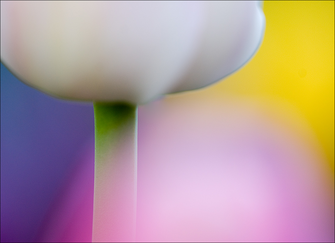
Since shooting a similar shot of a tulip last year, I wanted to get another one with more colors behind the tulip. I found what I feel I have envisioned for the last year.

What do you think? Does it work? These colors are all from tulips of different colors. One in front of the main subject (crammed past) and the others behind.

ANY thoughts appreciated.

Nathan

Nikon D80, Sigma 180 macro, tripod, ISO 200, f3.5

Comments

24 comments
Comment posted by Luke Ormand on May 7, 2010 at 11:41 PM
I love everything about this. Reminds me of a kids artwork - imaginative and full of color and simple lines. (Note, I'm not one for abstract flower images... I much prefer showing a flower in its natural beauty but I'd be happy to have taken this)

- Luke
Registered on February 4, 2009, 1093 Posts, 7035 Comments
Comment posted by Robert Dayton on May 8, 2010 at 12:08 AM
Your pre-visalization paid off, Nathan. This is unique in the most beautiful
sort of way. Very abstract. It's fine art. Make it into a print, greeting card,
poster, etc.
Registered on November 11, 2008, 281 Posts, 3958 Comments
Comment posted by David Cobb on May 8, 2010 at 1:23 AM
A beautiful color combo and comp Nathan, and the tulip cram is great. There may be a line of chromatic abberation around the white flower, but that's easily tweaked in Adobe Raw. A wonderful image.
Registered on December 14, 2007, 312 Posts, 3243 Comments
Comment posted by Balan Vinod on May 8, 2010 at 1:26 AM
Absolute wonder Nathan ...love every bit of it !!

Balan Vinod
Registered on March 20, 2006, 889 Posts, 2312 Comments
Comment posted by John&Patty Benway on May 8, 2010 at 5:30 AM
Love the soft colors throughout, beautiful work Nathan.
John
Registered on May 12, 2006, 626 Posts, 8700 Comments
Comment posted by Bob Duff on May 8, 2010 at 5:51 AM
Works for me. The colours are wonderful. Perfect tone,saturation and luminosity. Very well done.
Registered on April 21, 2010, 160 Posts, 1675 Comments
Comment posted by John Kerr on May 8, 2010 at 8:03 AM
Well done. Great blend of colors, the cram works well here showing an endless appearence of tulips both in front of and beyond the white subject. I like the overall soft touch to this.
Registered on October 28, 2009, 111 Posts, 1070 Comments
Comment posted by scott lanz on May 8, 2010 at 8:59 AM
nice!
Registered on November 14, 2003, 840 Posts, 12902 Comments
Comment posted by Michael Lowe on May 8, 2010 at 10:52 AM
love the color wheel here, Nathan. :toast:
Registered on February 11, 2004, 777 Posts, 5252 Comments
Comment posted by Morris McClung on May 8, 2010 at 3:35 PM
MIchael said it, "love the color wheel!" Great vision, capture, and color.
Registered on May 7, 2007, 670 Posts, 19650 Comments
Comment posted by Mauro Pasquero on May 8, 2010 at 5:19 PM
A beautiful palette of colors for an awesome abstract image, Nathan! I like it very much.
Mauro
Registered on January 21, 2010, 650 Posts, 2500 Comments
Comment posted by Ed Lowe on May 8, 2010 at 7:07 PM
Very creative, Nathan. Your patience certainly paid off beautifully. I love the way you spread the colors about the image. :toast:

Ed
Registered on February 7, 2004, 414 Posts, 7115 Comments
Comment posted by Bill Fach on May 8, 2010 at 8:30 PM
Nathan: My first impression was "Easter colors." Works for me and I'm glad winter has lost its grip. Nicely done.>=))>
Registered on November 1, 2003, 1805 Posts, 26981 Comments
Comment posted by Kathy Odiorne on May 8, 2010 at 9:46 PM
Love the colors. Nice work :cool:
Registered on November 1, 2003, 211 Posts, 1471 Comments
Comment posted by Philip Southard on May 8, 2010 at 10:13 PM
Works for me Nathan. A superb image IMO. I like the mix and placement of the colors. Well conceived and executed. :cool:
Registered on July 15, 2007, 258 Posts, 3892 Comments
Comment posted by Kim Ritsema on May 9, 2010 at 9:17 AM
I LOVE LOVE LOVE this shot. The composition is just awesome and the colors work great together! Great to see your vision come alive. Very cool.
Registered on February 7, 2008, 21 Posts, 26 Comments
Comment posted by Pat Sampson on May 9, 2010 at 10:06 AM
Beautiful color palette and composition Nathan. Made me immediately think of easter eggs. I think that is a good thing. I like the image a lot.

Pat
Registered on May 19, 2007, 953 Posts, 15989 Comments
Comment posted by Mike Gallo on May 9, 2010 at 10:24 AM
an eye catching blend of colors Nathan, creative, well visualized and well composed
Registered on September 14, 2005, 182 Posts, 1471 Comments
Comment posted by Albert Darmo on May 9, 2010 at 1:42 PM
Hi Nathan :wavey: This lovely palette of color really works for me. :eek: The composition and lines are superb :toast:
Albert Darmo Canada
Registered on November 25, 2008, 1386 Posts, 11978 Comments
Comment posted by Ramamohan Pai on May 9, 2010 at 8:03 PM
Nathan, I quite the complimentary colors used here and focus on the lines and forms :cool: . I'd have liked the cram effect to be a little subtler but I know its tough to control.

I like it as it is as well. :toast:
Registered on November 1, 2003, 550 Posts, 9037 Comments
Comment posted by Larry Lynch on May 10, 2010 at 10:20 AM
Good to see you back. The colors are outstanding. Beautifully composed and presented.
Registered on September 16, 2006, 773 Posts, 9940 Comments
Comment posted by Phil Pogledich on May 10, 2010 at 1:21 PM
I'm a little late catching up with this one but thought I'd leave a comment nonetheless. It's a very striking, beautiful image and everything works very well together. You pulled this off masterfully.
Registered on August 24, 2009, 123 Posts, 3099 Comments
Comment posted by beth summer on May 10, 2010 at 6:07 PM
Easter ....lovely, Nathan. I like the simplicity and the lines, not sure about so many colors. But very nice.
Registered on November 1, 2003, 437 Posts, 5220 Comments
Comment posted by Debashis Bandyopad on May 11, 2010 at 11:39 AM
W :eek: W W :eek: W W :eek: W. Nathan, even by your excellent standards this is mind blowing.... A sheer work of art and beauty :toast:
Registered on June 24, 2007, 130 Posts, 1309 Comments