Nature Photographers Network
This is the preserved archive of the original Nature Photographers Network. The community continues at naturephotographers.network.
Erosion Landscape
‹ PreviousLandscape GalleryNext ›

Erosion Landscape

by Catherine Reilly

Gallery: LandscapePosted April 9, 2010259 views14 comments
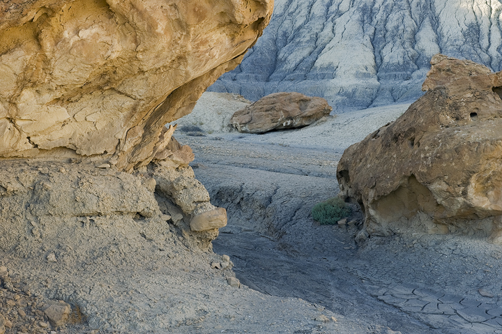
This was taken last September in the area around Page, AZ. I know some of you know this area well, so I'd appreciate being reminded where I was. :rolleyes: I was so tired, I forgot to note it. Anyway, I enjoyed the shapes and lighting and all of the indicators of erosion from the hillside cracks, the wash, and the carved out rock formation on the left.

D700, 24-70, tripod, circ.pol.; f 22, 1/5, ISO 320.

Sure would like to know your thoughts on this. Thanks.

Comments

14 comments
Comment posted by Neale Dyster on April 9, 2010 at 7:17 AM
I like it Catherine but on my monitor at least , it could use a bit more contrast ?
Registered on February 19, 2008, 94 Posts, 738 Comments
Comment posted by Jay Nielsen on April 9, 2010 at 9:00 AM
The combination of warm and cool tones is very nice. I would agree that a slight boost in contrast/saturation would bring that out even more. I really like your composition and placement of the elements.
Registered on October 6, 2008, 137 Posts, 720 Comments
Comment posted by Nick Moore on April 9, 2010 at 9:02 AM
I really like your composition, using the fg formation to frame the scene. The light is also very nice throughout the scene, you could perhaps add a little more contrast, but I think it looks good as it is (Edit, just noticed your large version is different than the posted one, posted one looks spot on to me!).
Registered on May 23, 2006, 93 Posts, 2228 Comments
Comment posted by John&Patty Benway on April 9, 2010 at 9:46 AM
I like this very much Catherine, the warm and cool colors really makes this stand out. Beautifully done.
John
Registered on May 12, 2006, 626 Posts, 8700 Comments
Comment posted by Bill Chambers on April 9, 2010 at 10:54 AM
I love the cool blue BG, especially when contrasted against the left FG. Excellent composition Catherine - I like the way the rock on the right is shaped so that it's a nice "fit" into the eroded rock on the left. Nicely done.
Registered on April 10, 2005, 753 Posts, 21216 Comments
Comment posted by R.Bill Moser on April 9, 2010 at 1:04 PM
I like the combination of the warm and the cool tones. I also love your composition using the fg rock to frame your scene. Bi like the lighting and the shapes. Well done
Registered on January 29, 2010, 285 Posts, 4281 Comments
Comment posted by Dean Sauskojus on April 9, 2010 at 4:22 PM
Awesome colors Catherine. I like how you used the sides to frame the background. Nice work.
Registered on September 29, 2009, 137 Posts, 2659 Comments
Comment posted by Eva McDermott on April 9, 2010 at 4:43 PM
I like the cool and warm tone Catherine as well as how you used the rock on the left to frame the scene. Nice find.
Registered on January 4, 2009, 1015 Posts, 13229 Comments
Comment posted by Anthony Vincent on April 9, 2010 at 7:19 PM
Looks like an awesome place to explore. Lovely mix of moods Catherine.
Registered on February 5, 2009, 199 Posts, 2775 Comments
Comment posted by John Williams on April 9, 2010 at 7:39 PM
Interesting. The larger photo is different in saturation but looks like the same size.

I like the blue/gold contrast and the way the comp hints at what's around the corner.
Registered on September 6, 2007, 221 Posts, 5985 Comments
Comment posted by Joel Hazelton on April 9, 2010 at 8:34 PM
I love the warm/cool contrasts. The less saturated version is a bit more pleasing, imo.
Registered on August 6, 2008, 194 Posts, 1315 Comments
Comment posted by Greg Cope on April 9, 2010 at 10:15 PM
I love the combination of warm and cool colors, that - together with all the shapes and patterns - makes me feel I can reach into this.
Registered on January 22, 2007, 212 Posts, 2737 Comments
Comment posted by Rudy Ruberti on April 10, 2010 at 3:31 AM
Great canyon scene, Catherine. Nice colors and well composed.
Registered on October 28, 2008, 179 Posts, 1875 Comments
Comment posted by David Edwards on April 12, 2010 at 6:02 AM
A very nice comp, Catherine. I like the way the darker blue curves around the warmer tones of the rocks. All the elements are very well placed.
Registered on December 6, 2008, 142 Posts, 2623 Comments