Nature Photographers Network
This is the preserved archive of the original Nature Photographers Network. The community continues at naturephotographers.network.
Springflowers (+repost)
‹ PreviousFlora GalleryNext ›

Springflowers (+repost)

by Ant

Gallery: FloraPosted April 5, 201072 views7 comments
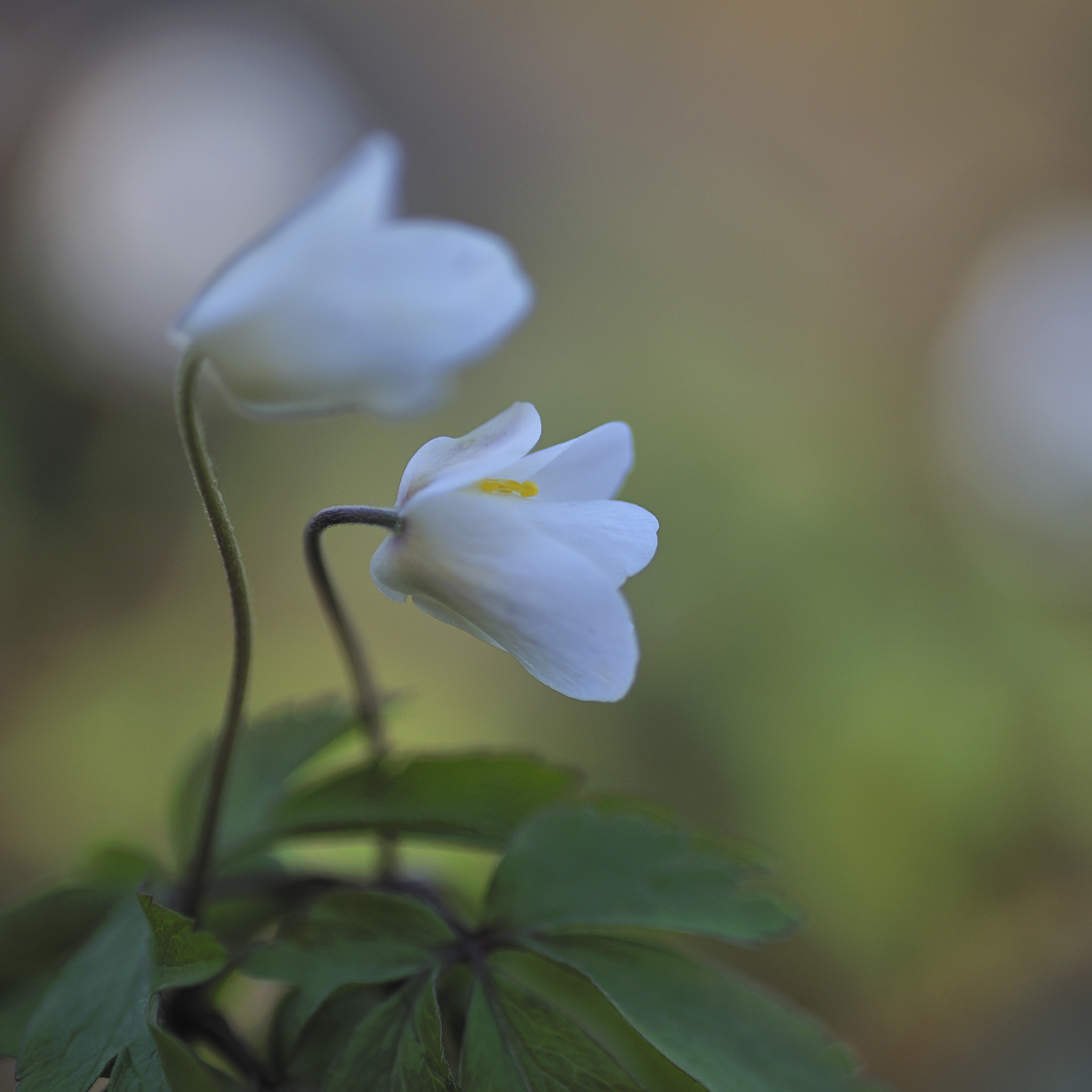
From this morning walk in the "Bosco del Vaj" (Vaj Wood), a natural protected area on the hills not far from Torino, northwestern Italy. After heavy rain yesterday, today it was glowing with the splendor of spring... Here is an Anemone nemorosa, in a mixed wood of chessnut, beech and oak. Nikon digital FX, old micro Nikkor 105/2.8 AF, tripod, ISO 100, f/3.5,1/400.

Comments

7 comments
Comment posted by MARINUS on April 5, 2010 at 2:56 PM
Hi Antonello,

Verry nice image, maybe the white could be brighter. Further i think that the image would be powerfull when the square format would be changed in a rectangular , so the white unsharp flower on the right would vanish.
Anyway a good image. :toast:
Registered on January 26, 2009, 104 Posts, 260 Comments
Comment posted by Bill Fach on April 5, 2010 at 3:30 PM
Antonello: Marvelous comp and DOF management with a really nice BG. I might be tempted to paint in some color over the OOF blue BG elements but this works for me as is. Well done.>=))>
Registered on November 1, 2003, 1805 Posts, 26981 Comments
Comment posted by Bernie Kasper on April 5, 2010 at 4:14 PM
Lovely image !!

:toast:
Registered on June 5, 2005, 251 Posts, 3734 Comments
Comment posted by Gary Yeoh on April 5, 2010 at 7:24 PM
Antonello
I like how you have focussed on the anthers in the centre bloom. I would try a vertical frame cropping out the right OOF white to see how it looks. Nice capture.
Registered on September 1, 2009, 588 Posts, 8184 Comments
Comment posted by Philip Southard on April 5, 2010 at 10:58 PM
Hi Antonello. I can see where the others are coming from with their suggestions, but I for the most part like the image as is. The only thing I might prefer would be a bit more brightness. :cool:
Registered on July 15, 2007, 258 Posts, 3892 Comments
Comment posted by Ant on April 6, 2010 at 5:46 AM
Thank you all for your comments! Following some of your suggestions, I tried a slightly brighter, cropped version (6x7 now) to avoid the clear spot on the right. I am not sure which one I like better - they are, in some sense, two different images that (try to) convey a different impression...
Thanks again for the feedbacks!
Registered on April 13, 2009, 27 Posts, 474 Comments
Comment posted by MARINUS on April 8, 2010 at 4:31 PM
Hi Antonello,

The second one is indeed lighter, but i miss the brilliance, but maybe is that what you want.
The rectangle image is i think think better without the white spot, but now the white spot in the left corner above is verry dominant, so for me the image is verry well, but i think that only the flowers on the green background would be great. the white spots leads to much attention from the subject. :toast:
Registered on January 26, 2009, 104 Posts, 260 Comments