Nature Photographers Network
This is the preserved archive of the original Nature Photographers Network. The community continues at naturephotographers.network.
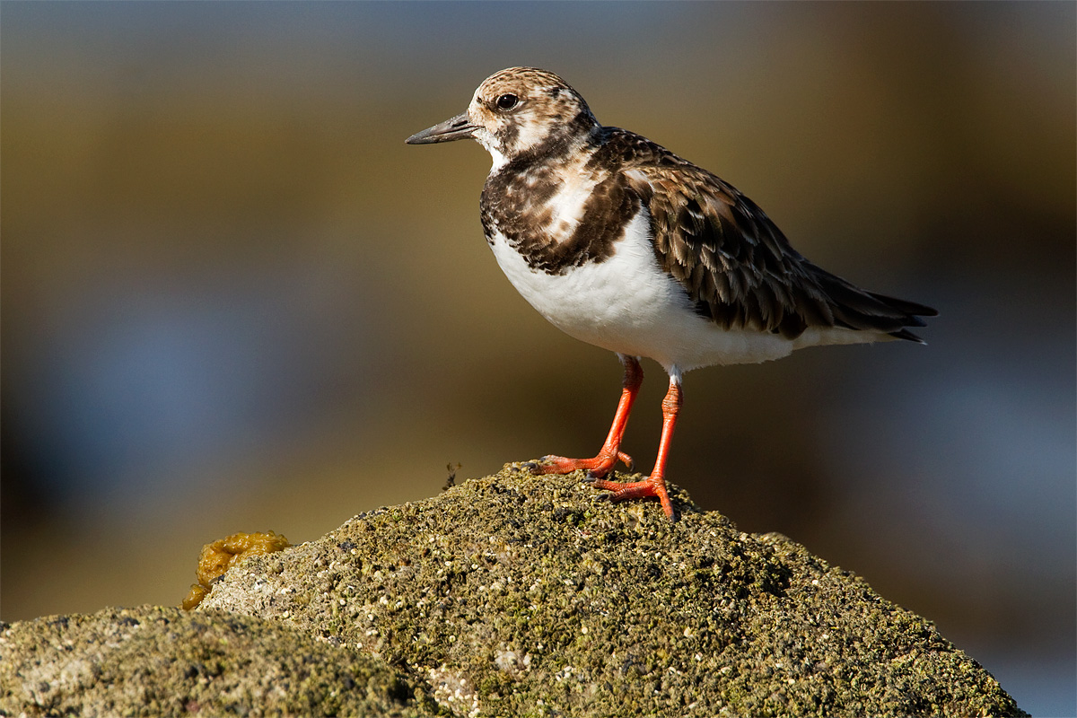
Turnstone w/REPOST
‹ PreviousAvian GalleryNext ›

Turnstone w/REPOST

by Brian Gatlin

Gallery: AvianPosted February 27, 2010150 views16 comments
Canon 7D, 500mm f/4 + 1.4x TC. Handheld.

1/1250, f/7.1, ISO 400. -1/3 EC.

Crop to 66% (11.9 of 18MP).

Taken at Puerto Penasco, Sonora, Mexico.

This is the first of many shots to follow from my 4 days on the Gulf of California. These turnstones tend to stay low in the rocks, which makes it hard to get a nice bg. This one perched up nicely on a good sized boulder, and I was able to make the most of it.

Comments and critiques appreciated.

Comments

16 comments
Comment posted by Gary Gulash on February 27, 2010 at 10:52 AM
I'll use the adjective...."sensational", because it seems most appropriate. Wonderful lighting and a super pose, looks so proud and confident up there. Love the texture and color in the rock. I wish my Nikon I had a few more pixels to play with sometimes, this crop still appears to have all kinds of detail.
Registered on January 28, 2005, 879 Posts, 12098 Comments
Comment posted by Monica Siri on February 27, 2010 at 1:55 PM
Brian
one to be proud of!! :toast:
Registered on September 20, 2009, 132 Posts, 3764 Comments
Comment posted by Jim DeWitt on February 27, 2010 at 1:59 PM
Excellent work on this RUTU, Brian. The background compliments the bird nicely. If it were mine, I'd be tempted to give the bird a little more headroom, even if I had to sacrifice part of the coarse cobble.
Registered on August 28, 2006, 1240 Posts, 8506 Comments
Comment posted by Richard Ditch on February 27, 2010 at 2:53 PM
Very nice: great light; nice image quality overall. I agree with Jim about a touch more headroom.

So close to AZ - why won't one show up around Phoenix so I can add this to my AZ list?
Registered on November 1, 2003, 1031 Posts, 12705 Comments
Comment posted by Sharon Hallowell on February 27, 2010 at 3:00 PM
Such nice lighting on a beautiful subject. Well done! :toast: Sharon
Registered on November 1, 2003, 392 Posts, 4810 Comments
Comment posted by Roy Bailey on February 27, 2010 at 3:04 PM
Wonderful colour, texture and detail. I think Jim may be right and a little more on top could make this even better.
Registered on November 16, 2008, 24 Posts, 486 Comments
Comment posted by Mia McPherson on February 27, 2010 at 3:44 PM
Brian,

The setting is gorgeous, so is the lighting. Great pose, details & sharpness. The only suggestion I have is a touch more room above the bird's head to balance the composition a little more.

A fine image as presented and a great look at this bird's eye too.
Registered on June 25, 2007, 491 Posts, 12566 Comments
Comment posted by Cheryl Molennor on February 27, 2010 at 8:19 PM
Beautiful light and detail Brian. the large one is great. :toast:
Registered on June 30, 2009, 300 Posts, 5051 Comments
Comment posted by KC Choo on February 27, 2010 at 8:22 PM
A keeper, for sure!
Registered on November 15, 2004, 519 Posts, 8278 Comments
Comment posted by Dennis Plank on February 27, 2010 at 11:30 PM
Beautiful light, Brian. Really good detail and I like the perch and bg a lot. :toast:
Registered on January 28, 2008, 1767 Posts, 23192 Comments
Comment posted by Nate Chappell on February 28, 2010 at 1:12 AM
Hi Brian,
I think this is really wonderful for the soft side lighting, nice perch and bg. I'd prefer a little more room on top and a little bit less on bottom if you have it. :toast:
Registered on February 1, 2006, 1158 Posts, 19528 Comments
Comment posted by Mauro Pasquero on February 28, 2010 at 5:06 AM
Great shot. A little more room on top would help.
Mauro
Registered on January 21, 2010, 650 Posts, 2500 Comments
Comment posted by Rob Drummond on February 28, 2010 at 6:54 AM
Great lighting and detail Brian

cheers
Rob
Registered on November 8, 2003, 617 Posts, 8267 Comments
Comment posted by Brian Gatlin on February 28, 2010 at 8:22 AM
Here is a re-composed version.

The original comp was chosen to emphasize how high the bird was perched, and also to try to move it out of the center of the frame. I do see how it's just a little tight on top.

For this repost, I took the same crop frame, moved it up some, and then took a hair off the lower right to try to move the bird a little more off center.

Let me know which you prefer!
Registered on March 21, 2009, 202 Posts, 4187 Comments
Comment posted by David Sparks on February 28, 2010 at 9:44 AM
Brian:
I prefer the repost because of the additional head room and the bird/bolder competition for attention is tilted a little more toward the bird. I really like the BG and lighting.
Registered on May 26, 2007, 290 Posts, 4270 Comments
Comment posted by Matt Shellenberg on February 28, 2010 at 1:37 PM
An excellent look at this Ruddy, Brian. I really like the perch and pose. Very appealling background and very nice detail. I do like the repost a bit better with more headroom. Great image.
Registered on February 6, 2008, 168 Posts, 3118 Comments