Gallery: FloraPosted February 3, 201036 views6 comments
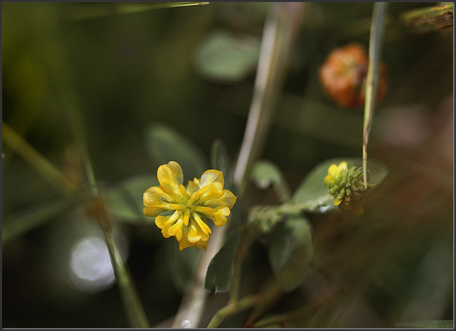
Hop clover
D200
180mm macro w/extension
ISO 200
f4
1/200
Charles
Dushore, Pa.
Comments
6 comments
Comment posted by Bob&Charly Nelson on February 3, 2010 at 8:51 PM
Great POF Charles, but the bright spot in the lower left is distracting, and it seems kinda busy to my untrained eye. Just my humble opinion.
Bob
Registered on October 27, 2005, 289 Posts, 4202 Comments
Comment posted by Philip Southard on February 3, 2010 at 9:30 PM
Hey Charles. Nice color and detail in the clover flower. As that is the main subject, I'd suggest zeroing in on that or trying to blur the BG more. I agree with Robert in that the BG (as is) is quite busy and distracting. Just my two cents worth.
Registered on July 15, 2007, 258 Posts, 3892 Comments
Comment posted by Charles Younger on February 3, 2010 at 10:19 PM
I can understand why someone would find the bright spot in the lower left distracting. Or the reddish shmear on the right. Or the "stalactite" in the upper right, or the bright streak at the top, or the little "button" of brightness on the left edge. I appreciate your comments. But just to be clear. I like this one just the way it is. I think everything balances out. And, for me at least, the image strikes a cord. My eye moves comfortably around in it. I'm only sorry that yours doesn't.
Thoughtful criticism and suggestions on how to make my images better are welcome. I do want to know how someone would have done this or that differently.
Charles
Registered on January 15, 2010, 151 Posts, 269 Comments
Comment posted by Bill Fach on February 4, 2010 at 12:54 PM
Charles: I can see the nits that have been mentioned but I like the complexity of this pretty much as is. In fact this may be my favorite of your recent offerings. This image makes me think and IMO that's a good thing. Nicely crafted. >=))>
Registered on November 1, 2003, 1805 Posts, 26981 Comments
Comment posted by Charles Younger on February 4, 2010 at 5:52 PM
Thanks, Bill. It's always heartwarming to get some sense of appreciation for all the effort that often goes into these. I have a much prettier shot of hop clover in my pocket that I'll post later. It shouldn't get much criticism. We'll see.
Charles
Registered on January 15, 2010, 151 Posts, 269 Comments
Comment posted by Pat Sampson on February 4, 2010 at 10:05 PM
Charles,
I like the balance of the image elements in this both with regard to shape and color. A very fine image for my tastes. I feel like I'm looking at a mobile and I'm sitting here trying to figure out where the center of mass is and what to poke first.. I like this one a lot. My favorite of yours to date.
Pat
Registered on May 19, 2007, 953 Posts, 15989 Comments

Comments
6 commentsBob
Thoughtful criticism and suggestions on how to make my images better are welcome. I do want to know how someone would have done this or that differently.
Charles
Charles
I like the balance of the image elements in this both with regard to shape and color. A very fine image for my tastes. I feel like I'm looking at a mobile and I'm sitting here trying to figure out where the center of mass is and what to poke first.. I like this one a lot. My favorite of yours to date.
Pat