Nature Photographers Network
This is the preserved archive of the original Nature Photographers Network. The community continues at naturephotographers.network.
Visual Overload?
‹ PreviousLandscape GalleryNext ›

Visual Overload?

by Paul Marcellini

Gallery: LandscapePosted January 10, 2010549 views35 comments
Thanks for the comments on the last, always appreciate what you guys have to offer.

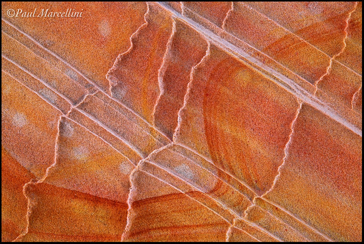
This little spot in Coyote Buttes South had a lot going on. Too much perhaps? I really enjoy trying to organize chaos, as that is what much of the Cypress swamps can be. This was totally different but still a fun challenge.

5d2, Tamron 28-75@75

Comments

35 comments
Comment posted by Mike Bohlander on January 10, 2010 at 9:19 PM
This is really nice Paul. I don't think it's too much at all. I really like how the 3 different patterns play off each other.
Registered on August 22, 2008, 14 Posts, 125 Comments
Comment posted by Steve Sieren on January 10, 2010 at 9:21 PM
Paul, the S brush stroke right through the frame is nice and so are those crusty erosion lines
Registered on January 2, 2008, 360 Posts, 5321 Comments
Comment posted by Stan Rose on January 10, 2010 at 9:23 PM
Not at all (too much), looks great Paul!
Registered on September 15, 2005, 836 Posts, 17099 Comments
Comment posted by Tony Kuyper on January 10, 2010 at 9:29 PM
Neat. Wonderful colors and I do enjoy exploring all the shapes and textures.
Registered on November 1, 2003, 364 Posts, 22328 Comments
Comment posted by Lon Overacker on January 10, 2010 at 9:31 PM
Paul,

Too much of what? This is fantastic! Great patterns, lines and design in the sandstone. The colors are quite natural and the saturation subdued. Just not sure what we could be overloaded with... :smile: This is wonderful and is beautifully crafted.

Lon
Registered on November 24, 2006, 521 Posts, 19147 Comments
Comment posted by Ben Horne on January 10, 2010 at 9:35 PM
You've done a splendid job with this shot! The waving red streak guides my eye through the photo with the help of the diagonal lines. I know what you mean about organizing the chaos. You've done a great job.
Registered on August 27, 2009, 51 Posts, 959 Comments
Comment posted by Guy Tal on January 10, 2010 at 9:44 PM
I like the way each type of line moves in a different direction and with its own rhythm. Sandstone can be so fascinating.

Guy
Registered on November 1, 2003, 566 Posts, 15507 Comments
Comment posted by Floris van Breugel on January 10, 2010 at 9:48 PM
Looks great Paul, definitely not too much going. In fact, I think there's just enough going on :smile: Excellent composition too!
Registered on December 19, 2008, 306 Posts, 4840 Comments
Comment posted by Chris Chamberlain on January 10, 2010 at 9:52 PM
It's hard to come up with something new to say about these sometimes. But this one is a beauty! Great colors, and patterns, as well as texture. I think the faint white splothces add a lot here. It even looks like there's a couple of yellow ones in there too.

Chris
Registered on March 13, 2007, 500 Posts, 8365 Comments
Comment posted by Cory O'Neill on January 10, 2010 at 9:57 PM
Beautiful pattern work, Paul. Love the detail, and the balance of colors across the image.
Registered on October 4, 2008, 28 Posts, 273 Comments
Comment posted by Chris White on January 10, 2010 at 10:02 PM
Paul,

Lines, texture, tones, hues. This shot is lovely.

Chris
Registered on February 27, 2007, 61 Posts, 945 Comments
Comment posted by Daniel Ewert on January 10, 2010 at 10:21 PM
This is one of my favorite abstracts from your recent trip. The lines, detail and color are really great in this one.
Registered on June 2, 2009, 103 Posts, 1500 Comments
Comment posted by Albert Darmo on January 10, 2010 at 10:25 PM
Hi Paul :wavey: This is so well seen and captured, The texture, color, and paterns are all marvelous.To me, it evokes a serene mood. :smile:
Albert Darmo Canada
Registered on November 25, 2008, 1386 Posts, 11978 Comments
Comment posted by Harley Goldman on January 10, 2010 at 10:33 PM
Looks great to me. Excellent abstract.
Registered on November 19, 2003, 586 Posts, 11271 Comments
Comment posted by Daniel Rappaport on January 10, 2010 at 10:44 PM
The colors and lines and shapes work very well with/against each other. The orange sweeping curve is captivating.
Registered on September 9, 2009, 294 Posts, 2006 Comments
Comment posted by Mark Hudon on January 10, 2010 at 11:26 PM
Dang, I love this kind of shot. I'll bet you I know right where this is also. It's nice up there, isn't it? No one around.
Registered on November 1, 2003, 315 Posts, 2246 Comments
Comment posted by Brian Schrayer on January 10, 2010 at 11:34 PM
I like the way you have captured the patterns, textures, and color variations in the rocks. Personally, I don't think there is too much going on in the composition. NIce abstract!!
Registered on May 28, 2004, 114 Posts, 2890 Comments
Comment posted by Eva McDermott on January 11, 2010 at 12:03 AM
Fabulouse lines, shapes, and color Paul. The dark orange streak is splendid. I never tire of the intimate sandstone scenes. Beautiful work.
Registered on January 4, 2009, 1015 Posts, 13229 Comments
Comment posted by Dean Sauskojus on January 11, 2010 at 3:05 AM
Very nice Paul. The lines are amazing. They really help as the image pops off the page. Beautiful image.
Registered on September 29, 2009, 137 Posts, 2659 Comments
Comment posted by Rafael Rojas on January 11, 2010 at 4:21 AM
absolutely fantastic. Colour, lines, textures...really gorgeous
Registered on March 1, 2009, 56 Posts, 623 Comments
Comment posted by Anil Rao on January 11, 2010 at 4:53 AM
Very nice, Paul. The different types of lines are quite remarkable.
Registered on November 15, 2003, 234 Posts, 4923 Comments
Comment posted by Jim Bullard on January 11, 2010 at 10:30 AM
Too much? No. A very nice abstract. I like the counterpoints in the colors and textures. Well done.
Registered on February 4, 2009, 30 Posts, 128 Comments
Comment posted by Phil Pogledich on January 11, 2010 at 12:31 PM
I don't think there's too much going on at all. Very beautiful and well-composed abstract. I kind of like it tilted to vertical (90 degrees CW or CCW, either way) as well.
Registered on August 24, 2009, 123 Posts, 3099 Comments
Comment posted by Justin Reznick on January 11, 2010 at 1:12 PM
I like the shapes throughout the image, from the straight lines, to the curvy lines, to the white spots, there's a lot to look at, yet it remains simple at its core. Great work Paul! I'm glad you're enjoying the weather:)
Registered on November 24, 2009, 79 Posts, 515 Comments
Comment posted by Jimmy Gekas on January 11, 2010 at 1:14 PM
I like this a lot, Paul. The textures really come out well on this, as I can see how the delicate nature of this scene. The diagonals and curved lines are well composed to work well with each other.
Registered on July 26, 2007, 244 Posts, 2807 Comments
Comment posted by Daniel & Loana on January 11, 2010 at 4:12 PM
Very nice. The different patterns interact really effectively.

D&L
Registered on October 7, 2008, 166 Posts, 3044 Comments
Comment posted by Kenn Leonhardt on January 11, 2010 at 4:37 PM
Definitely not too much. There's is certainly plenty to look at with the numerous different patterns, but you arranged it very well.
Registered on March 29, 2008, 27 Posts, 1710 Comments
Comment posted by Jay Patel on January 11, 2010 at 4:45 PM
Too much details. I don't remember the sand stone being quite so textured. The numerous curves and lines in certain places seem to be overwhelmed by strong textures. Not that it really matters in an abstract shot....It is just my 2c.

The line and curves are very nice.

-Jay
Registered on August 28, 2008, 87 Posts, 566 Comments
Comment posted by Morris McClung on January 11, 2010 at 8:14 PM
Excellent abstract. Put together very well.
Registered on May 7, 2007, 670 Posts, 19650 Comments
Comment posted by Anthony Vincent on January 12, 2010 at 7:34 AM
Awesome abstract of this sandstone. You got some killer shots from here. The diagonal striations lines are solid and composing this was perfect on your end. Very nice
Registered on February 5, 2009, 199 Posts, 2775 Comments
Comment posted by Paul Marcellini on January 12, 2010 at 10:09 AM
Thanks so much everyone for the comments, glad it works for you guys.

Phil, great idea, I do like it as a vertical.

Jay, yeah, I also remembered it less textured, but it could be perspective and scale. If you zoom to 100% it looks like grains of sand and not a solid. Web sharpening made it a little stronger too I think.
Registered on November 27, 2007, 250 Posts, 2468 Comments
Comment posted by Mark Metternich on January 12, 2010 at 11:18 AM
Love it!
Registered on June 19, 2009, 276 Posts, 6240 Comments
Comment posted by Ian Haskell on January 12, 2010 at 1:54 PM
Really lovely detail and patterns in this. The texture really stands out.

Ian
Registered on October 30, 2008, 24 Posts, 673 Comments
Comment posted by Ian Plant on January 12, 2010 at 4:21 PM
nicely seen and flawlessly executed . . . as always! :toast:
Registered on July 7, 2008, 271 Posts, 1657 Comments
Comment posted by Dan Baumbach on January 12, 2010 at 4:54 PM
Beautiful abstract.

- Dan.
Registered on November 1, 2003, 473 Posts, 7980 Comments