Nature Photographers Network
This is the preserved archive of the original Nature Photographers Network. The community continues at naturephotographers.network.
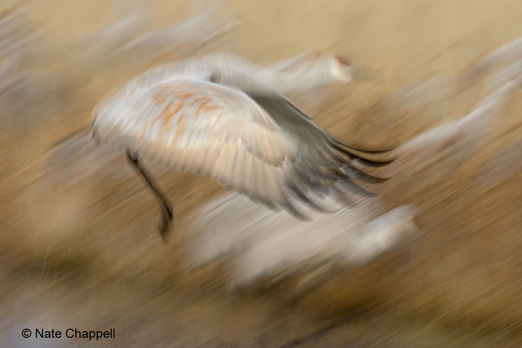
Sandhill Pan Blur
‹ PreviousAvian GalleryNext ›

Sandhill Pan Blur

by Nate Chappell

Gallery: AvianPosted December 10, 2009318 views21 comments
Here's something quite different than anything I've posted before. When we were at Bosque recently we spent a lot of time at the crane pools. The 3rd morning we were there it was overcast, not a lot of light to work with and I already had plenty of sharp flight shots, so I started experimenting with blur shots. This was taken while panning at a slow shutter speed. Full frame, normal acr and ps workflow except with no sharpening added. Let me know what you think: good, bad or indifferent.

MkIII 500F4 1/50 F11 iso 250, evaluative metering +0.3

Comments

21 comments
Comment posted by Jade Schiess on December 10, 2009 at 5:23 PM
Different but i like it! It's nice to see what blur can do to an image. I espically like the way you panned with the shot to give it the extra motion. Great job!
Registered on September 23, 2009, 7 Posts, 59 Comments
Comment posted by Richard Ditch on December 10, 2009 at 5:30 PM
Perhaps not to everyone's taste, but I like this artistic feel of this.
Registered on November 1, 2003, 1031 Posts, 12705 Comments
Comment posted by Alexander Vasiljev on December 10, 2009 at 6:11 PM
Great image. I would always give it a preference to a sharp one. It is nicely balanced, emotional, full of motion and with a very pleasing pallet of colors. My not sounds like it, but it is far more difficult to get this kind of photo than a sharp image. It is always unpredictable and creative. Incredible job!
Registered on February 20, 2009, 35 Posts, 64 Comments
Comment posted by Nick Saunders on December 10, 2009 at 6:54 PM
Some very unique images have been posted lately and this one is another one.
I'm amazed how many look like paintings, or maybe its just me.
There is a real sense of movement here :smile:
Registered on February 6, 2008, 321 Posts, 3035 Comments
Comment posted by Rob Drummond on December 10, 2009 at 7:14 PM
Many 'artistic' photos just look like an oof photo but this is certainly not one of them. Really like this Nate - the sense of movement and the almost pencil like strokes in the background.

cheers
Rob
Registered on November 8, 2003, 617 Posts, 8267 Comments
Comment posted by KC Choo on December 10, 2009 at 8:17 PM
Wel, I don't think it's bad or indifferent, so it has to be good! I really like the angle of the BG lines.
Registered on November 15, 2004, 519 Posts, 8278 Comments
Comment posted by Mia McPherson on December 10, 2009 at 8:17 PM
Nate,

I like the feeling of action in this shot and the wonderful colors.
Registered on June 25, 2007, 491 Posts, 12566 Comments
Comment posted by Neil Rossmiller on December 10, 2009 at 8:25 PM
I find it wonderful, Nate!
I find these kind of shots hold my attention longer and make me return more often than most styles. The pencil strokes from the panning throughout the image except for the main subject are very unique and mesmerizing.
Great work on a very cool shot!
Neil
Registered on October 30, 2009, 156 Posts, 749 Comments
Comment posted by Gary Gulash on December 10, 2009 at 9:05 PM
I like it Nate, it really conveys the excitement and energy of these large birds taking flight. I think I would like to see the head a bit sharper to provide a focal point, other than the wing. Great to see you doing some unconventional experimentation.
Registered on January 28, 2005, 879 Posts, 12098 Comments
Comment posted by Steve Balke on December 10, 2009 at 9:34 PM
Interesting experiment, Nate. Attractive in its own way but I too wonder what it would be like with a different part of the bird in focus. I suspect that you may be able to experiment more easily by using software to selectively blur a sharp image. :toast:
Registered on June 18, 2009, 229 Posts, 2915 Comments
Comment posted by Kathy Odiorne on December 10, 2009 at 10:03 PM
I don't comment often enough in the Avian gallery, but this caught my eye.. Very creative and artistic. :toast:
Registered on November 1, 2003, 211 Posts, 1471 Comments
Comment posted by Kirk Greene on December 10, 2009 at 10:30 PM
:toast: This is very pleasing to my eye and I applaud your creativity. I especially like that this was done in camera rather than created in PS. Your choice of shutter speed was right on and the panning worked as well. I just went back and looked at your recent post of the sandhill crane in flight. That is a solid image in it's own right but I much prefer this. A good lesson on experimenting. Thanks for sharing! :toast:
Registered on May 12, 2004, 191 Posts, 1578 Comments
Comment posted by Dennis Plank on December 10, 2009 at 10:48 PM
Interesting effect, Nate. Very artsy. It makes a pleasant composition. :toast:
Registered on January 28, 2008, 1767 Posts, 23192 Comments
Comment posted by Ken Archer on December 11, 2009 at 5:27 AM
I like it too Nate!!! The complimentary colors are especially nice :toast:

Ken Archer
Registered on October 28, 2004, 222 Posts, 6683 Comments
Comment posted by Wayne Willison on December 11, 2009 at 8:46 AM
I like it, Nate. The complimentary lines of travel in the bg lend continuity. For me, this kind of work is very interesting, although posting one on a forum brings up the need to (as you have done) to explain that it wasn't a mistake in shooting. I'd definitely hang this.
Registered on April 10, 2009, 292 Posts, 3967 Comments
Comment posted by Mitch Moraski on December 11, 2009 at 2:03 PM
I've applied the same technique here in VT with snowgeese Nate. I like this very, very much. It's a different approach. Great shot, very artistic.
Registered on August 3, 2008, 105 Posts, 590 Comments
Comment posted by Brian Gatlin on December 11, 2009 at 2:27 PM
very interesting shot Nate--I like it. The diagonal panning lines create an intriguing effect. I do think it would be interesting to see a shot like this where the head rather than the wing was sharpest.
Registered on March 21, 2009, 202 Posts, 4187 Comments
Comment posted by Andy Astbury on December 12, 2009 at 6:54 AM
I have to admit that sometimes these sort of shots are a bit 'over my head' - but not this one.

The colours, softness and diagonal features are very easy on the eye and the image has a great 'pastel' feel to it :toast:

This is art...
Registered on January 11, 2007, 28 Posts, 257 Comments
Comment posted by Pat Sampson on December 12, 2009 at 11:59 AM
Nate,

I really like this. Glad you posted it.

Pat
Registered on May 19, 2007, 953 Posts, 15989 Comments
Comment posted by Sally King on December 12, 2009 at 2:23 PM
That is so very cool. Just enough detail to know what it is but very artsy. Love it.
Registered on December 2, 2008, 416 Posts, 4450 Comments
Comment posted by Bill Leggett on December 12, 2009 at 4:24 PM
Nate, I'm kicking myself because this is something I was intending to try on my recent trip to the Bosque but never did. Most of mine were just accidental or botched attempts. This has a nice impressionistic flow. Well executed!
Registered on July 21, 2004, 706 Posts, 3233 Comments