Nature Photographers Network
This is the preserved archive of the original Nature Photographers Network. The community continues at naturephotographers.network.
Bee Hive
‹ PreviousLandscape GalleryNext ›

Bee Hive

by Erik Stensland

Gallery: LandscapePosted November 11, 2009236 views16 comments
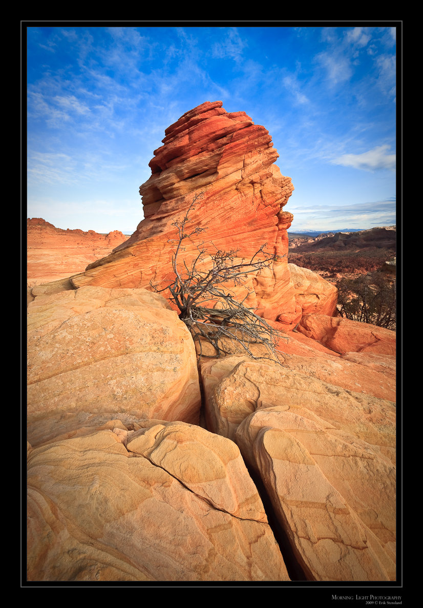
At the end of October I spent a few days enjoying some solitude in the desert. I came across this interesting formation just after sunrise. It reminded me of a bee hive. One of the things that really attracted me to this scene were the great lines through the stone in the foreground. I'd enjoy hearing what you like or dislike about this image. Any chance to improve is always appreciated!

Canon 5D, 17-40 F4,

Comments

16 comments
Comment posted by Will Campbell on November 11, 2009 at 6:33 PM
Fantastic composition. Great image, I like it just as it is.
Registered on July 4, 2007, 38 Posts, 281 Comments
Comment posted by Sean Bagshaw on November 11, 2009 at 6:35 PM
Really nice Erik! Love it. No nits. Excellent on all fronts...light, color, composition, technicals. OK...one super small nit I just noticed. There is a light object on the right border about mid high. Not sure what it is or if it is an issue when viewed larger, but at this size my eye keeps getting pulled.
Registered on February 14, 2007, 99 Posts, 479 Comments
Comment posted by Erik Stensland on November 11, 2009 at 6:39 PM
Great eye Sean! I'll make sure to clone out that area of bright rocks.
Registered on September 27, 2004, 121 Posts, 718 Comments
Comment posted by Rodney Dugmore on November 11, 2009 at 6:39 PM
Great shot Erik.
I like the tonality and the composition is pleasing too.
I agree about the light bit on RH side it pulls my eye too.
Well captured
Registered on January 3, 2004, 76 Posts, 1028 Comments
Comment posted by Harley Goldman on November 11, 2009 at 6:47 PM
This is really nice, Erik. You nailed the composition and have some good clouds to make it pop. Well done.
Registered on November 19, 2003, 586 Posts, 11271 Comments
Comment posted by Elliot Johnston on November 11, 2009 at 8:14 PM
The dead tree really makes the image for me. It stands out nicely against the sandstone and it makes the middle-ground much more interesting. Nice shot.
Registered on November 11, 2009, 23 Posts, 288 Comments
Comment posted by Tony Kuyper on November 11, 2009 at 9:08 PM
Nice comp, soft light, and clouds. Sandstone seems a little washed out in color :wink: Seriously, I really like this. The contrast between the sandstone and the sky is very nice and the comp really strong.
Registered on November 1, 2003, 364 Posts, 22328 Comments
Comment posted by Dan Baumbach on November 11, 2009 at 9:31 PM
The large version is awesome.

- Dan.
Registered on November 1, 2003, 473 Posts, 7980 Comments
Comment posted by Doug Roane on November 11, 2009 at 9:55 PM
the larger version just totally rocks! great colors, contrast and comp. perfect as is! :toast:
Registered on December 12, 2008, 213 Posts, 2226 Comments
Comment posted by Nathaniel (Nat) Al on November 11, 2009 at 9:55 PM
The larger image really shows this one off. However, I disagree with those who like the dead tree. I find it distracting because I really want to look at the sandstone. BTW, nice use of the leading line composition.
Registered on October 3, 2009, 9 Posts, 80 Comments
Comment posted by Morris McClung on November 11, 2009 at 10:49 PM
Excellent work on every aspect.
Registered on May 7, 2007, 670 Posts, 19650 Comments
Comment posted by Paul Wegemann on November 12, 2009 at 7:51 AM
I really like this Erik. The contrast of rock to sky is fantastic, and I love the clouds. The cracks and detail in the rocks are wonderful. I can see what attracted you to this scene. The already mentioned bright spot is a minor distraction. One thing that bugs me is that in the small version, I like the dead tree, but in the large version I find it distracting. I don't know why that is. Maybe I would feel differently if I saw a large print. (hint!)
Registered on December 14, 2006, 58 Posts, 1888 Comments
Comment posted by Kevin Trinkner on November 12, 2009 at 7:58 AM
Nice Erik, love the contrasting colors and a very nice comp.
Registered on June 30, 2008, 203 Posts, 2641 Comments
Comment posted by Erik Stensland on November 12, 2009 at 11:33 AM
Ok, here is the image with that bright area of rocks removed from the right and I've also desaturated the main rock a little. Is this better?
Registered on September 27, 2004, 121 Posts, 718 Comments
Comment posted by Stan Rose on November 12, 2009 at 8:47 PM
I like this Erik--good colors, exposure etc, and nice comp. I dont really notice any difference in the repost. To be super picky, i think this could have been even stronger if you could have somehow managed to avoid the darker bg on the rhs--but that may not have been possible. Very Nice! :smile:
Registered on September 15, 2005, 836 Posts, 17099 Comments
Comment posted by Mario Pappalardo on November 13, 2009 at 5:33 PM
Simple and straight composition with soft light and beautiful color. For me a master class shoot Erik!
Registered on October 14, 2009, 18 Posts, 61 Comments