Nature Photographers Network
This is the preserved archive of the original Nature Photographers Network. The community continues at naturephotographers.network.
Horizon Line + Repost
‹ PreviousLandscape GalleryNext ›

Horizon Line + Repost

by Elliot Johnston

Gallery: LandscapePosted November 11, 200983 views8 comments
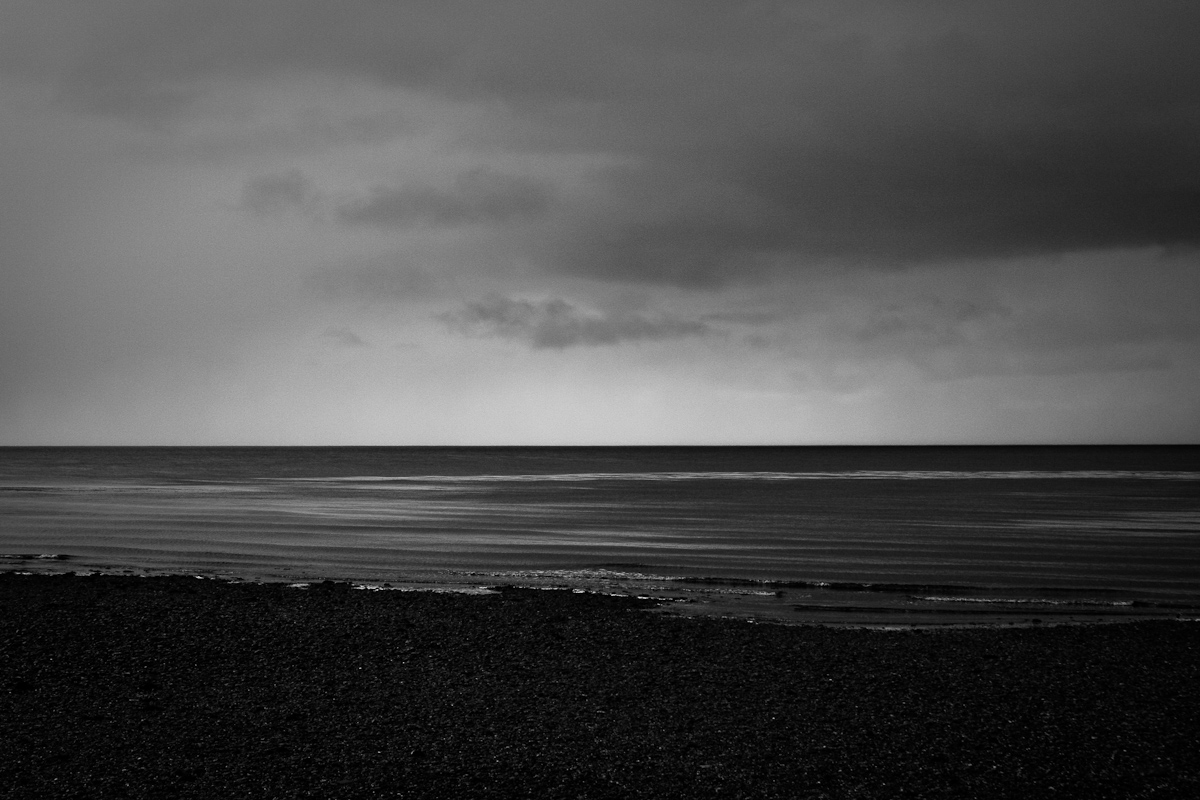
After a year of admiring the photos on NPN, I decided it was ridiculous that I didn't have a membership of my own so I finally got myself one. Now I can participate and not just silently view everyone else's photos :smile:. My first post (which also happens to be my avatar) is from southeastern Alaska. I was nearing the end of a month-long NOLS sea-kayaking trip and one evening a clearing storm created a beautiful, eerie glow over the horizon. The contrast between the sky and horizon was striking.

All comments and critiques welcomed.

40D, 28-135

Comments

8 comments
Comment posted by Bill Chambers on November 11, 2009 at 4:47 PM
Welcome to NPN Elliot, and nice first post. This has a very tranquil feel to it.
Registered on April 10, 2005, 753 Posts, 21216 Comments
Comment posted by Rodney Dugmore on November 11, 2009 at 6:48 PM
Yes welcome Elliot.
Im wondering what the colour version looks like? I am not getting the feeling of the glow
it feels dark and brooding but lacks any real focal point

Thanks for sharing.
Registered on January 3, 2004, 76 Posts, 1028 Comments
Comment posted by Harley Goldman on November 11, 2009 at 6:51 PM
Welcome. Very nice first post. For my tastes, I would favor a crop of 2/3 of the dark foreground. It really makes the image pop for me. Thanks for including the large version, too. It looks good big.
Registered on November 19, 2003, 586 Posts, 11271 Comments
Comment posted by Elliot Johnston on November 11, 2009 at 8:07 PM
Rodney - This image was shot back when I hadn't realized (not sure how) the many advantages to RAW. Also, I was on a long trip with limited memory space so I was shooting jpeg. I shot the photo in B&W, so that's what I'm stuck with. But I agree, having the color version would be nice.

Harley - I've included a second version with a cropped foreground. Upon looking at it longer, I thought that the sky needed a slight crop too.

Thanks for the comments.
Registered on November 11, 2009, 23 Posts, 288 Comments
Comment posted by Youssef Ismail on November 11, 2009 at 8:45 PM
Welcome Elliot,

Interesting first post. Nice tonal range. Gives me a somber feeling. I kind of like the extra black in FG.
Registered on November 1, 2003, 474 Posts, 5555 Comments
Comment posted by Tony Kuyper on November 11, 2009 at 9:01 PM
I like the extra black on the foreground too. I'm wondering about drying to dodge the wave crests a bit more to give add emphasis to the pattern they create. Welcome to NPN.
Registered on November 1, 2003, 364 Posts, 22328 Comments
Comment posted by Stuart Williams on November 12, 2009 at 5:10 AM
welcome elliot. i like the lines in the water and actually, being an odd sort, i'd crop off the TOP and not the bottom to come to a 50:50 crop ... look forward to more!
Registered on December 7, 2007, 247 Posts, 4792 Comments
Comment posted by Mark Metternich on November 12, 2009 at 10:51 AM
I like this one. Nice feel and B+W
Registered on June 19, 2009, 276 Posts, 6240 Comments