Nature Photographers Network
This is the preserved archive of the original Nature Photographers Network. The community continues at naturephotographers.network.
The Grove
‹ PreviousLandscape GalleryNext ›

The Grove

by Kurt Budliger

Gallery: LandscapePosted November 2, 2009146 views11 comments
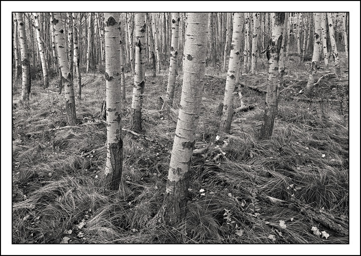
Probably the last shot I can post from my trip to Acadia a couple of weeks back since everything else I shot consisted of lobster traps, buoys and piers. That's what happens when Mother Nature has different plans for your photo trip. I went with a black and white conversion to emphasize the graphic pattern of the near white trunks and foreground grasses (not really coming through in this small format).

5D2, 24mm tilt/shift, polarizer

Comments

11 comments
Comment posted by Joseph Kayne on November 2, 2009 at 9:11 PM
:toast: :toast: :toast:
Registered on November 1, 2003, 573 Posts, 2619 Comments
Comment posted by Daniel Ewert on November 2, 2009 at 9:16 PM
Nice work, Kurt. The b&w tones look great here. I would probably be tempted to overdo the contrast, but I think you have a nice balance here. Well done.
Registered on June 2, 2009, 103 Posts, 1500 Comments
Comment posted by Michael J Greene, on November 2, 2009 at 10:41 PM
Kurt,

Very nice composition and crystal clear sharpness on the web. I would agree with Daniel this image could be improved with a contrast boost to emphasize the light and dark tones. Thanks for sharing!
Registered on June 18, 2009, 86 Posts, 2317 Comments
Comment posted by Joel Hazelton on November 3, 2009 at 1:26 AM
I agree with the above suggestions. Great shot! Very nicely composed.
Registered on August 6, 2008, 194 Posts, 1315 Comments
Comment posted by John&Patty Benway on November 3, 2009 at 4:24 AM
I like this alot Kurt, it conveys the mood of the Northeast at this particular time of year. Wouldn't change a thing.
John
Registered on May 12, 2006, 626 Posts, 8700 Comments
Comment posted by Eva McDermott on November 3, 2009 at 9:29 AM
I like the perspective Kurt. I think I agree though on the contrast.
Registered on January 4, 2009, 1015 Posts, 13229 Comments
Comment posted by Harley Goldman on November 3, 2009 at 2:58 PM
Very pretty scene, Kurt.
Registered on November 19, 2003, 586 Posts, 11271 Comments
Comment posted by Laurent Baig on November 3, 2009 at 5:10 PM
I like the comp, but the tones are really flat, imho.
Registered on January 12, 2005, 206 Posts, 6784 Comments
Comment posted by Chris White on November 4, 2009 at 9:32 AM
An interesting shot of a great subject. I enjoyed looking at it for a long time.

For me, the perspective is a bit too much, I personally find the flare of the trees at the top of the image slightly distracting. But that's just me, others (who have already commented) like your perspective. Did you point the camera down and use tilt here?
Registered on February 27, 2007, 61 Posts, 945 Comments
Comment posted by Kurt Budliger on November 4, 2009 at 11:18 AM
Thanks Chris. Nothing special about the perspective, camera was positioned about 5 ft off the deck and level to avoid distortion. I then shifted the front element slightly up to include more of the top.
Registered on June 11, 2006, 113 Posts, 2116 Comments
Comment posted by Morris McClung on November 4, 2009 at 7:09 PM
A very ordered comp and the conversion is excellent. Really nice work.
Registered on May 7, 2007, 670 Posts, 19650 Comments