Nature Photographers Network
This is the preserved archive of the original Nature Photographers Network. The community continues at naturephotographers.network.
Drinnon Pass
‹ PreviousLandscape GalleryNext ›

Drinnon Pass

by Kenn Leonhardt

Gallery: LandscapePosted October 25, 2009258 views13 comments
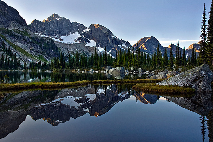
Since we didn't have any sort of fall here before plunging into winter, this one is from July. It's a relatively remote part of Southern BC, but definitely worth the effort to get to.

I'm having a tough time deciding which composition to go with. This one I just processed today and like because it has the trees as a frame on the right. The one below I processed in July, and prefer the position of the FG rock in it. Which comp is stronger overall?

Any other comments/critiques appreciated as well.

Comments

13 comments
Comment posted by Kenn Leonhardt on October 25, 2009 at 5:41 PM
Registered on March 29, 2008, 27 Posts, 1710 Comments
Comment posted by Benjamin Glatt on October 25, 2009 at 5:47 PM
Gorgeous reflection and shot, Kenn. Here is my crop suggestion (for the first image): crop the rock out on the right side, leaving just a patch of that grass next to it, then crop that highest peak on the left that is on the edge of the frame. That will isolate the mtns that have the sweetest light.
Registered on July 15, 2007, 171 Posts, 3566 Comments
Comment posted by Eva McDermott on October 25, 2009 at 6:14 PM
I really like the 2nd post Kenn althoug the first is good too. While the second has a lot more complexity to it, I like it for that reason. Great reflection in the perfectly still water.
Registered on January 4, 2009, 1015 Posts, 13229 Comments
Comment posted by Stephen Weaver on October 25, 2009 at 6:42 PM
I like #2 better, and I agree with Ben on cropping #1- the trees on the right are a bit of a distraction. The reflection is nice!
Registered on November 1, 2003, 226 Posts, 623 Comments
Comment posted by Michael J Greene, on October 25, 2009 at 8:02 PM
Ken,

Nice shot. Overall I like the second one better, but I would try cropping between the tree on the right and the one on the left and see how that works for you. I think you could also come up on the foreground just a bit. I hope this helps. Michael
Registered on June 18, 2009, 86 Posts, 2317 Comments
Comment posted by Dean Sauskojus on October 25, 2009 at 8:32 PM
The placement of the grass and rock looks much better in the second one. Nice work!
Registered on September 29, 2009, 137 Posts, 2659 Comments
Comment posted by Justin Peterson on October 25, 2009 at 9:50 PM
I like the 1st one...the tree on the far right frames the image more naturally. Both are beautiful!
Registered on January 20, 2008, 33 Posts, 298 Comments
Comment posted by Rune Hansen on October 26, 2009 at 4:00 AM
Gorgeous reflection image!!

I´m preferring the first one. I like how the trees are framing the image like your mentioned. The crop-suggestion for the first image would also work great! Not much help here :wink:
Love the image!

Rune Hansen
Registered on January 21, 2008, 40 Posts, 420 Comments
Comment posted by Sam Chrysanthou on October 26, 2009 at 1:44 PM
Hi Kenn,

Very crisp file--I can feel the chill! I like the image with the trees 'bookending' the right side of the lake the best. Nice subtle light here too.
Registered on December 18, 2007, 71 Posts, 1191 Comments
Comment posted by Kenn Leonhardt on October 26, 2009 at 6:43 PM
Thanks for the comments. I like the crop idea, but overall I think I'm partial to keeping the wider view. I wish I had taken a few more compositions from this spot...
Registered on March 29, 2008, 27 Posts, 1710 Comments
Comment posted by Jason Edlund on October 26, 2009 at 6:43 PM
Looks like a beautiful spot, will have to add it to my list of places I have to visit. I like the rock in the second one, great reflection.
Registered on February 9, 2009, 21 Posts, 284 Comments
Comment posted by Richard Hartmann on October 26, 2009 at 10:02 PM
I like the first one, too.

Nice reflection!
Registered on January 15, 2009, 13 Posts, 772 Comments
Comment posted by Lon Overacker on October 27, 2009 at 3:27 AM
Kenn,

Both are excellent, but I prefer the second one. The reason is because of the anchor of the boulder and the overall balance of the image. I like the tree on the right, but for me, it's a case of either I want more trees - or none. Everything else is great in both, the color, clarity, contrast, etc. Although I just noticed that the light hitting the peaks in the first post looks a little warmer - and I like that part better. Even if you cropped the trees on the right, I think the symmetry is strong enough alone to hold up the image.

Just some thoughts, but I really like them both.

Lon
Registered on November 24, 2006, 521 Posts, 19147 Comments