Nature Photographers Network
This is the preserved archive of the original Nature Photographers Network. The community continues at naturephotographers.network.
Autumn Remnant w/repost (square)
‹ PreviousLandscape GalleryNext ›

Autumn Remnant w/repost (square)

by Vance Gese

Gallery: LandscapePosted October 12, 2009761 views45 comments
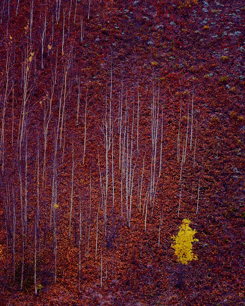
Made this image of a hillside in the fall a few years ago in the Matanuska River Valley which is northeast of Anchorage, Alaska. I liked the almost abstract design of the bare aspens against the fallen leaves and vegetation of the hillside and the single bush, probably a willow, still glowing yellow. While this image doesn't really showcase the beauty, the Matanuska Valley in the autumn is incredible.
4x5, 210mm, Velvia.

Large image provided.

Comments, suggestions, critiques all welcome.
Thanks.

Comments

45 comments
Comment posted by Stan Rose on October 12, 2009 at 2:29 PM
Wild! Ill bet the compression aint helping this any, with all that detail. Ill bet this will make a superb big print tho. Personally id crop square, i think the balance would be better. :smile:
Registered on September 15, 2005, 836 Posts, 17099 Comments
Comment posted by Verena & Georg Pop on October 12, 2009 at 2:29 PM
that one just just proves my ol' saying, that very late autumn is the best photo time of the year!
georg
Registered on July 5, 2006, 272 Posts, 2823 Comments
Comment posted by Ian Plant on October 12, 2009 at 2:41 PM
great one Vance. As always I am impressed with you eye for finding unique convergences in nature.
Registered on July 7, 2008, 271 Posts, 1657 Comments
Comment posted by Floris van Breugel on October 12, 2009 at 2:46 PM
Absolutely fantastic Vance! Incredible composition full of great contrasts. I think this might be one of my favorites of yours, just love it!
Registered on December 19, 2008, 306 Posts, 4840 Comments
Comment posted by Bill Chambers on October 12, 2009 at 3:02 PM
Another beauty Vance. The saturation is so rich, but not overdone.
Registered on April 10, 2005, 753 Posts, 21216 Comments
Comment posted by Joseph Kayne on October 12, 2009 at 3:03 PM
:toast: :toast: :toast:
Registered on November 1, 2003, 573 Posts, 2619 Comments
Comment posted by Robert Dayton on October 12, 2009 at 3:06 PM
Congratulations, Vance, on capturing a very rare and beautiful scenic. There
are so many of the elements of art here--color, lines, and textures. Perfect
placement of the yellow willow in the compositon. It's kind of abstract too which
I like.
Registered on November 11, 2008, 281 Posts, 3958 Comments
Comment posted by Kurt Budliger on October 12, 2009 at 3:32 PM
Great find and well seen. I agree with Stan that a squarish crop from the top would be great. :toast:
Registered on June 11, 2006, 113 Posts, 2116 Comments
Comment posted by Dean Sauskojus on October 12, 2009 at 3:37 PM
Well composed shot! The yellow bush in the corner adds so much to the image. Nice work.
Registered on September 29, 2009, 137 Posts, 2659 Comments
Comment posted by Aaron Ellingsen on October 12, 2009 at 3:38 PM
Vance, I think this is brilliant, and the type of photo that I'd personally like to have on my own wall.

I do like Stan's crop suggestion, though it works well for me as it is right now. Good stuff! :toast:
Registered on January 16, 2008, 56 Posts, 953 Comments
Comment posted by Bret Edge on October 12, 2009 at 3:47 PM
I think it showcases lots of beauty, Vance. This is an exceptional study and one that will make a fine large print. That lone yellow bush/tree against the stark hillside of color/aspen trunks is killer.
Registered on November 1, 2003, 711 Posts, 6363 Comments
Comment posted by Anish Desai on October 12, 2009 at 3:49 PM
Beautiful abstract. I think your chosen focal length is just right for emphasising the lone yellow tree's solitude. The yellow/red color pallette really conveys the sense of "autumn".
Registered on May 23, 2009, 49 Posts, 410 Comments
Comment posted by Kevin Trinkner on October 12, 2009 at 4:12 PM
Awesome Vance, I bet this will make an outstanding print. Great eye.
Registered on June 30, 2008, 203 Posts, 2641 Comments
Comment posted by Carrie O'Brien-Sib on October 12, 2009 at 4:12 PM
Vance, Fabulous lines and texture, simply remarkable! I think the vertical choice is best suited for this one.
:toast: :toast:
COS
Registered on August 4, 2009, 149 Posts, 889 Comments
Comment posted by Mel Ladewig on October 12, 2009 at 4:22 PM
That is a stunning richly colored frame. Just goes to show why you should never give up.
Registered on July 24, 2005, 114 Posts, 1205 Comments
Comment posted by Rick Goldwasser on October 12, 2009 at 5:13 PM
Very nice shot, this one really tells a story. I think I agree about the square crop idea, it's worth a try.
Registered on May 10, 2009, 127 Posts, 970 Comments
Comment posted by Jimmy Gekas on October 12, 2009 at 5:24 PM
Love this! :toast:
Registered on July 26, 2007, 244 Posts, 2807 Comments
Comment posted by Wayne Simpson on October 12, 2009 at 5:25 PM
Vance,
Great image - very original! I agree with the square crop. I would recommend cropping from the top down to where the trees indent and then whatever you need to crop from the left to make it square. I think the crop would place more emphasis on the yellow tree, and isolate that great triangle of trees which adds to the abstract/geometric quality about this great image. Love it!!!

Wayne
Registered on December 11, 2006, 303 Posts, 924 Comments
Comment posted by Steve France on October 12, 2009 at 5:26 PM
this is simply stunning! one of your best for me. I love everything about this one. I may be inclined to crop square? Ill be coming back to this one!
Registered on September 26, 2007, 89 Posts, 1477 Comments
Comment posted by Tony Kuyper on October 12, 2009 at 6:12 PM
Whoa, glad you pulled this one out of the files. I'm with everyone else that this is just fantastic.

Gotta tell you that your images here are some of the best. Great eye for composition and really good light. I hope I'm as successful as you when I retire :wink:
Registered on November 1, 2003, 364 Posts, 22328 Comments
Comment posted by Daniel Ewert on October 12, 2009 at 8:04 PM
Wow! Those colors are really intense (in a good way) and your composition was perfect. I thought it was a rock face at first glance and then upon closer inspection saw what it was. Really great stuff here.
Registered on June 2, 2009, 103 Posts, 1500 Comments
Comment posted by Rudy Ruberti on October 12, 2009 at 8:23 PM
This is stunning. Well done again.
Registered on October 28, 2008, 179 Posts, 1875 Comments
Comment posted by Mark Pelton on October 12, 2009 at 9:54 PM
Simple, stark, and quite beautiful.
Registered on November 25, 2003, 380 Posts, 4647 Comments
Comment posted by Bill Fach on October 12, 2009 at 9:59 PM
Vance: Great find and a superb capture. 2 thumbs up! >=))>
Registered on November 1, 2003, 1805 Posts, 26981 Comments
Comment posted by Mike Ryan on October 12, 2009 at 10:00 PM
Wow Vance you images never fail to impress. The contrasts here (lighting, color, and leaves/no leaves) just meld nicely. Really cool. Keep up the good work.
Registered on June 29, 2008, 85 Posts, 636 Comments
Comment posted by Vance Gese on October 12, 2009 at 10:05 PM
Thank you very, very much everyone for all the great feedback. When I lived in Alaska, I showed this 4x5 to a few folks and all I got was the shoulder shrug sign. I am very glad that all you folks, ie. real artists, like this. A super affirmation.
Here's my try at a square crop. Have only done a square crop on one other image as I tend to see the world in 4x5, so hope it works. I sort of like the S-curve of the line of leafless aspens in the full-frame image but certainly do like the more graphic emphasis that the square provides, as several of you suggested. See what you think.
Thanks again. Your input is so very helpful to this old guy.
Registered on November 13, 2008, 298 Posts, 6629 Comments
Comment posted by Dan Baumbach on October 12, 2009 at 11:04 PM
I like the original crop better. Nice work.

- Dan.
Registered on November 1, 2003, 473 Posts, 7980 Comments
Comment posted by Floris van Breugel on October 13, 2009 at 12:31 AM
Original for me Vance, I miss the blueish shrubs (rocks?) in the URC and the S-curve. Plus I hate squares :wink:
Registered on December 19, 2008, 306 Posts, 4840 Comments
Comment posted by Stuart Williams on October 13, 2009 at 2:06 AM
i think i agree on the square crop suggestion ... i love the contrast between the reds & oranges, and that yellow. well seen!
Registered on December 7, 2007, 247 Posts, 4792 Comments
Comment posted by John&Patty Benway on October 13, 2009 at 6:54 AM
I'm with the original Vance. Gorgeous.
John
Registered on May 12, 2006, 626 Posts, 8700 Comments
Comment posted by Gabi Lach on October 13, 2009 at 8:44 AM
Great shot! For me also the original works better. Nice detail, color, and the overall scene looks very unique.
Registered on May 1, 2007, 101 Posts, 3187 Comments
Comment posted by Bill Dark on October 13, 2009 at 8:58 AM
While both versions are extraordinary, my personal preference is for the original. I like the format better and the s-curve created by the contrasting textures adds a wonderful element to the composition. Really, really nice, Vance!
Registered on May 27, 2005, 148 Posts, 1121 Comments
Comment posted by Dorin Bofan on October 13, 2009 at 10:01 AM
Outstanding work, Vance! The luminosity and the abstract quality are superb. Wow!
Registered on April 30, 2007, 122 Posts, 3086 Comments
Comment posted by Jim Jirka on October 13, 2009 at 10:26 AM
Vance,
The 4x5 image for me. Cropping loses the cool tones and eliminates the conflict with the yellow tree. It also eliminates the almost abstract properties of the image.
Registered on November 1, 2003, 254 Posts, 1620 Comments
Comment posted by Kah Kit Yoong on October 13, 2009 at 12:40 PM
Looks almost like a board game! Both are so good I don't think I can single out a particular crop.
Registered on September 27, 2006, 636 Posts, 10682 Comments
Comment posted by Abdullaziz Bin Ali on October 13, 2009 at 1:31 PM
Vance, Really unique scene
:)

Wonderful
Registered on May 31, 2009, 112 Posts, 1590 Comments
Comment posted by Steve Sieren on October 13, 2009 at 2:13 PM
Great find and fantastic capture Vance. :toast:
Registered on January 2, 2008, 360 Posts, 5321 Comments
Comment posted by Laurent Baig on October 13, 2009 at 5:08 PM
Again, my kind of image. I quit and am just going to live vicariously through your photography :biggrin:
Registered on January 12, 2005, 206 Posts, 6784 Comments
Comment posted by Eric Good on October 13, 2009 at 5:29 PM
This is crazy cool! I might prefer a very slight crop off the left side to eliminate/minimize those leaves on the immediate LL boarder. A square crop eliminates all that wonderful smattering of color in the URC which I feel is a integral part of the image. Excellent work!
Registered on March 17, 2007, 116 Posts, 4764 Comments
Comment posted by Lon Overacker on October 13, 2009 at 7:32 PM
Outstanding Vance! If this isn't hanging somewhere, it should be! I like the square crop too, but the original is fine by me. Just fantastic in all regards, including the positioning of the elements. Wish it were mine. :-)

Lon
Registered on November 24, 2006, 521 Posts, 19147 Comments
Comment posted by Anthony Vincent on October 13, 2009 at 8:07 PM
I was hoping this was still on the front page. A wonderful capture Vance. I love those deep dark maroons setting the backdrop for the single glowing tree. Great addition to your portfolio.
Registered on February 5, 2009, 199 Posts, 2775 Comments
Comment posted by Morris McClung on October 13, 2009 at 8:59 PM
I love vertical palettes! And this one is one of the best I have ever seen. Outstanding! Oh, and full frame for more of a sense of scale.
Registered on May 7, 2007, 670 Posts, 19650 Comments
Comment posted by Greg Cope on October 13, 2009 at 11:07 PM
Up there as one of my favorites of yours. I prefer the original relative to the repost. This is one I recommend printing large and hanging proud! :toast:
Registered on January 22, 2007, 212 Posts, 2737 Comments
Comment posted by Wayne Jones on October 13, 2009 at 11:25 PM
The autumn floor of a forest of barren trees has always intrigued me, but I have never found an interesting way to portray it. This really does the job! I am so glad you included the larger version. The blues in the top half of the smaller one kind of bothered me, but the larger version shows that it's just some kind of compression artifact. I prefer the 4x5 version.
Registered on April 18, 2007, 953 Posts, 6435 Comments
Comment posted by Prashant Khapane on October 14, 2009 at 4:12 PM
:toast: :toast:
Registered on November 1, 2003, 492 Posts, 4580 Comments