Nature Photographers Network
This is the preserved archive of the original Nature Photographers Network. The community continues at naturephotographers.network.
Aspen Grove
‹ PreviousLandscape GalleryNext ›

Aspen Grove

by Vance Gese

Gallery: LandscapePosted October 8, 2009576 views31 comments
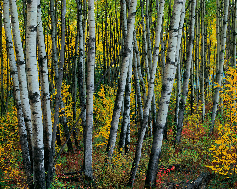
This is a grove of aspens I found south of Fairbanks,Alaska a few years ago in their peak of autumn color. After a night of steady rain, the colors really sang this particular morning. The use of Velvia film sort of made the colors really sing, maybe a bit too much.
4x5, 210mm, Velvia, polarizer

Large image provided.

Your thought, suggestions, comments, critiques are all always welcomed.

Thanks again.

Comments

31 comments
Comment posted by Trevor Anderson on October 8, 2009 at 3:02 AM
Amazing shot, Vance. For a more focused take, I may consider cropping a portion of the right side to isolate the trees more, but then you would be sacrificing more fall color.

I would love to see this one in print. :toast:
Registered on April 25, 2007, 64 Posts, 483 Comments
Comment posted by Floris van Breugel on October 8, 2009 at 3:15 AM
Stunning Vance, just incredible! This has such a mysterious and haunted feel to it even with the bright singing colors, love it! Thanks for the kind words regarding my photo and new site - when are you getting a website, your images certainly deserve a nice online home!
Registered on December 19, 2008, 306 Posts, 4840 Comments
Comment posted by Bruno Silva on October 8, 2009 at 5:10 AM
fabulous image. nice range of colors and deph. the light looks sweet too. nicely done.
Registered on May 6, 2009, 132 Posts, 1406 Comments
Comment posted by Verena & Georg Pop on October 8, 2009 at 5:12 AM
Sweet. somehow a bit different from the many aspen images we get to see here.
georg
Registered on July 5, 2006, 272 Posts, 2823 Comments
Comment posted by Dean Sauskojus on October 8, 2009 at 6:09 AM
Love the contrast. The trees have a painterly look to them. Nice Work!
Registered on September 29, 2009, 137 Posts, 2659 Comments
Comment posted by Steve France on October 8, 2009 at 7:08 AM
I really like the composition.. a little different than most with this type of image. Great colours and textures. The lighting is nice and soft ...bet the details in this are awesome,

What has this been like to scan..easy? The whites of the aspens looks a little odd ..but Im at my work screen which is way off..so there is nothing off at all probably.
Registered on September 26, 2007, 89 Posts, 1477 Comments
Comment posted by Kevin Trinkner on October 8, 2009 at 7:54 AM
Nice capture Vance, really like the different lines the trunks create, and great vibrant colors. The processing looks very different to me here, not sure if you applied a different technique. Very painterly. I like it.
Registered on June 30, 2008, 203 Posts, 2641 Comments
Comment posted by Dietrich Gloger on October 8, 2009 at 7:57 AM
Love the comp. Vance. The colors are a bit on the extreme side for my taste, but it's impressive nevertheless. I think there is some cyan cast (aspen bark) that could at least be considered to be removed.
Registered on January 26, 2007, 360 Posts, 9876 Comments
Comment posted by Kurt Budliger on October 8, 2009 at 8:43 AM
This is awesome Vance. I love how the trunks seem to glow against the colorful and mysterious background. The fact that few of the trunks are vertical is pretty sweet also.
Registered on June 11, 2006, 113 Posts, 2116 Comments
Comment posted by Mel Ladewig on October 8, 2009 at 9:06 AM
This is a truly unusual aspen image Vance. The high contrast in the boles is just really strange, certainly the result of all the rain. It is perhaps just a bit too jarring for me. It certainly isn't just like every other aspen shot out there.
Registered on July 24, 2005, 114 Posts, 1205 Comments
Comment posted by John Williams on October 8, 2009 at 9:23 AM
The color bands as you move up and down in the photo are very nice, and the trunks tie it all together. I agree that the contrast just borders on too much for what looks like such even lighting.
Registered on September 6, 2007, 221 Posts, 5985 Comments
Comment posted by Rick Goldwasser on October 8, 2009 at 10:16 AM
While I agree that the contrast/saturation are both a little strong if you're looking for totally realistic, I really like this image.It kind of feels like a painting and it makes me want to go visit that Aspen Grove.
Registered on May 10, 2009, 127 Posts, 970 Comments
Comment posted by Mike Dawson on October 8, 2009 at 10:20 AM
Outstanding color and contrast, very nice !
Registered on February 4, 2006, 364 Posts, 8872 Comments
Comment posted by Joseph Kayne on October 8, 2009 at 10:26 AM
:toast:
Registered on November 1, 2003, 573 Posts, 2619 Comments
Comment posted by Harley Goldman on October 8, 2009 at 10:34 AM
This is a beaut, Vance! Love the perspective and great color. It shines even more in the large size. Fine work!
Registered on November 19, 2003, 586 Posts, 11271 Comments
Comment posted by Bill Chambers on October 8, 2009 at 11:36 AM
Beautiful Vance - looks like an aspen bouquet!
Registered on April 10, 2005, 753 Posts, 21216 Comments
Comment posted by Morris McClung on October 8, 2009 at 11:42 AM
Do you have a book on Alaska, Vance? If not, you should have. You have some very unique and beautiful shots from there. And I second Floris' suggestion on a website.
Registered on May 7, 2007, 670 Posts, 19650 Comments
Comment posted by Laurent Baig on October 8, 2009 at 11:48 AM
No way, not too much! This is divine! I want a print!!!
Registered on January 12, 2005, 206 Posts, 6784 Comments
Comment posted by Mitch Moraski on October 8, 2009 at 11:50 AM
Great shot Vance! Love the depth and the overall graphics of the image. My good buddy Kurt Budliger (cover shot) and I were just commenting on your images the other day. Your stuff is stellar!! Keep up the good work.
Registered on August 3, 2008, 105 Posts, 590 Comments
Comment posted by Robert Dayton on October 8, 2009 at 2:38 PM
Great graphic lines and colors, Vance. The colors may be a little over saturated
or vibrant, but I don't care; I still like it.
Registered on November 11, 2008, 281 Posts, 3958 Comments
Comment posted by Paul Wegemann on October 8, 2009 at 3:16 PM
As soon as I saw the thumbnail I thought "Velvia!". I love the comp, punchy colors, and the contrast. Fantastic image, Vance.
Registered on December 14, 2006, 58 Posts, 1888 Comments
Comment posted by Eric Good on October 8, 2009 at 3:23 PM
I really enjoy the graphic quality of this image... strong comp, bold colors and lots of depth. Good stuff!
Registered on March 17, 2007, 116 Posts, 4764 Comments
Comment posted by Bret Edge on October 8, 2009 at 3:30 PM
This is one of the more unique aspen photos I've seen, Vance. I love the vivid colors and the somewhat haphazard nature of the trunks. Good work!
Registered on November 1, 2003, 711 Posts, 6363 Comments
Comment posted by Peter Gordon on October 8, 2009 at 3:39 PM
Love the contrast and beautiful blanket of colour..
Registered on May 31, 2007, 224 Posts, 1490 Comments
Comment posted by Wayne Willison on October 8, 2009 at 4:45 PM
This is awesome. You sure get some definition with that 4x5. Love the bg yellows.
Registered on April 10, 2009, 292 Posts, 3967 Comments
Comment posted by Paulo A.Lopes on October 8, 2009 at 6:31 PM
:toast: terrific image. Perhaps one of the best fall image i have seen this year, even if is doesn't belong to 2009 :smile:
Registered on October 14, 2008, 122 Posts, 836 Comments
Comment posted by Tony Kuyper on October 8, 2009 at 11:25 PM
One of the finest aspen images ever, Vance. The darker than expected trunks make for a very powerful presentation when balanced with the other saturated colors. Truly a excellent image that breaks new ground.
Registered on November 1, 2003, 364 Posts, 22328 Comments
Comment posted by Vance Gese on October 8, 2009 at 11:49 PM
Thanks everyone for the kind comments. The aspens in the FG were quite unique with very white bark which really contrasted with the blacks. I did not accentuate this at all in processing; actually tried to tone down the white a bit as the contrast seemed a bit high (used a few Tony Kuyper's luminosity masks in processing but not much). All the other aspens in the area had the typical tones. Have no idea why these were so white.
Floris, Morris - no website yet. Want to but haven't really decided how to proceed just yet.
Steve, Kevin - used very little processing, just a few TK's masks. The 4x5 Velvia didn't really need much. For some reason, the M1 scan worked quite well. Must have been a fluke as usually my scanning leaves much to be desired.
Dietrich - thank for pointing out the color cast. Have corrected this in the master file.
Morris - like everyone here at NPN, I dream of producing a book. Maybe someday. After 23 years in Alaska, I do have a 'few' images.
Thanks again everyone.
Registered on November 13, 2008, 298 Posts, 6629 Comments
Comment posted by Jesse Speer on October 9, 2009 at 11:47 AM
The colors look great to me. It's amazing how moisture affects fall color. I love the layering of color in the backdrop - a wonderful mix of vertical/horizontal going on here.
Registered on September 18, 2004, 19 Posts, 339 Comments
Comment posted by Chris Chamberlain on October 9, 2009 at 7:48 PM
Incredible composition! After a night of rain, and an overcast sky, I could see these colors being true. A stunning image!

Chris
Registered on March 13, 2007, 500 Posts, 8365 Comments
Comment posted by Jason Edlund on October 9, 2009 at 9:58 PM
I love these aspen groves in the fall, and this one looks so awesome, the colors are outstanding, great shot Vance
Registered on February 9, 2009, 21 Posts, 284 Comments