Nature Photographers Network
This is the preserved archive of the original Nature Photographers Network. The community continues at naturephotographers.network.
In the Flow II
‹ PreviousLandscape GalleryNext ›

In the Flow II

by Lon Overacker

Gallery: LandscapePosted June 4, 2009741 views38 comments
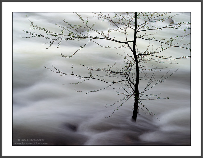
Well, I've done the tree and the river thing so I guess it's just a natural extension to do both at the same time? Saves film. :-)

Another image from our rainy weekend. This was captured at Happy Isles in between passing rain. Some of you may recall this same scene posted last year. In fact the images were captured exactly 1 year apart. A big difference in the amount of water this year.

I much prefer last years capture and this should be a lesson in that you're not likely ever to repeat your favorite images. But this one is a bit different and I'm wondering if it's strong enough to stand on it's own. This first one is a crop and you'll see from the second one why I cropped it. But thought I would include it to see if anyone actually prefers the full view.

Thanks again for all the previous comments and I look forward to your thoughts and critiques on this one.

Chamonix 4x5, V100F, Nikkor 300mm, f45 @2s with 3stop ND.
Tony's Luminosity masks and painting

Thanks!

Lon

more notes: I considered b&w, but I'm a color guy. This doesn't have a whole lot of pop to it and in b&w, even less so. But also, I've struggled for many days on this one and finally got to the point where I just had to leave it alone for a while. Hopefully some comments or suggestions will help the next time I work on this one.

Comments

38 comments
Comment posted by Lon Overacker on June 4, 2009 at 8:56 PM
Here's the full frame image (actually slightly cropped from the slide)

Which do you prefer, if any?

Thanks!
Lon
Registered on November 24, 2006, 521 Posts, 19147 Comments
Comment posted by Paulo A.Lopes on June 4, 2009 at 8:59 PM
:toast: This is great. do you have tried on Bw? Think that it can suit quite well. First post for sure
Registered on October 14, 2008, 122 Posts, 836 Comments
Comment posted by Jeffrey Hak Kan Le on June 4, 2009 at 9:02 PM
unique and nice. I prefer the attached one.

Jeff
Registered on January 9, 2007, 42 Posts, 157 Comments
Comment posted by Eva McDermott on June 4, 2009 at 9:08 PM
Lon - I really like this..... It is spectacular and I do like it more than your last year's post. ....but that is me...... More abstract in a way.
Registered on January 4, 2009, 1015 Posts, 13229 Comments
Comment posted by Floris van Breugel on June 4, 2009 at 9:13 PM
Man, rough times for that poor tree. I agree the crop was a good idea, and I think I'm with you in that I prefer last years - I'm on a little roll with liking 'hints of light' in images.. so last years was working well for me in that regard, and the boulders added more interest. This does have a nice abstract flow to it though, and might be best appreciated in B&W? You're so right, no matter how 'trivial' we may think a shot is, it's surprisingly hard to repeat them most of the time. This year my two favorite dogwoods from last year had but a few blooms.. whereas last year they were exploding with flowers!
Registered on December 19, 2008, 306 Posts, 4840 Comments
Comment posted by Daniel Ewert on June 4, 2009 at 9:30 PM
I really like that light from the one you took last year, but this is a fine shot as well, albeit a bit more abstract. I looked at your other photos and you seem to have a very unique style, which I like. Thanks for sharing it.
Registered on June 2, 2009, 103 Posts, 1500 Comments
Comment posted by Wade Hardy on June 4, 2009 at 9:58 PM
For me, the cropped version definitely works better. As far as comparing this shot to last year's version, I like this one just as much or better. Great shot btw!
Registered on May 2, 2006, 121 Posts, 1824 Comments
Comment posted by Ian Plant on June 4, 2009 at 10:00 PM
another great intimate moment capture! :toast:
Registered on July 7, 2008, 271 Posts, 1657 Comments
Comment posted by Tony Kuyper on June 4, 2009 at 10:19 PM
I actually like this one better, Lon. I like simplicity, and this has that in a very appealing way. Needless to say I also like the crop better than the uncropped. The rocks along the top are distracting to my eye. My only thought, and it's a small one, might be to burn down the highlights at the top edge of the frame.
Registered on November 1, 2003, 364 Posts, 22328 Comments
Comment posted by Jeff Hackett on June 4, 2009 at 10:30 PM
I prefer this year's cropped image. There seems to be a darker more ominous feel to it that I like. Less literal information but enough to be mysterious. Very nice.
Registered on March 13, 2006, 65 Posts, 1119 Comments
Comment posted by Nick Moore on June 4, 2009 at 10:30 PM
Cropped version over uncropped definitely, I think this one works just as well as last years!. As Tony mentioned this one is about simplicity, there is a beauty to that for sure!.
Registered on May 23, 2006, 93 Posts, 2228 Comments
Comment posted by Arnab Banerjee on June 4, 2009 at 10:54 PM
I prefer the last years' because of the light, but this one, as stand alone, is quite unique too. The comp is what makes it work
Registered on January 3, 2007, 313 Posts, 2270 Comments
Comment posted by Anthony Vincent on June 4, 2009 at 10:59 PM
This one is beautiful Lon. Probably one of my favorites of yours. Its simple in nature but really over the top artistic. Nicely done.
Registered on February 5, 2009, 199 Posts, 2775 Comments
Comment posted by Kurt Budliger on June 4, 2009 at 11:33 PM
I definitely prefer the cropped version here. It reminds me of a Japanese watercolor painting, very elegant. I do also like last years version with splashes of light although I'm hard pressed to say which I prefer, both are very nice.
Registered on June 11, 2006, 113 Posts, 2116 Comments
Comment posted by Vance Gese on June 4, 2009 at 11:54 PM
A simple but yet very graphic image Lon. Loved the light on last years image which I had seen on your website. That image was/is a beautiful interplay of light, color, and motion. This new image is more abstract to me, distilled down to lines against the motion of the water. Fewer leaves and more water on this image as well add to the more graphic design. I think they are both fantastic. Just different. The first, cropped image of this years comp works best in my opinion. Outstanding.
Registered on November 13, 2008, 298 Posts, 6629 Comments
Comment posted by Kent Mearig on June 5, 2009 at 1:20 AM
Less texture and less variation in the water allows the tree it's proper prominence. I agree that black and white doesn't seem like the best option here, but I'm also not really into the colors. You could just change them to orange and blue... :wink:
Registered on September 4, 2006, 237 Posts, 4748 Comments
Comment posted by Chris Chamberlain on June 5, 2009 at 1:21 AM
You know, it's funny how taste differs from one person to another. I think I like this one a little better. Maybe it's cause' I was with you when you captured it :smile: Anyway, I was thinking about a b&w also. I have tried a conversion, then backing the opacity off to about 60-75%. It leaves just a hint of color in there that looks good in some cases. Also, we talked about this little guy being bigger this year. So now you must go back again each year to chronicle it's growth!

Chris
Registered on March 13, 2007, 500 Posts, 8365 Comments
Comment posted by Igor on June 5, 2009 at 1:33 AM
Can you get any more color out of those leaflets? A hint of green springled here and there could make a difference. Also, some light and shadow on the tree could add another dimension.

I really like it the way it is but those two added dimensions could help here.

Also, it would be interesting what definition would have come out of that water with various increases in shutter speed.

Perhaps change the color balance a tad to hint at shades of blue in that water.

I like that rock in the URC and wish there more like that throughout the stream.
Registered on February 22, 2009, 12 Posts, 618 Comments
Comment posted by Youssef Ismail on June 5, 2009 at 2:09 AM
Lon,

I remember this tree from last year and actually thought you had reposted it. I think I like this one better than last year's. I do like the crop better as well. It is such a moving image with dynamics and stillness portrayed simultaneously.
Registered on November 1, 2003, 474 Posts, 5555 Comments
Comment posted by Prashant Khapane on June 5, 2009 at 5:25 AM
lovely image Lon. Love this.
Registered on November 1, 2003, 492 Posts, 4580 Comments
Comment posted by Pedro Bento on June 5, 2009 at 5:27 AM
Lon, I prefer 1st version and this is a really sweet!
Registered on September 2, 2007, 45 Posts, 761 Comments
Comment posted by Bruno Silva on June 5, 2009 at 6:24 AM
very nice! love these shots! the first works better for me. I kind of like the sense of isolation of the tree in the first version. very nice comp lon!
Registered on May 6, 2009, 132 Posts, 1406 Comments
Comment posted by Paolo De Faveri on June 5, 2009 at 7:34 AM
Thumbs and toes up for this one, Lon, it's just wonderful. I prefer the original version , those sharp stones in the second post detract from the dreamy feeling of the scene.

:wavey:
Paolo
Registered on August 29, 2007, 318 Posts, 1651 Comments
Comment posted by Bill Maile on June 5, 2009 at 8:48 AM
Two distinctly different ones, where as last year's seems to battle between abstract and reality, this one fully captures the abstract feel w/ the crop. I'd vote for this year's model, and look forward to next year's!
Registered on March 2, 2009, 984 Posts, 2518 Comments
Comment posted by Robert Dayton on June 5, 2009 at 9:46 AM
Less is more. In its simplicity it's elegant. Very nice, Lon.
Registered on November 11, 2008, 281 Posts, 3958 Comments
Comment posted by Karsten Wrobel on June 5, 2009 at 9:54 AM
Lon, I much prefer the cropped version... even in comparison to your shot from last year... for me, this one has tons of dreamlike atmosphere to it... the lone tree in the mist (even if it is water ;-)
superb image!
Registered on November 1, 2008, 117 Posts, 851 Comments
Comment posted by Gabi Lach on June 5, 2009 at 9:57 AM
Nice! You captured water movement so well, Lon, that I feel like I am flowing with the water. Nice, smooth and very pretty. I prefer the first one.
Registered on May 1, 2007, 101 Posts, 3187 Comments
Comment posted by Marc Adamus on June 5, 2009 at 10:26 AM
Superb image, Lon. Love the contrasts here. Great use of space throughout the image. I prefer the closer crop by far.
Registered on September 17, 2005, 780 Posts, 8091 Comments
Comment posted by Harley Goldman on June 5, 2009 at 10:43 AM
This turned out really, really well, Lon. I like it a lot. I like the cropped version. I think I like it better than the prior year image.
Registered on November 19, 2003, 586 Posts, 11271 Comments
Comment posted by Rick Lundh on June 5, 2009 at 11:56 AM
Wow...unique and very cool image!
Registered on April 28, 2004, 774 Posts, 4351 Comments
Comment posted by Jerry Greer on June 5, 2009 at 12:05 PM
Lon,

This is beautiful! I Love it :toast:
Registered on November 1, 2003, 404 Posts, 1977 Comments
Comment posted by Jimmy Gekas on June 5, 2009 at 12:09 PM
I love the cropped version and I think I like it better than the one last year. It's such a simple, yet striking scene. Well done, again, Lon!
Registered on July 26, 2007, 244 Posts, 2807 Comments
Comment posted by Morris McClung on June 5, 2009 at 5:04 PM
Just more tree art from you, Lon. Outstanding, and I like the crop.
Registered on May 7, 2007, 670 Posts, 19650 Comments
Comment posted by Martin Stankiewicz on June 5, 2009 at 8:24 PM
Lon, you never cease to amaze me. Great capture.
Registered on October 26, 2008, 52 Posts, 462 Comments
Comment posted by Mark Pelton on June 5, 2009 at 11:34 PM
I agree with Tony. I prefer this cropped version slightly more than last years. I like both, but the simplicity of this one is hard to beat.
Registered on November 25, 2003, 380 Posts, 4647 Comments
Comment posted by Steve Sieren on June 6, 2009 at 12:37 AM
I'm liking the first uncropped version. What beautiful stationary battle you're displaying here.
Registered on January 2, 2008, 360 Posts, 5321 Comments
Comment posted by Dietrich Gloger on June 6, 2009 at 5:06 AM
Hi Lon, once I saw this it reminded me of that other image your are referring too but I was not sure if it really was the same scene. If i compare the first post here with the now "classic" image from one year ago I have to say I prefer the "original". Light is simply "better" and so effective. BUT the uncropped image is almost an entirely different story because that bit of rock at the top and that bit more and darker fg frames the scene so well and really enhances it. While the first one here could maybe considered as a"poor" attempt to repeat the older shot, the second one here is a very good new one on its own.
Registered on January 26, 2007, 360 Posts, 9876 Comments
Comment posted by Josh Anderson on June 6, 2009 at 10:06 AM
Very nice Lon. I like both images, but prefer the second.

~JA
Registered on June 2, 2005, 493 Posts, 2996 Comments