Moon over Ice
by Rafael Rojas
Another photo of the Lake Superior series. Even if all nature photographers know it, landscape is an incredibly dynamic thing. After a couple of weeks of being going to the very same spot every morning, i could check it out. Every morning the place was a complete different one. Parameters like quantity of snow, cloud cover, position of ice chunks, moon, wind pushing the ice, etc gave an almost never-ending range of different possibilities photographically speaking.
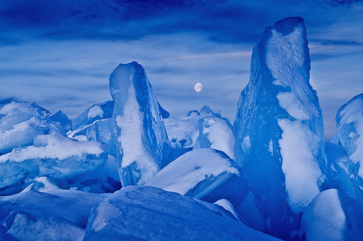
The morning this shot was made I had another image already in mind, where the moon was the star. I wanted to highligh the surrealistic character of this place, with those blocks of ice piled up, avoiding in the picture anything "real" that could give to the image any context (i.e, horizon). The only thing "recognisable" should be just the Moon, telling us that the place is real, even if it does not appear to be so. I love this contradiction, and in many of my pictures I always try to give this double sense: we know that it is a real place but it really looks as if it was on another planet.
Both the ice, the blue colors and the moon and its light are often associated with cold, and all this made a pretty consistent theme. The image was sidelit by a barely rosen sun on the horizon and slightly veiled by high clouds. This ligth gave some modelling to the blocks of ice but without excessive brightness.
Composition wise, the Moon is not exactly placed in the center, but close enough as it is the main element that I want to be visible from the first glance. "Flanking" the star with two vertical blocks of ice would also create a frame around it which would further highlight its presence. I set the white balance at a temperature of 5000K (daylight) so the camera did not "compensate" the blue ice reflected by ice, thus showing a cold and desolate landscape, monochromatic. I did not saturate the colours in postproduction.
The snow sprinkled on the ice was a bonus, giving depth and a three-dimensional look to the blocks of ice, besides breaking the blue monochromatism of the entire image. Finally, the sky. Without clouds the picture would have lost all its impact, "mood" and depth, resulting in a "cardboard-cut-out" kind of edge between the ice and the sky.
Greetings to all and good light to you! Rafael, Switzerland.
http://www.rafaelrojasphoto.com

Comments
24 comments- Dan
Very nice image, captures the landscape in that area very well.
However, somehow this, more than most others I think, is an image that can go many ways with postproduction and, let's not forget, without it too and it will appeal to different people in different ways. How I would treat it, therefore, is obviously not by default how you should treat it and it certainly works pretty darn well the way you present it!
You've certainly accomplished your goal in creating an "other wordly" image. And for that, the strong blues work very well and the moon does indeed bring some reality back in.
There are a few things though that I would like to comment on. And certainly please take these just as they are, opinions. The first would be the difference in lightness of the two tall towers of ice. You didn't mention it, but it looks like a GND was used. I would try and balance that out. Secondly, the shadows along the bottom and especially in the LRC seem unnaturally light to me, even muddy. That may very well be part of your vision with this scene having a greatly reduced contrast. Lastly, the moon. The sky is full of clouds and I might expect the moon to be obscured somewhat by the clouds; to me it looks like the moon is in front of the clouds and therefore placed there? I may be off base on that, but just my observation.
I only mention those things because I think this image has the potential of being spectacular.
In the end, this is a unique and well crafted image.
Lon
Keep shooting shots like this and you'll have a line of photographers standing right behind you.
As long as the snow is white, the white balance does the rest and sets the mood. Awesome photograph.
Great work
Fernando Brito
This is simply fantastic!! I agree with the others about toning down the blue saturation a bit, but that is a very easy and minor correction and this is a big time winner!!!! I LOVE this image.
Concerning your points, I think i will increase the white balance to reduce the blue slightly, that idea was really in my mind too before posting it...
I forgot to mention i used a graduated filter, that is why the tip of the ice block to the right is slightly dark. I should have corrected that slightly.
The other really important thing is the Moon!!: It is not pasted!!! The only reason i went out that morning was trying to find the Moon. The clouds appear on the photo much thicker they were. Anyway, i have the same composition some 5 minutes later, and as the Moon sunk a little bit more the cloud veiled it way too much. Perhaps what is happening here is the "clarity" that has been boosted too much in Lightroom, and given the fact the Moon is very clear, it has got too contrasty...Good point anyway, your comments mean that i need to decrease slightly the contrast in the Moon, making it more veiled...
Pasting the Moon here would have ruined the whole idea of that day...which was chasing the Moon itself!
Thanks for the comments, i will surely put them to play ;-)
Rafael,
Thank you for the updated information. I wasn't completely convinced the moon was placed, but was simply because the moon was in front of the clouds - or so it seems. But a bright moon can certainly shine thur thin clouds. So thanks for clearing that up for me.
Lon