Digital Imaging Part 2
Introduction to Color Management
Text and Photography Copyright Matt Hagadorn
All rights reserved.
In the first part of this series, we looked at basic techniques for scanning, color correcting and sharpening digital images. We learned a simple and effective method for neutralizing color casts, but we weren't concerned with matching the colors of the original slide, or with making accurate prints. To advance to this next step we need to learn about color management -- what it is and how it is employed.
What is Color Management?
Scanners, digital cameras, monitors and printers all render color in different ways. A monitor produces images by modulating the strength of the red, green and blue electron beams that make its phosphors glow. A typical print, on the other hand, reflects light from a combination of cyan, magenta, yellow and black pigments, dyes, waxes or toners. The type of colorants used, choice of paper and the light under which the print is viewed all have an effect on the colors we see. Because of the limitations of each technology involved, some of the colors that can be captured by a scanner or camera simply cannot be displayed on a monitor or reproduced on a printer.
To solve this problem, a group of companies including Apple, Kodak, Adobe and Microsoft formed the International Color Consortium (ICC) in 1993. The ICC's mission is to promote an open, cross-platform color management architecture for achieving consistent, predictable and reliable color throughout digital workflows. ICC color management utilizes a software engine called the color matching method (CMM, also called the color management module, or simply the "color engine") and device profiles to match color across input, display and output. In simpler terms, color management makes what comes out of your printer look like what you saw on your monitor.
Because the ICC defined an open standard, a lot of the details are left up to the individual companies that implement color management software. A vendor's specific implementation of the ICC color management architecture is called a color management system, or CMS. Microsoft's CMS built into Windows is called ICM, and Apple's is called ColorSync (the original ICC specification was actually based on ColorSync 2.0). While there are differences in the details, they both utilize standard ICC device profiles that are compatible across both systems.
Device Profiles
Each device, such as your scanner, monitor and printer, has its own device-dependent color space. Even though they all input or output RGB data, the meaning of that data is different for each device. (We consider inkjet printers to be RGB devices because their drivers usually accept only RGB data and perform the conversion to CMYK behind the scenes.) A color model such as RGB specifies an amount of each colorant to produce a color -- for example, R=210 G=100 B=90 -- but the exact color this recipe of numbers will produce is completely dependent on the device that receives them. The numbers given in the preceding example might produce a salmon-like color on my monitor, a rusty orange on your monitor, and a dirty brown on any given printer.
To adjust for these differences, the color behavior of each device is measured, and a file called an ICC profile is created that references each device's behavior to a known standard -- the CIELAB or CIEXYZ color models. For the most part you will never be concerned with LAB or XYZ. It is enough to understand that they are mathematical color models that describe how colors look to a person with normal vision. By referencing each device's color behavior to these known standards, a CMS can use profiles to translate the image as it goes from scanner to monitor to printer and render accurate, predictable color on each device.
 Color Spaces
Device-dependent color spaces are specific to a device and are rarely neutral or perceptually uniform, meaning the tones from black to white are not perceived to be evenly distributed. These characteristics make them particularly bad choices for editing and storing images. Therefore, once an image is acquired from an input device such as a scanner or digital camera, it should be converted to a device-independent color space, such as sRGB or Adobe RGB (1998). These are neutral, abstract color spaces that define a gamma, white point, and red, green and blue primaries. In Photoshop we configure our working space to be one of these standard color spaces or we can choose any other device-independent color space for which we have a profile installed. Converting your images to a standard working space disassociates them from the device you used to acquire them. They can then be edited or displayed on any machine or sent to a lab for custom prints and still produce accurate color.
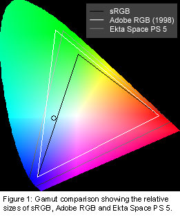
Which color space should you choose? Like all things, that depends on the image and how you captured it. For example, many digital cameras output files with a color gamut similar to sRGB, so this is usually an acceptable choice. However, if you are scanning transparencies with a film scanner, color spaces with a wider color gamut such as Adobe RGB or Ekta Space are more appropriate. Adobe RGB is a fairly large color space and is becoming a de-facto standard as a result of being included with Photoshop. Ekta Space (sometimes referred to as JoeRGB), available for free download from www.profilecentral.com, was created by photographer Joseph Holmes to encompass the entire color gamut of Ektachrome films and is suitable for Fuji E-6 films as well. (See Figure 1 for a comparison of the gamuts of these three color spaces.)
Monitor Calibration
Now that you've learned the basics of color management, device profiles and color spaces, the first step towards realizing a color-managed workflow is to calibrate and profile your monitor. Calibration is the process of setting a device to a known standard. In the case of a monitor, this simply means setting it to a standard gamma and white point and adjusting the brightness and contrast to their optimum settings.
Most Windows systems default to a gamma of 2.2. Depending on the features implemented by your graphics card driver, you may or may not have any way to select a different gamma. If you are using a Macintosh, your system probably defaults to a gamma of 1.8, which has been the standard in the publishing and graphic arts industries for many years. Many experts today agree that a gamma of 2.2 is more perceptually uniform than 1.8 and is perhaps the better choice. However, the type of system you use will most likely determine your gamma setting for you.
In addition to selecting a gamma (or at least recording your system default gamma), you must also choose a white point. The white point is specified in degrees Kelvin, and is a measure of how warm or cool your monitor's whites will appear. Most monitors today have selectable white point settings ranging from 5000K to 9500K or higher. Most experts feel that 6500K is a good choice for matching prints under D50 lighting, perhaps even better than 5000K which tends to look very warm on-screen. Because the method for selecting a white point is different for each monitor, you should refer to your documentation. If your monitor offers 6500K as a choice, I recommend using it. If not, or you wish to use 5000K because you feel this is a better match to your lighting, Photoshop will automatically compensate for the differences in your monitor and working space white points.
Monitor Profiles
 Once your monitor has been calibrated to a standard gamma and white point, it must be profiled. Profiling is the process of characterizing your monitor's gamma, white point and color behavior, and recording those settings in an ICC profile. ICC-aware applications such as Photoshop use the monitor profile to compensate for the differences between your chosen working space and your monitor's color space, rendering the image correctly on-screen.
So how do you actually profile your monitor? A software utility such as Adobe Gamma, which comes with Photoshop, can lead you through a visual profiling process, usually by selecting a generic or "canned" profile as a starting point. This is better than nothing, however no two monitors -- even of the same model from the same manufacturer -- will ever be the same. The canned profile provided by your monitor manufacturer is an "ideal" characterization of a monitor at factory specs, but does not describe your monitor. A monitor's color changes as the phosphors age with use so any profile created when a monitor was new will not be accurate several months later.
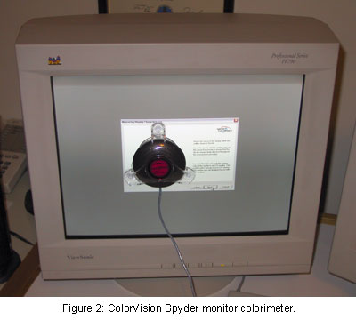
A far more accurate solution is to use profiling software products such as ColorVision PhotoCal or Monaco EZColor in tandem with a colorimeter (an inexpensive hardware device that measures emissive color) to measure the exact characteristics of your monitor. (See figure 2.) The monitor can be measured and reprofiled on a regular basis so that your profile is always accurate.
The cost of hardware and software bundles for building custom monitor profiles has become very affordable in the last few years. If you make a living as a photographer (or hope to) and will be making a serious transition to digital imaging, you can't afford not to use a hardware-based profiling package.
Input and Output Devices
Just as with monitors, most scanners and inkjet printers come with generic profiles. The quality of these profiles varies widely among manufacturers and can range from very good to very mediocre. Creating custom profiles for your scanner and printer, again using software from the aforementioned companies, will almost always improve the quality and accuracy of your scans and prints.
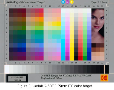 Scanners can be profiled by scanning an industry-standard color target, called an IT8 target. (See Figure 3.) The scan of the IT8 target is then analyzed by profiling software, compared to a pre-measured data file that is specific to a batch of targets, and a custom profile is generated. IT8 targets are available from Kodak, Fuji, Agfa and others in 35mm and 4x5" transparencies and 5x7" reflective prints. (You don't have to use an IT8 target from the same manufacturer as the film you are scanning. For example, profiles made using a Kodak transparency target will work perfectly well for scans of Fuji Velvia.)
Printer profiles must be created for each type of paper you will use. Not long ago, expensive hardware and software was required to create custom printer profiles. However, companies like ColorVision and Monaco Systems pioneered the use of inexpensive software and flatbed scanners to measure printed profile targets and build custom printer profiles. The quality of profiles generated by these software packages are surprisingly good and often a substantial improvement over a printer manufacturer's generic profiles.
The same companies also offer high-end software that works with spectrophotometers costing hundreds or thousands of dollars to build the highest quality profiles. However, an inexpensive alternative is to use remote profiling services available from Chromix or Profile City. Simply download their custom color target, print it on your printer and paper, and mail it to them. For $99.00, they will measure the target with their software and a spectrophotometer and email your custom profile to you, usually within a few days. This is a very cost-effective alternative if you print with relatively few different papers or do not wish to get involved with custom profiling yourself and desire very high quality results.
Just the Beginning
I've only scratched the surface of a very deep topic. Color management can seem bewildering at first and can get even more confusing as you learn more about it. However, the basic principle is very simple; a color management system uses device profiles to produce consistent color across all of your input, display and output devices.
In the next article in this series I will show you how to begin to put profiles to work. I'll discuss the simplest method for making accurate and consistent scans, the requirements for soft-proofing output in Photoshop 6, and how to make the most accurate inkjet prints using custom paper profiles. In addition, I'll discuss how to utilize a color-managed workflow even when you don't have a profile for your input device, as is the case for many digital cameras. Until then, I recommend you follow the links below for more information on the profiling products I've mentioned, as well as learn much more detail about how color management works.
|