|
|
 Why I Love the Blues
Text and photography Copyright Niall Benvie
As someone predisposed to lurk in the shadows on sunny days, I have developed a great liking for the blue bias, an emotional relief from the full-on red light which I customarily use at dawn and dusk. Sometimes, cool IS cool. Predicting the blues When we work in direct, low angle sunlight, we have a pretty good idea how those red wavelengths will appear on film: as seen, plus 10 if shooting on Velvia. Our visual system (brain and eye) might do a little bit of colour reinterpretation but not nearly as much as it does when we are in the shadows on a sunny day. Here, the automatic white balance which operates in our brains is adept at filtering out blues, instead giving the impression of tonal neutrality. For evidence of this bias towards favouring warm light, try looking out through a window at dusk while you stand in a room lit by (warm) tungsten light. The colours in the room seem quite normal while the view through the window looks very blue; this is the affect of the “white balance” correcting for the warm light. But if you stand outside and look in, while your surroundings may not appear particularly blue, neither will the artificially-lit room seem excessively orange or yellow. In practical terms, then, the colours you see in the shadows are more divergent from what film will record than those seen in open, low angle sunlight. And knowing just how those shadow colours will be rendered is central to the success of the search for the best blues. Surfaces
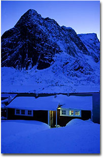
Some situations are sure-fire for getting strong blues. I know that if I shoot ice along a fjord edge while the shoreline is in shadow I will get good blues, even if my visual system tells me that the snow and ice is white. Likewise, low raking sunlight on sand ripples invariably sets up a strong contrast between the sides which are illuminated and those in shade. Slightly less predictable are pre-dawn and post-dusk intensities. In both cases, a clear or coloured sky and reflective surfaces are pre-requisites, but the saturation of the blue depends a lot on just how long before or after dawn or dusk you think you can keep shooting. It’s probably longer than you imagine, just as long as you compensate appropriately for reciprocity failure. In this respect, Provia and Astia have more favourable characteristics than Velvia (and many Kodak films, especially Kodachrome 64); in Provia’s case, it can be exposed for 2 minutes with only plus one stop of compensation and a correcting filter of 2.5 units of magenta to get rid of a green case. Astia will take up to 2 minutes with only plus half a stop and no correction. Velvia, on the other hand, calls for 4 seconds, plus one third of a stop and 5 units magenta, 8 seconds, plus a half stop and 7.5 M; 16 seconds, two thirds of a stop and 10M and for 32 seconds, the longest exposure approved by Fuji, one full stop plus 12.5M. Clearly then, your blues get some greens mixed amongst them if you risk excessively long exposures. The decision about when to shoot is to some degree determined by the brightness of any other light sources. In the case of the sřjhus at Reine in the Lofotens (image at the top of the page), I shot about 30 minutes after the sun had set on a clear day when I could get a reasonable mix of tungsten light from inside the cabin and strong blues as the snow reflected the sky colour. If I had left it any longer, a balanced exposure would have been trickier.
Reproducing colour While the quest for ”blue” bluebells is an annual ritual amongst some photographers, attention is normally paid only to film, lighting and filtration. I think that an even bigger problem comes when we try to convert these RGB values to the CMYK ones of output inks. If you use the Fuji Pictrography system or any other RGB photographic output devices, there is no problem. However, as soon as you try to convert into the CMYK values of an inkjet printer or offset press, even in an editing space as wide as Adobe 1998 or (my preference) ColourMatch RGB, a whole lot of those blues are suddenly ”out of gamut” - they cannot be replicated in CMYK. “Illegal colours” are shown by going to the View menu in PhotoShop and selecting Gamut Warning. If anyone else is scanning or printing your pictures, make sure they know that you aren’t a ketchup junkie and actually like the blue look. Niall Benvie - NPN 018 Comments on NPN nature photography articles? Send them to the editor. |
 A few years ago I read an article by a well-known Canadian wildlife
photographer in which he set out a ten-point formula for a commercially
successful wildlife photograph. His approach was cold-blooded, but nevertheless,
accurate not least in his advocacy of red as a way to get a
picture noticed on the lightbox. Put a picture of poppies along side one of
cornflowers and most undemanding users will go for the red hit. Red
wavelengths of light have of a natural point of focus beyond the retina,
requiring the lens to refocus every time they enter our eyes. This gives the
sensation of red as an advancing colour; it is stimulating. Blues, on the
other hand, appear to recede. They are not the natural territory of the
commercially hungry photographer.
A few years ago I read an article by a well-known Canadian wildlife
photographer in which he set out a ten-point formula for a commercially
successful wildlife photograph. His approach was cold-blooded, but nevertheless,
accurate not least in his advocacy of red as a way to get a
picture noticed on the lightbox. Put a picture of poppies along side one of
cornflowers and most undemanding users will go for the red hit. Red
wavelengths of light have of a natural point of focus beyond the retina,
requiring the lens to refocus every time they enter our eyes. This gives the
sensation of red as an advancing colour; it is stimulating. Blues, on the
other hand, appear to recede. They are not the natural territory of the
commercially hungry photographer.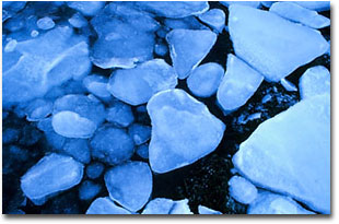 Pale or reflective surfaces such as sand, bleached wood, snow, ice and
water, are the natural hosts of blues picked up from the sky. Joe Cornish’s
expression, “borrowed light” perfectly summarises the process whereby
colours from beyond the shadows are introduced, setting up powerful
contrasts, contrasts that vanish as soon as the shadow is opened up by
direct sunlight. Overcast skies have no colour to lend.
Pale or reflective surfaces such as sand, bleached wood, snow, ice and
water, are the natural hosts of blues picked up from the sky. Joe Cornish’s
expression, “borrowed light” perfectly summarises the process whereby
colours from beyond the shadows are introduced, setting up powerful
contrasts, contrasts that vanish as soon as the shadow is opened up by
direct sunlight. Overcast skies have no colour to lend. 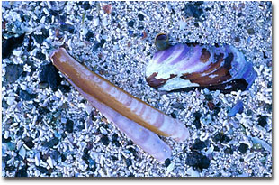 A recurring problem of shooting in the shadows is the loss of contrast,
denying shapes the expression of form through shadow. The light is flat; it
lacks brightness. The brightest light occurs just near the transition
between open sunlight and shadow. In the picture of the razor shell and
horse mussel, the sun had only just left the piece of beach as it was cast
into shadow by the mountain behind me. This particular Lofoten beach had a
high content of coral in the sand, ideal for reflecting the sky. If the
predominant hues in the picture are warm, then it is appropriate to correct
the cast with an 81a filter, although my personal preference is to challenge
our usual understanding of these colours by leaving them unfiltered.
A recurring problem of shooting in the shadows is the loss of contrast,
denying shapes the expression of form through shadow. The light is flat; it
lacks brightness. The brightest light occurs just near the transition
between open sunlight and shadow. In the picture of the razor shell and
horse mussel, the sun had only just left the piece of beach as it was cast
into shadow by the mountain behind me. This particular Lofoten beach had a
high content of coral in the sand, ideal for reflecting the sky. If the
predominant hues in the picture are warm, then it is appropriate to correct
the cast with an 81a filter, although my personal preference is to challenge
our usual understanding of these colours by leaving them unfiltered.|
|