Developing a "Field Strategy," or, Pass the Chiaroscuro, Please
Text and Photography Copyright Mark Hobson. All rights reserved.
In the photographic world, the word "field" generally has a single meaning for most, as in, I do most of my shooting in the field, or, these are some of the techniques I use when I am shooting in the field, or, I have a 4x5 field camera. Many are also familiar with the same word when used as, "He is outstanding in his field" (photography), which, of course, is distinctly different from the more agrarian usage, "he is out standing in his field" (of wildflowers, maybe).
Well, I’m not here to discuss any of those usages. I’m interested in dissecting the one that describes, according to Webster, the area visible through the lens of an optical instrument, or, more specifically, that same area/field when it is made visible on the surface of a two-dimensional photographic print. And to drive home an even finer point, the notion of field strategy as an alternative to what most would call composition.
In the "school of photography" (1 of the Big 4) that is most commonly practiced by NPNers, "Straight Photography" (pictures that show world as it is without manipulation - at least apparent manipulation), there are many commonly accepted and easily visually recognized "rules" of composition - rule of thirds, S curves, focal point/center of interest, leading lines, etc., etc., and etc. If you want to know more about rules, say goodbye to your family and friends and do a google of "photo composition". You should get about 1,390,000 results. It’s no wonder that many of you are confused about what constitutes "good" composition.
But, one thing that I know for sure about composition is that most of you are confused/bewildered about my techniques and subsequent results. Let me try to explain, not in an attempt to convince that my way is right, or that my photos deserve more "respect", but rather, to inform those who are here to learn that there are other ways of seeing (both in the field and on the print).
The key to the way I see lies in developing an MO that emphasizes an extreme awareness of the primary quality of the final product of my photographic labors - the 2-dimensional photographic print. I do not see the print as a transparent window to the"real world. Nothing about the print is real except the print itself. What lies on the flat-as-a-pancake surface (field) of the print is an image that is a relic or a trace of something that once was, or, as Gary Winogrand stated, "... what something looks like when it is photographed." In photography, that something must make the transition from 3-dimensional reality to a new reality that exists in a 2-dimensional state - the flat surface or visual field of the photographic print.
So, back to that word "field" again. I tend to see the world as a visual "field." I am not sure if this is preternatural or the result of years of photographic seeing. I do think that it has something to do with the way my brain assimilates and integrates what lies in my peripheral vision with what is in my primary field of view. The writer John McPhee described something similar to this about NBA great Bill Bradley (A Sense of Where You Are, Farrar, Strauss & Giroux). Bradley’s extraordinary perception of what was in his periphial vision, a sense that he deliberately developed, was what caused many of his teammates to sport bloodly lips and broken noses that resulted from being the unsuspecting reciptiants of many an improbable and unexpected pass. As far as I am aware, my vision is normal in all other respects.
What this visual idiosyncrasy seems to make me sensitive to or aware of is relationships - of tones, textures, colors, and shapes somewhat independently of the objects and space that they help describe - and how they create a unified visual "whole" within my field of vision and on the flat, 2-dimensional plane of the photographic print. I "see" the space that objects in my photograph occupy and the spaces between and around them as shapes arranged across a visual field.
As an example, in a scene that contains a red ball and a blue box on a green lawn, I see red juxtaposed with blue and green almost more than I see a ball and a box and grass. I see a circle, a rectangle and a plane of texture almost more than i see a ball, a box and grass. And, I am keenly aware of their relationships to each other and how they integrate into a visual whole. My vision emphasizes holistic visual fields as opposed to discrete individual details within the field. This personal visual phenomenon is also how I see photographic prints.
The result for me (and many others - see the work of Eggleston, Meyerowitz, Shore, et al) is a decided slant towards the creation and appreciation of non-hierarchical "composition" in my photography. To my eye, subject and its visual essence are indivisible. Every tone, texture, color and shape is used for its expressive potential as well as its structural function. In manner similiar to Abstract Expressionist painting, the space-shapes and objects in my photographs are like interlocking pieces of a jig-saw puzzle which come together as a continuous visual plane, but unlike that style of painting, my photographs are also like a window through which the observer can recognize familiar notions of navigable space and discernable subject matter.
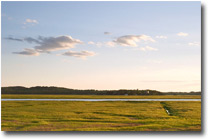
"House of Evening."
Image copright Ana Licuanan
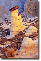
Image copright Tony Kuyper
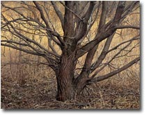
Image copright Michel Legendre
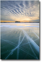
Image copright Eric Fredine
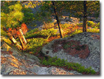
Image copright Mark Hobson
|
|
This deliberate, delicately adjusted, almost invisible equilibrium between form and content (abstraction and reality) creates a visual structure where conspicuous design is not instantaneously apparent. Since the subject matter has not been bullied into exaggerated angles (according to the rules) or supersaturated colors, most find the photographs lacking a "compelling" quality (I often hear on NPN that my photographs are "interesting but not "compelling"). Many see the photos as altogether misssing an obvious subject and composition. (again, I hear "no strong COI, FP" etc., or, the ever-popular, "I don’t know what this photo is about").
OK, but to my eye, the visual texture or energy of my photographs comes from an optical blend of individual components, delineated with utmost specificity, that are presented in a manner calculated to emphasize the subject’s cumulative, rather than individual, visual appearance.
To put it in a compositional nutshell or my idea of a field strategy, I coopt visual sections of the 3-dimensional world to function both as representations of recognizable things and as carefully arranged and chromatically co-ordinated 2-dimensional shapes, which come together as a unified, decorative "composition" or "whole" that emphasizes cumulative appearance and impression.
In the field (as in "out in the field") I have found that there is nothing better than a view camera’s ground glass (or its equivalent - the focusing screen of an slr/tlr without a prism or a lcd screen) as an "aid" for developing/implementing a field strategy approach to photography. If you "see" the image on the ground glass/screen in its 2-dimensional aspect, "relationships" become much more obvious and visible than they are through the "real-time" vision of a pentaprism. I find that prism view finders visually transmit 3-dimensional information in a manner that a direct view of a flat ground glass or focusing screen does not. The projected image on a ground glass is already making it’s way to a 2-dimensional representation.
To wit, by looking at the image on a flat plane, I see the scene not as the real thing, but as the photographic transformation of the thing - two very different mental and visual constructs. "Really."
And while we’re on the subject of the formal organization of 2-dimensional space, I would be deficient in my duties as the resident NPN "Agent Provocateur" if I didn’t use this opportunity to fire another shot across the bow in the ongoing "home-school" vs "educated" battle for the heart and minds of the photographic public. The formal organization of 2-dimensional space (a formal characteristic that photography shares with painting) is much appreciated and highly regarded quality by the mucho-maligned "Art World" crowd. They are looking for something more subtle and intellectually/emotionally challenging than the standard, by-the-book type of composition. For those of you that feel backed into a corner by this statement, remember, this is just a matter of "taste". And besides, relax, you definitely have the upper hand in the audience-appreciation consolation race.
About the photos...
Editor's note - thumbnails are links to to larger images presented in slide show format.
Try viewing these photographs, not just as literal documents of what they represent, but also as flat, featureless planes of abstract tones, colors, and shapes. At first, this is not an easy thing to do. Try moving way away from the screen to a point where discrete details start to disappear. Squint. Whatever. Just keep trying. Once you start to see in this manner, you are on your way to developing your own field straegy. Remember also that this is not suggested as the only way of seeing, but as an additional way of seeing that can dramatically enhance the way you photograph and view the photography of others. As always, wear a seatbelt and don’t hurt yourself.
I have seen only a handful of photographs (some of Eric Fredine’s, Michel Legendre’s and Tony Kuyper’s come immediately to mind) on NPN that illustrate my idea of Field Strategy better than Ana’s "House of Evening". I use it as an example here because I believe that it deserves more attention. "House of Evening" is an excellent demonstration of "cumulative impression."
By her own admission, Ana was "trying to capture the open feeling of the landscape." As such, the photograph does not appear to be subject driven. Like much of her photography that I have seen, she definitely seems to favor content (emotion, intellect, "feel") over form (subject). Most often, her subject(s) seems to exist only as a carrier through which she conveys rich content, but I think that that is not the case. Ana seems to realize that subject and its visual essence are indivisible.
In "House of Evening" there is only a little evidence of traditional rules of composition, and that is not a surprise since she also states that "...there wasn’t a lot of conscious thought (author’s note - about composition) that went into this." Her MO is similar to mine - "Most of the time, something catches my (Ana) eye and I sort of get "tunnel vision" and this one thing I’m focused on is making me feel "something" (whatever it is) and everything else is sort of in flux around it. And I tend to just zoom around until it seems like the background is in balance with whatever I’m obsessing over."
The photographic result of all of this seems, at first/casual glance, to be about very little specifically. It drew little response and only 50ish views, many of which were mine.
The "composition" is remarkably unaffected, yet subtly sophisticated - what Stephen Shore calls "consciously casual". While the photograph works modestly well as a picture of a house, grass, water and sky - it really is all about what she says it is, "open". The photograph creates a mood, establishes a feeling, and conveys a sense of place, all without resorting to any photographic cheap tricks. It whispers and seduces with a sly, quiet, contemplative character (right Ana?). "House of Evening" is honest, straight-forward and from-the-heart in an intuitive manner that so many wish to emulate, but so few actually accomplish.
Show us more Ana. Kudos to Fredine, Kuyper, and Legendre. Your photography rarely fails to intrigue.
Mark Hobson’s Photo Workshops feature the Digital Darkroom. For more info click here.
Comments on NPN creative photography articles? Send them to the editor.
MH-NPN 1196
 MARK HOBSON is a family guy lucky enough to be living in his favorite place on earth, the Adirondacks. A former agency creative director and commercial photographer, Mark has brought his love of the wilderness and photography together to form Nessmuk & Stoddard Trekking.
Mark's photography has been used by Fortune 500s such as Kodak, Xerox, Heinz, PPG, and Bausch & Lomb. As a creative director he has produced campaigns for clients such as; I LOVE NY, Lake Placid, The Adirondacks, Cooperstown and the Finger Lakes.
His Adirondack photography has been exhibited in galleries in the NE. He has won recognition as a repeat finalist in the Carnegie International Nature Photo Competition. Mark has also been a judge for the Kodak International Snapshot Competition as well as the Kodak Camera Club.
Mark offers comprehensive written portfolio reviews for amateur and professional photographers. Contact him at photoworkshop@charter.net for details.
Be sure to visit Mark's website at www.adirondacklight.net.
Comments on NPN landscape photography articles? Send them to the editor.


|