The Power of Saturation
Copyright Tim Grey - All rights reserved.
There is a surprising amount of power hidden in the Hue/Saturation adjustment in Photoshop. Most photographers tend to use it for only one thing – increasing the saturation of their images to give the colors more “pop”. But there is much more control you can exercise with this little dialog box, so let’s take a look at what it has to offer.
Master Saturation
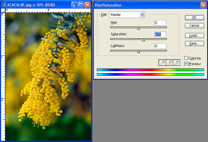
The Saturation slider in the Hue/Saturation dialog box is the most common use for this control. Generally speaking, it is used to increase the saturation of an image. When you increase saturation, you are increasing the purity of the colors in the image. Ultimately, you can increase saturation so much that there are only six colors in the image – the additive and subtractive primary colors of red, green, blue, cyan, magenta, and yellow.
When increasing saturation, there are two problems to watch out for. The first is the creation of artificial colors in your image. Some shades of green are only found on golf courses, not in the “real world”. If you increase saturation too much, the image will look fake, and the viewer won’t believe it is a genuine photograph.
The other potential problem with increasing saturation involves the loss of detail in saturated areas. As you increase saturation, more and more pixels are shifted toward the purest colors. The result is a loss of detail in the highly saturated areas of your image.
As a general rule, I am very careful about increasing saturation above a value of about +20. That doesn’t mean I’ll never increase saturation beyond that level, but if I increase above that I’ll be sure to take a close look at the image to be sure I’m not creating problems.
While you wouldn’t generally increase the saturation too much, doing so can be helpful in evaluating your images. Simply increase the saturation all the way to +100, and you’ll get a very good idea of what colors are located in your image. This can be very helpful for knowing what adjustments are necessary or what problems to watch for.
A less commonly used option in the Hue/Saturation dialog box is to actually reduce the saturation level. Most photographers are trying to add snap to the colors in their images, but there are certainly many situations where you may want to reduce the saturation in an image. A common example would be an ethereal flower photograph or an image you want to present as a watercolor interpretation. In those cases you may actually want to mute the colors slightly. Simply reduce the saturation to achieve the look you are going for. While you can reduce the saturation all the way down to a -100 value to produce a black & white image, this isn’t the best method for converting a color image to black & white.
Desaturate a Color
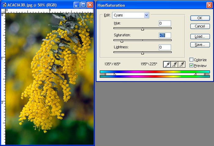
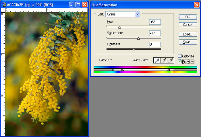
Another great use of the Hue/Saturation dialog box allows you to eliminate problem colors in your image. For example, in many landscape shots you will see magenta in the haze caused by atmospheric scatter. You may be able to correct this by selecting the Magenta channel from the dropdown at the top of the Hue/Saturation dialog box and reducing the Saturation for that color only.
You can often reduce the saturation of a particular color completely, but you’ll want to be sure that it doesn’t cause problems in other areas of the image. Just because you want to get rid of a color in one area of an image doesn’t mean you can get rid of it globally throughout the image.
Saturate a Color
Similar to the option of removing unwanted colors is the ability to enhance colors individually. For example, if you photograph a field of flowers, you may want to increase the saturation of the red flowers to a higher degree than the yellow flowers. You could simply select each color channel in turn, increasing the saturation for just that range of colors as you see fit.
Hue Shift
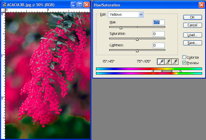
The Hue control in the Hue/Saturation dialog box should almost always be ignored when it comes to “normal” photographic images. It causes all colors in the image to be shifted in value in a linear fashion. This is very different from a color balance adjustment, in that the color shift only occurs along a single axis, rather than the three axes used with color balance adjustments.
However, there are situations where you might want to use the Hue control (besides the creation of psychedelic images). That is to apply a hue shift to a specific color range. First, select the color channel you would like to adjust from the dropdown at the top of the Hue/Saturation dialog box. Then slide the Hue slider to change the hue (what we would normally call the “color”) of the selected color range.
Adjusting Color Ranges
I’ve talked about a variety of adjustments you can make that apply to a specific range of colors. However, so far the range has been limited by those colors available from the dropdown list, which represents the additive and subtractive primary colors.
Often, you’ll want to be a bit more specific about the range of colors you are adjusting in the image. Fortunately, the Hue/Saturation dialog box offers a tremendous amount of control along these lines.
The first step is to select the color channel you want to start with from the dropdown list at the top of the dialog box. Once you have selected a color channel other than “Master”, the eyedroppers will become available. The first eyedropper allows you to click on an area of the image to define the basic color you want to adjust in the image. You can also use the “plus” and “minus” eyedroppers to add and subtract colors from the range you will edit. Note that the colors you can edit will always be a continuous range of colors. You can’t pick and choose a variety of non-contiguous colors from the range available.
Selecting a specific color you want to adjust is a good start, but you can also manually adjust the range of colors. Once you have selected a starting point, you can fine-tune the range of colors you want to adjust. This is done along the color bars that appear at the bottom of the dialog box.
There are two color bars displayed. Both represent a color wheel that has been “unrolled” to display the range of colors in a straight line. The top color bar represents the “before” values, and the bottom color bar represents the “after” values. If you slide the Hue slider, you’ll see the bottom bar shift left or right. If you adjust Saturation you’ll see the colors in the bottom bar get more or less vibrant.
Between those two color bars are the controls that define the range of colors your adjustment will affect. The vertical bars represent the range of colors that will be affected in full by the adjustments you make. The triangles outside these vertical bars can be thought of as something like feathering. They affect how gradual the transition is between colors that are affected by your changes and colors that aren’t.
What I generally find most helpful is to start with a basic range of colors, defined by clicking with the eyedropper on a specific color I want to adjust. I then make the adjustment that I want to apply to that area. Chances are the change will affect a different range of colors than I had intended. I can then adjust the range of colors that are affected by sliding the vertical bars left or right. I can also adjust the “feathering” of the adjustment by fine-tuning the position of the triangles outside the vertical bars.
Controlling Color
By controlling the specific range of colors that are affected by the changes you make, the Hue/Saturation dialog box suddenly becomes much more powerful. It can help you fine-tune the colors in your images with great control, producing subtle improvements that would be difficult or impossible with any other control available.
Tim Grey - NPN 019
Comments on NPN digital photography articles? Send them to the editor.
 About Tim Grey...
Tim enjoys sharing information about digital imaging as much as he enjoys learning it in the first place. Tim publishes an almost-daily Digital Darkroom Questions (DDQ) e-mail service that provides a forum for photographers to have their questions related to the digital darkroom answered. He is editor of The Digital Image, a quarterly journal published by George Lepp. He also teaches courses to help photographers master the digital darkroom at the Lepp Institute of Digital Imaging.
Tim can be contacted at tim@timgrey.com.


|