|
Collecting Original Photographs
Text and photography copyright © Alain Briot. All rights reserved.
1 - Introduction
I am always surprised when I think of how few fine art photographers collect fine art photographs. I don't mean collect their own work, I mean collect the work of other photographers. Certainly, a number of photographers have collections of photographs but this is not a widespread practice. Often, when this subject is mentioned, the question of cost is brought up as a reason for not building a collection. The fact is that most fine art prints, in 16x20 matted size, by reputed living photographers, cost far less than say a camera, considerably less than most lenses, often less than a full version of Photoshop, and sometimes less than the upgrade to next version. I use these as price references because those are items we all purchase in the course of doing photography.
Here are the facts: original fine art prints by well-known living photographers, in 16x20 size, cost from $175 to $650 (US Dollars) on average. Cheap? Expensive? It all depends on how you look at it and on what your disposable income is. However, most of those who can afford to practice digital photography, to upgrade their equipment and software regularly, and to attend workshops and seminars can also afford to build a private collection of fine art photographs.
I personally have such a collection, and the prices I paid for each print are within the range I just mentioned, except for an image by Edward Weston, printed by his son Cole, that cost me $3000. But then this print is not by a living photographer, placing it in an entirely different price range.
2 - Living or, well, dead?
It is a commonplace joke among artists that the best way to raise your prices is to die. Good idea, but the problem is that it is a one-way street. Your prices may rise, but you won't be there to enjoy the rewards. Tough news for artists. Good news for collectors. The minute you divide fine art prints into two categories - prints from famous living photographers and prints from famous dead photographers - it becomes clear that the former are significantly more affordable than the latter. The other good news is that there are many famous living photographers offering beautiful prints, making building a collection a rewarding experience that doesn't have to break the bank.
3 - You won't take the same photographs
So why aren't there more photographers collecting fine art prints? I am qualified to answer this question because until maybe 5- to 7-years ago I wasn't collecting photographs myself despite practicing photography since 1980.
I believe that there are several reasons why photographers rarely collect photographs. With landscape photography, for a long time I was fooled into thinking that if I would find the location of the photograph that so enthralled me, that if I would go to this location, that if I would use the same equipment that the photographer whose work I admired used, that somehow, someday, I could get the same shot. Maybe not on the first try. Maybe not on the second try. But somehow, I was going to get lucky over time. Finally, somehow, I was going to learn how to print like the master whose work I admired. Maybe...
Example I
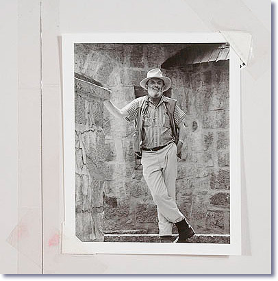
Ansel Adams Portrait / Al Weber
At 4"x5" this image is the smallest in my collection. It is a unique portrait of Ansel Adams that I have never seen in print, or anywhere else for that matter. Al Weber printed about 20 copies for the members of his Annual Photographer's Gatherings a few years back and I was one of the lucky few to get a copy, having attended the gathering. It's value, to me, is as much in the contents of the image as in the print quality and the author.
The photograph is held to archival board with plastic corners taped to the mat. While this looks a little "risky", both the tape and the corners are archival and are not harmful to the photograph in any way. However, this print would need to be matted if it was to be displayed.
The tones are delicate and subtle, a feature that, as we will see, is a very important quality in a fine art print.
|
The problem is that "maybe" doesn't quite cut it. And the fact is that it won't happen. Certainly, there is nothing that prevents any of us from going to the same locations, using the same equipment, learning to print better (or print like the photographers we admire), and so on. But, there is one thing that cannot be done by any of us, and that is recreate the exact moment that was captured in the images that we love - the images that someone else created. That moment is gone forever. It existed once and the next moment was, is, and always will be different. Always.
There is another thing we cannot recreate and that is the exact vision of the original artist. It is often all in the details, in the little things that - in our frantic desire to go there and take the photo ourselves - we overlook: the feeling that a particular image has, the emotions it brings out in us, the exact nature of the work of art that stands in front of us. It would be like wanting to play a musical composition ourselves rather than purchasing the CD on which it is available or instead of attending a concert by the original artist. Certainly, nothing prevents us from doing so, and nothing is impossible in this regard, but the interpretation that we love so much won't be the same as our interpretation. The feeling, the soul, the emotional content, the inspiration, in a word - the delivery, won't be the same. It won't be the same because we are not the same person. We are not them. We are ourselves, each and every one of us, with unique feelings and emotions, and with a unique vision of the world.
It is for this reason and for this reason mainly that I collect other photographers' work - not because I cannot do what they do, but because each fine art photograph is a unique vision of the world, a unique account of how someone else saw what we can each see and photograph individually. I collect their work because their vision stands alone and embodies something that cannot be embodied in another image. Only by understanding this fact can we realize that our own images - the images we create ourselves without external influences in regard to vision, location and equipment - embody the same exact qualities. And, that if the technical aspects of our craft as similar to those of the masters we admire and desire to emulate, we will, in our turn, have images that possess these very same qualities and will evoke in others the exact same reactions. It is a circle, a continuum, a constant rediscovery of things eternal. As photographers who collect fine art photographs, we enter this circle with the full strength of our passion and of our desire to learn.
4 - Why collect photographs
This is an important question. After all, the case can be made that one can simply go to a museum or a gallery and study, admire and learn from the prints exhibited there.
This is certainly true and it may work for some. Unfortunately it doesn't work for me anymore than looking at a Porsche in a dealership works in regards to giving me the feeling I get from owning one. Here too the case can be made that I can take a ride with a friend, or with the car salesman. Indeed. And while this will no doubt be an enjoyable experience, and one that I would highly recommend if you are so inclined, it will do little more than whet your appetite for the real thing.
Example II
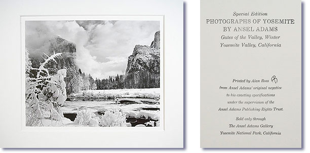
Gates of the Valley, Winter / Ansel Adams
This photograph is part of the Yosemite Special Edition series of Ansel Adams Photographs printed by Alan Ross. It is not signed by Adams, but is initialed by Alan Ross on the back together with the stamped information that is featured above.
The print quality is excellent, though not 100% similar to that of a print made by Adams. The price however cannot be beaten. I purchased the one above in 1986 and paid $75 for it including shipping if I remember well. At the time this essay is written they are $175 plus shipping unframed, still an excellent value.
In 1986 the photographs came dry mounted but not matted. Today they come dry mounted and matted plus they carry a special Ansel Adams embossed stamp on the middle front of the mat.
In my view the Yosemite Special Edition collection is a great way to start a collection of original photographs at a relatively low cost.
|
For me the true pleasure of ownership, be it sport cars, original photographs or other, is in having access to them at any time. In regards to photographs, I want to mention that it is one thing to look at a fine print in a gallery, during open hours and with potentially other visitors and curators around you, and an entirely different experience to look at the same print in the privacy of your home, without anyone to influence your judgment, to be able to place other photographs next to a specific print to see how they compare, or how they echo from one to the other, or how close one of your prints is in comparison to that one specific print.
It is a privileged experience to be able to control the amount of light falling onto the print, as well as the ambiance in which you are viewing it. Personally, I like to look at prints late at night, when all is quiet and everyone is asleep, and take my time observing them under different lighting situations, placing my Solux lights closer or further away, or at various angles, trying to see the images in a new manner. Being the owner, I can do away with glass and framing if I so desire, and look at the print the way the artist saw it coming out of the developer or out of the inkjet printer. I can study how the print was signed, mounted and matted, and look at the most intimate details of the artwork. I derive a lot of pleasure from this unrestrained access to the works of art in my collection.
5 - Originals and reproductions
As photographers, we create fine art prints because they are the most sophisticated and most beautiful way to show our work. If we exhibit or sell our work, a fine art print is the final step in a long process. It is the finest expression of our efforts, the one we are most proud of, the one we want others to see.
Yet, when we look at the work of other photographers, we rarely look at fine art prints. Most commonly we look at reproductions of various types, be it web images, books, or magazines. Each reproduction, as the name implies, is an attempt to reproduce the original. Nearly always, reproductions are inaccurate duplications of the original. In these duplications, something gets lost. The reproduction, as a result, is less than the original. Some of the qualities of the original make it into the reproduction, but not all. Some qualities are lost in the process, and will never be available to those who only see the reproductions.
Some would say that little of the original, if any, is left in a reproduction. Without going this far, I can say for sure that it is often the most important aspects of the original that are lost. Why? Because the most important aspects of a work of art are the most delicate and subtle aspects. Because reproductions by nature aim at capturing the main characteristics of an original, the ones that are the most immediately noticeable. Often, little concern is given to those more elusive and less prominent aspects.
Think of it in terms of music and compare a concert of your favorite music to a radio broadcast of this concert listened to in a noisy environment on a below-par radio. What do you hear on the radio? In essence, you hear the main instruments playing the most noticeable notes. You hear the main melody. What do you not hear? You do not hear the instruments that play more softly, or which play a secondary role, or play a more delicate melody, or are in the background in terms of musical space rendering. You do not hear instruments whose melody is muted, or softer, or more sophisticated. What is lost between the concert hall and the sub-par radio broadcast could be summed up as being sophistication, or the richness of sound, or the three-dimensional quality of the piece. What is lost is the ability to concentrate on a single instrument or musician playing in the background, or rather the ability to isolate this instrument among all the others. Above all, what is lost is the possibility to study this musical composition in order to learn something you may have missed or that you did not realize was in it before. Why? Simply because in order to hear a familiar composition all over again, as if it was new, as if you listened to it for the first time, you need to hear every note in the performance; you need to hear the full breadth of the composition - with every note rendered as precisely as possible. The best way to do that is in a concert, or, in the case of music, in a fine recording played on a high-end stereo system.
With photography, no reproduction can capture the full breadth of the original. Some will say it is the same with music, and I won't argue - this isn't the place or the time. Let's just say that with photography the finest original is the original print and the original print only.
6 - How it is done
We all wonder how other photographers do it - how they create their finest images. In particular, we wonder how those we admire -the masters- create their images. We buy books, attend workshops, and study their writings. And yet, what better and simpler way is there to learn how they do what they do than by studying the fruits of their labor: their original prints? After all this is the end product - the final conclusion of their efforts, the legacy they want to leave us with. In it are all the secrets that we try so hard to uncover.
The final print is the outcome of the finest printing methods each particular photographer had developed to best express his or her vision. Certainly, the individual steps that led to the creation of this print are not visible per se, but the expression of the artist - the score's performance of that artist - is there in front of us. In this performance is the impression that artist wants to leave with us. In this performance are the emotions the artist wants to express and share with us. In this performance is his or her message, neatly contained in a simple yet powerful form.
But there is more. Besides the print we have the mounting, as well as the presentation, the labeling, and the packaging of the image. We have the letters and invoices that usually accompany each print. If shipped, we have the shipping materials and packaging method. Each step in this process, though simple and to some extent transparent in itself, shows unique choices that vary from one photographer to another. With the discovery of each step, powerful lessons are learned regarding how other photographers conduct their business. These lessons teach us how we can do it too and, by comparing these approaches to our own, allow us to find out how we can improve, or how things can be done differently. All in all, each step reveals the unique approach that specific photographers have chosen to use.
Example III
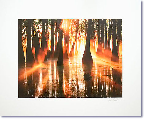
Cypress Swamp / David Muench
I ordered this original print because I loved the image as published in one of Muench's coffee-table books. However, when I received the print I was disappointed because the tones are not significantly richer, or "better" than the ones in the book. It is also interesting to note that out of the 6 examples in this essay, this is the one that reproduces the best as a low-resolution photograph of an original print. The other original prints reproduce very poorly in my photographs, some losing most of their attractive qualities in the process.
So what should I conclude from these facts? My opinion is first that the scan and the master file were not optimized as well as they possibly could. I believe that a richer range of tones can be obtained from the original. Second, my opinion is that this image was scanned and optimized for book reproduction, which means using offset printing in a CMYK color space, and then printed from the same original using an inkjet printer. I do not know the printer used, and this may be a limitation as well. I also suspect that in addition to the color space, the ink set may be further limiting the color gamut. I would love to know the exact image-enhancing and printing workflow used to better assess the reasons. It is my belief that a far better print can be made from it, one that sings rather than shout. In many ways, this print is the opposite in approach of the Edward Weston print that I discuss below. In the Weston print there are no extreme black and white values, there is only a wonderful range of grey tones. In the Muench print the opposite is true: there are mostly extreme values - deep blacks and almost pure whites with yellow and orange overtones - with a minimal range of tones in between. The image reproduces well in printing processes that reduce the range of tones, because there is such a small range to start with. The Weston print on the other hand would reproduce poorly in printing processes that reduce the range of tones because such reduction would mean diminishing the interest of the image.
|
7 - Art all around
I don't just create and collect art. I surround myself with art. I won't go as far as to say that everything in my life involves art but I apply it in as many aspects as I can. Besides collecting fine-art photographs, I also collect paintings, Indian art, automotive art, and other. I also buy real-estate for its aesthetic qualities, often with the intended goal of photographing specific parts or areas. I love gardening and landscaping and choose plants for their aesthetic qualities, and use it as a creative outlet. I practice other arts forms such as painting, leatherwork, drawing, and more. I love music and I love to listen to the same compositions over and over again. I love literature, philosophy, rhetoric, and critical theory. I love home-decorating, which to me is an art form in itself. I am sure that many other of my activities qualify as art also, but these are just the ones that come to mind right now. In short, art is something that I see in many places and something I practice on a day-to-day basis.
Why? Because art is not just something that has to be seen. Certainly, photography and all other visual arts have to be seen but, above all, and in order to reach another level of art appreciation, art is something that has to be experienced. In fact, art must be experienced. And, while experiencing it in museums and galleries is a good thing, museums and galleries do not allow one to go as far as one can with a piece that one owns and has access to at any time of the day or night.
Certainly there are pieces that one cannot own. I cannot own the Mona Lisa and, of course, a reproduction won't do so the only option is going to France, waiting in line, and admiring it in the Louvre. Pick a slow day so you can look at it longer than most do, and bear with the tinted glass while tourists using flash cameras cause the light to go on and off. It is a pity that one of the most beautiful paintings is so difficult to enjoy. At home, on the other hand, I can set up the lighting on each of the pieces in my collection just so, using a color-balanced light source and the exact angle of light I desire to bring out the details or to prevent glare, until it suits my taste perfectly. And, of course, there are no tourists to ruin the experience.
Art needs good lighting to be truly enjoyed and to reveal each subtle detail. I often pick up one of my Hopi Kachinas late at night and set it on a table with just the right amount of light and then spend hours looking at it, studying it from various angles. I do the same with photographs or with paintings - especially with paintings - setting the angle of the light so it grazes the surface of the painting so as to reveal the texture in the paint, outlining each brush stroke in a way that I couldn't see in a gallery where the light comes from above or from the front, but rarely sideways.
I like to look at the colors under controlled light to see them as the artist saw them, to compare the color quality of one specific area to that of another, or to compare the color of two different pieces; for example, a painting and a photograph. I compare tone, hue, and chroma, studying how artists working in two different mediums, both doing landscapes, have used similar colors to express their individual vision. Eventually, all good works of art have many things in common, one of the most important being the ability to surprise us, letting us discover something new just when we thought we knew it inside out.
Example IV
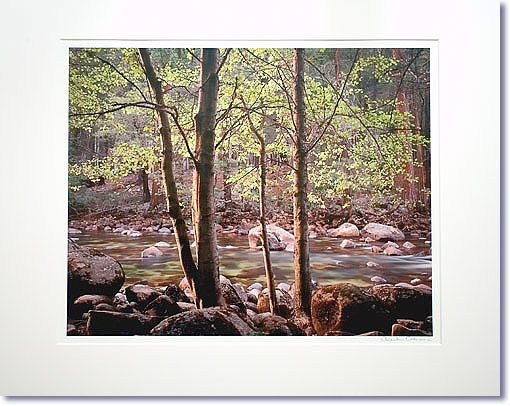
Trees and Rocks, Merced River, Yosemite / Charlie Cramer
This print is unlike the way I print my own work. I personally like to print with open shadows, so that details are visible everywhere. When this is not possible, due to the inability to capture the entire dynamic range of the scene, I usually resort to render the shadows as pure black. Such is my taste.
Here Charles Cramer decided to print the darkest tones of the image with barely a touch of detail. In a way, it can be said that the darkest tones of this print hang on the verge of being pure black while retaining a subtle touch of detail and color. They are, definitely, as far on the edge as tones can ever get.
The same is true, to a lesser extent, for the highlight areas of the print which, here too, hang on the verge of losing detail and color. Yet, this is less so than the shadows, probably because highlight areas are smaller than the shadows in this image.
The result, in my eyes, is a wonderful print full of brilliance, a print that shines with the presence of a very broad range of tones between highlights and shadows. This range of tones is what creates the mood and the delicate quality of this image, beautifully emphasizing the feeling of light filtering through the underwood and shining upon the open area of the river. When looking at the print, I feel as if I were there. The darker tones in the foreground of the image remind me of how easily the light and pure colors depicted in the upper areas can fall into muddy tones, should the light suddenly change and should the scene lose its luminous quality as a result. In a way, the tones that I find objectionable are a reminder that beauty is often a temporary situation.
|
Example V
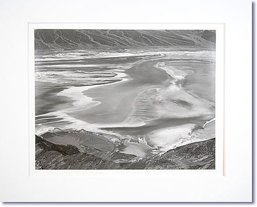
Dante's View, Death Valley / Edward Weston, printed by Cole Weston
What surprised me when I first received this original print was how soft the tones are. I expected a darker and more contrasty print. Instead, I received an image with very subtle tones, tones that had me almost to the point of asking for more contrast: deeper blacks and higher contrast, please!
And yet, upon close inspection, and after having allowed the print to "talk" and the image to express itself, it became clear that the tonality of the print was just right and that these tones let the composition take over rather than having the contrast dominate the composition. It became obvious that more contrast would have attracted attention locally instead of globally, and that there would have been a clash between tones and composition. For example, the white streaks of salt in the valley would have become whiter, and more contrast between white and dark tones would have resulted. The use of white in areas that are not really highlights is very challenging. Here, the solution used by Weston was to limit the contrast, thereby drawing the eye to the composition rather than to the individual tones.
In a sense what Weston is showing us is the importance that subtle tones can play in a photographic image. The absence of pure black and pure white forces us to study the grey tones carefully because this is all we have. In completing this study we immerse ourselves in the delicate tones of the image until we realize that this is what this image is all about: a collection of delicate tones and shapes. If solid black and white areas had jumped at us immediately we would have been mesmerized by those and would not have paid attention to the delicate greys. In fact, if the artist had elected to emphasize deep blacks and glaring whites, it is most likely that he would not have put forth the effort of developing the grey tones to the extent Weston did in this print, preferring to rely on the immediate impact of high contrast to capture the audience's interest.
|
8 - Making it real
In a way, looking at an original print of an image you previously saw as a reproduction is having this image become real. It is akin to having this image become what it truly is. It is making it reveal itself to you. It is removing all doubts about what the original really looks like. Things are now clear: the image is as it is in front of you. There are no longer doubts about what may have been lost in the reproduction, about whether the tones are more or less saturated than you see them, about whether the contrast is higher or lower, or about whether the colors are more or less real than on the web, in the book, in the magazine, or in the brochure. The colors, the tones, everything is now there, in front of you, exactly as the photographer intended it to be. The mystery is gone, and at the same time the magic has just started because a fine print talks to you in a way that a reproduction never will. What it says is why I collect fine art prints. It is addictive.
9 - Learning
Studying the prints of another photographer is also about learning the choices that this photographer made for a specific image. These choices are most likely different from the ones we would have made ourselves. By learning about these alternatives, we learn another way of doing what we do. Often, this results in a deeper understanding of the printing process as a whole. In turn, we incorporate what we learned in our own work, resulting in prints that are more sophisticated, more refined, more elegant.
I personally believe that a fine print is a print that is refined and elegant. A print that surprises rather than shocks, a print that reveals itself over time, a print whose true beauty unfolds slowly, upon close inspection and after careful study. Certainly, the gist of the image is there for us to see right away, at first glance. But more is in store for those who take the time to observe it at length. In other words - a fine print affords multiple levels of involvement in the image.
A fine art print demonstrates a total understanding not only of the printing process but also of the nature of the composition and of the relationships between tones, hues, and chroma. The print is the proof - the evidence - that this understanding was achieved by the printer. We often believe that the proof of such understanding is in books written on these subjects. However, books are only the repositories - the record of formal knowledge. They are certainly important but they are only road maps, guides, and teaching tools. Prints, on the other hand, are the performance - the implementation of this knowledge. They are the living proof that formal knowledge can be implemented in works that capture our imagination like no textbook ever will.
10 - What if
You may not be in a position to collect fine art prints. In this case, attending shows is your best bet to see original prints. However, be aware of the following potential shortcomings of shows:
- The lighting may not be optimal. In fact, it may be far from that. It may sound hard to believe but it is a fact. I saw a show of Ansel Adams' work at the Scottsdale Art Museum a couple of years ago and the lighting was so atrocious that it made me question why I was so passionate about his prints. So, take a good look at the lighting. You will notice that the lights are not always color-calibrated, are not always powerful enough, and are not always at the right angle.
- Glass sits between you and the print. This is a huge problem at shows and in any display of art framed under glass. Regular glass causes reflections and non-glare glass reduces contrast and sharpness. Furthermore, certain types of glass give a tint to the print. This tint is usually green but can be of another color as well. This tint is faint, but it is there, and the artist definitely did not intend it.
Example VI
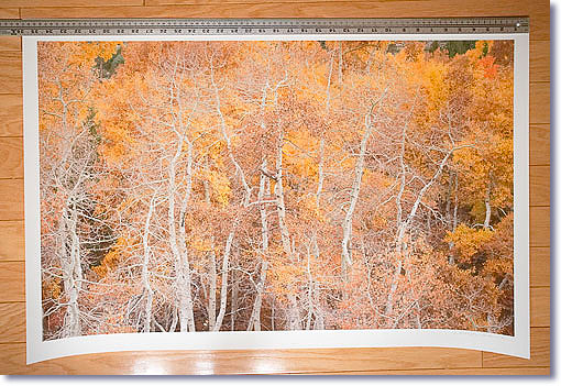
Aspens, Eastern Sierra 2006 / Joseph Holmes
This image was created by stitching together about 12 frames taken with a Canon 5D camera. The resulting image has as much detail as a single film capture from a 4x5 camera. One of the qualities of this print is therefore the level of detail, hence the need for a relatively large print size. In this instance, the print is 35" wide. Because this print is unmatted, I placed a heavy ruler at the top to keep it from curling. Incidentally, it also provides a reference point for the print size.
There are only minute areas of pure black in this print, those being under the trees in the darkest shadow areas. There are a lot of high tones but few pure highlights. In a pattern that we can now see as being somewhat expected, the beauty of this print comes from the extensive range of tones between black and white - from the wide gamut of yellows and browns, and from the way the whites merge with these instead of being separated from them.
The small areas of low-saturation greens and reds add touches of color that expand the gamut, as if to tell us that there are other colors out there, although right now the world we are looking at is essentially about whites and yellows, as well as about the complex intertwined shapes of the aspen boles. These shapes, which stand in the forefront of this mid-telephoto image, make the front of the image a performance, so to speak, that takes place against a backdrop of yellow and brown leaf cover.
|
- Other people may be waiting so see the same prints and competing for space. In other words, the viewing environment may be far from optimal. You also have to stand in front of the print, which can get tiring. The Louvre, and a few other museums, has benches and other seating arrangements in front of some of the large paintings. With photographs this is rarely the case, in part because photographs are often printed relatively small and in part because long-term contemplation of photographs isn't widely accepted at this time.
- Finally, while shows may be the best opportunity to see large or complete bodies of work by specific artists, the best original print viewing opportunity is to see unframed prints in a private, or semi-private setting. A gallery may be a good place, as you can ask to see prints unframed and usually gallery owners will accommodate you, especially if you express interest in making a purchase.
If you do not intend to buy, one of the best opportunities anywhere is to visit the Center for Creative Photography in Tucson, Arizona. There, you can ask to see one of the many collections of photographs kept at the center. These collections include works by Ansel Adams and Edward Weston, as well as many other famous black-and-white and color photographers.
Print viewing at the Center for Creative Photography is done by appointment only and takes place in a special viewing room. You start by making an appointment for a specific day and time to see a specific selection of prints, making your selection from the Center's catalog. At the appointed time your prints are brought to the viewing room where you can look at them. You can take all the time you want to study each print, in the presence and under the supervision of one of the curators. This is as close as it gets to seeing prints as if they were in your own collection.
11 - Conclusion
They say that a collection starts with two items belonging to the same category: 2 photographic prints are therefore the beginning of a fine-art photograph collection. One is not enough, 3 is already a large collection. My guess is that once the bug bites you won't be able to stop. Once the floodgate opens you will desire prints by more and more photographers. It's that much fun.
AB-NPN 2054
Comments on NPN nature photography articles? Send them to the editor.
Alain Briot lives in Arizona and leads workshops to Navajoland several times each year. His current workshops listing is available on his website at http://www.beautiful-landscape.com.


|