|
|
 Understanding Color Negatives...Part I
Text Copyright Tom Webster Lately, there has been a considerable amount of debate as to the advantages and disadvantages of shooting color negative materials for either making color prints or scanning images to be manipulated in photo-editing software. Many photographers are dissatisfied with color prints from “machine printers” and still others have been attempting to make flatbed scans from color prints to post in image galleries and have met with less than desirable results. I think, perhaps, a fuller understanding of color negative materials will help photographers understand why they get the results that they do. This month we’ll look at how color negatives relate to color printing papers. Before we can make sense of some of the information available about films and their response to light, we need a basic understanding of the “characteristic” film curve. It is not important for you be able to interpret every point along a
The “toe” of the “characteristic” film curve represents a region of low negative densities in which changes in exposure result in fewer image details being recorded on the film. Reducing film exposure to decreasing exposure time results in a faster loss of negative density for each incremental decrease in exposure time. Few image details are contained in the “toe” region of the film curve. The more sharply curved the “toe” region becomes, the more rapidly image details are lost in the shadows. The “straight-line” region of the “characteristic” curve represents a steady increase or steady decrease of negative density as the exposure time is increased or reduced incrementally. The “straight-line” region represents the range of useable negative densities that will provide details in the shadows and highlights of a negative. The slope (degree of tilt) of the “straight-line” curve of the negative represents the “contrast range” of the negative. The steeper the angle, the more contrast between the highlights and shadows the negative contains. The shallower the slope of the “straight-line” region of the film curve, the less contrast between the highlights and shadows the negative contains. The “shoulder” of the curve represents the region of the “characteristic” curve in which each incremental increase of exposure time builds increasingly higher negative densities for each incremental increase in exposure time. The shoulder represents the upper limit of image details that will be contained in the negative. The more sharply curved the “shoulder” region becomes, the fewer the details the film records in the highlights. “Density” units, on the left side of the graph, represent how much light is blocked by the negative when printing or scanning the negative. The “Relative Log Exposure” at the bottom of the graph represents exposure times. Do not be concerned about the units in “lux-seconds”; this is simply a precise measurement of light used by sensitometers. It is
The first thing you will notice about the “characteristic” film curve for a color film is that there are three curves. Each curve represents a different film layer sensitive to different colors in an image. Each layer will have its own “characteristic” curve. The curves are separated due to the orange/brown contrast mask that all color negatives contain. The contrast mask adds a little of its own color to the different color layer curves. The Kodak Gold 100 film, an ISO 100 print film, has a fairly gentle slope and, by itself, does not exhibit an extreme range of contrast. Another interesting characteristic to note, too, is the near lack of a “shoulder” in color negative film curves. Highlight values remain “separated”, or as distinct density differences, as far as the “D-max” of the film.
The gentle slopes of the straight-line region of the characteristic film curve and the virtual absence of a shoulder on the characteristic film curve as measured on color negative films is what creates the common “myth-conception” that color negative films have greatly increased “exposure latitude”. “Exposure latitude” is a film’s ability to record useable image details when the negative does not receive the proper exposure for the scene being photographed. Some manufacturers claim that their color negative films possess “exposure latitudes” of 2 f. stops to 3 f. stops or more. Manufacturers also claim that their color negative films can be over-exposed by up to 3 f. stops and still preserve details in shadows and highlights. This is great advertising hype based on the gentle slope and lack of a shoulder on a color film’s characteristic curve, but, as we will soon see, this is often an empty claim.
The first, and most critical, observation you will make when viewing a typical color printing paper’s characteristic curve is how much more steeply sloped the straight-line region of the curve is compared to the straight-line region in the characteristic curve of a color negative film. I am using the characteristic curves for Kodak’s Ektacolor Royal VII color printing paper. This is a very common color printing paper used in a typical automated color printer or used in a typical mini-lab printer. “Yes”, color-printing papers yield a much higher contrast than the negatives that are being printed on the paper. This is to provide the photographer with the rich and super-saturated colors that the photographer envisioned the scene to have at the time of film exposure. (Also note that there is no separation of the individual color curves. The color-printing paper contains no orange/brown color mask to separate the colors.) 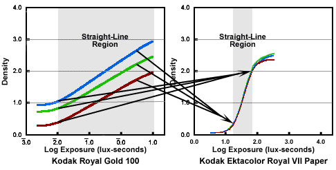 The second observation to make when viewing the color printing paper characteristic curve is that the densities are reversed. Highlights will be recorded as low densities and shadows will be recorded as high densities. (See illustration, above.) Don’t worry about this. It is just interesting to note that color-printing papers cannot achieve a very black “black”. There is always some light being reflected from the surface of the color print paper that keeps the shadow areas from recording as absolute black in a print. The highlight to shadow densities are very much more compressed compared to the same densities represented by the characteristic curve of a color negative film. (Complex curves, known as “printing-out curves”, can be created to map every density value from a color negative’s characteristic curve to a corresponding density value on the color-printing paper’s characteristic curve, but I will not bore you with an example of these.) In the illustration, the D-max of the color negative film is ideally compressed to fit onto the straight-line region of the color-printing paper’s characteristic curve. This is not what occurs in reality. In reality, highlight densities cannot be compressed that much and still record image details in the final print. The illustration, below, illustrates a more realistic comparison. 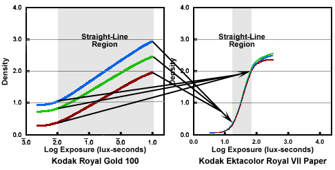 So what can we deduce from comparing a color negative film’s characteristic curve shape to a color printing paper’s characteristic curve shape? Quite a lot, really. (See illustration above.) The most important comparison to make is that the straight-line portion of the film’s characteristic curve must be greatly “compressed” to fit within the straight-line portion of the color-printing paper’s characteristic curve. These are the regions that hold the most useable densities to make a color print. “Compressing” the negative densities together to fit the printing-paper’s more sharply sloped (and more contrasty) characteristic curve results in a loss of the amount of image details that can be recorded from the negative onto the printing paper. The loss of image details is most noticeable at the extreme ends of the film’s characteristic curve. More image densities will be lost in the highlight and shadow areas of a film’s characteristic curve than will be lost in the middle densities. More tones will be pushed to black in the shadows and more tones will be pushed towards white in the highlights on the final print. Even though there is no real shoulder in a color negative’s characteristic curve and the color negative film can record negative densities with details all the way to D-max, compressing these this region of the film’s characteristic curve results in a severe loss of highlight details. When an automatic printer or a mini-lab printer adjusts the exposure the printing paper receives to print a negative onto color-printing paper, the exposure meter in the printer reads the highest negative density and reads the lowest negative density and calculates a printing exposure time so that the average of the densities will be placed squarely in the middle of the printing papers characteristic curve. If you have carefully exposed the color negative film based on the film’s ISO and have given the color negative film an exposure that will record highlight densities lower on the film’s characteristic curve, then the resulting print will have details in the highlight regions of the image. If, however, you have relied on the so-called “greater exposure latitude” of color negative materials and have increased the overall exposure to record more details in the shadow areas of a scene, then the highlight values will be pushed too far up the color negative film’s characteristic curve to be recorded as anything but white in the final print. It is not always carelessness on the part of the printing technician who is running the automated printer or who is running the mini-lab printer (although it cannot be entirely discounted) that results in improperly exposed prints with blank white highlights. If you have relied on the “greater exposure latitude” of color negative film to record shadow details and you have added an f. stop or two to your base exposure of the color negative film, then you have created negatives with highlight densities that cannot be compressed enough to be printed onto the printing paper using the print exposure time that the automated printer or mini-lab printer calculates for that negative. It is also too much to expect the printing technician to adjust the exposure for each and every negative on a roll of color negative film so that the prints will have highlight details. The automated printers and mini-lab printers are designed to maximize printing volume based on an average exposure of the negative values. These printers and the prints they produce are not designed for “custom” printing. Can you recapture highlight details from a color negative that falls outside the printing-paper’s capability of recording from a single exposure? “Yes”, you can. You can have the negative “custom” printed. The custom color-printing technician at a professional photo lab can dodge and burn the final print to balance the tonal relationships in the final color print. This does not come without a price, both monetary and quality. If a color negative has been over-exposed too far from the ideal overall exposure, dodging (withholding exposure time to these areas of the color print) the shadow values and burning-in (adding exposure time to these areas of the color print) the highlights can result in severe color shifts and lack of local contrast. Even though manufacturers boast of “greater exposure latitude” based on a color negative film’s characteristic curve, it is important to expose color negative films just as carefully as you would expose color transparency films to produce quality color prints that record adequate details in both the highlights and the shadows of a scene. Exposures must be carefully metered to place the highlights of a scene within the truly useable portion of the straight-line region of a color film’s characteristic curve. In next month’s installment, Understanding Color Negatives...Part II, I’ll examine the effects of “exposure latitude” when scanning color negative films with a consumer grade film scanner. The conclusions drawn may be interesting! Editor's Note - Visit Tom's online resource of photographic information at www.reasonableexpectations.com. Tom Webster - NPN 480 Comments on this article? Send them to the editor. |
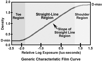 “characteristic” film curve. It is only important that you understand what the shape of the curve and placement along the exposure scale represents. (Refer to the “generic” negative film curve, please.) A typical “characteristic” negative film curve can be broken down into three regions: a) the “toe”, b) the “straight-line”, and c) the “shoulder” regions. Units of measure include “Log Exposure” and “Density”. Again it is not important, at this point, to understand the actual entries of these data points, it is only important to understand what each region represents.
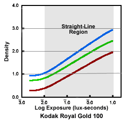 only important to know that these exposures refer to increasing or decreasing amounts of light. The farther the film curve falls to the left of “zero”, the more sensitive to light is the emulsion. Conversely, the farther to the right of “zero” the film curve falls, the less sensitive the film emulsion is to light. “D-min” represents the least density that a film can possess. There is always a little density due to the density of the film base and some minor chemical fog. “D-max” is the maximum density a film can achieve. Exposure times longer than “D-max” will not record any more image details. With this minimal amount of information we can begin to compare some film curves for color negative films and color printing papers.
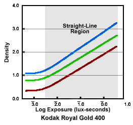 Kodak Royal Gold 400 color negative film, in comparison, has very similar color curves to Kodak Royal Gold 100 film. Again, the slope of the “straight-line” region of the curve indicates that this film does not exhibit exaggerated contrast levels. As would be expected, the film curves for Royal Gold 400 film is shifted to the left on the “Log Exposure” scale in comparison to Kodak Royal Gold 100 film. At ISO 400, Kodak Royal Gold 400 print film is more sensitive to light and is a “faster” film emulsion requiring less light to record useable film densities. The major difference to note is that the “D-max” of the Royal Gold 400 film is higher on the “Density” scale than Kodak Royal Gold 100 film.
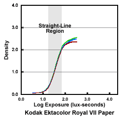 Okay, this is all well and good except the color negative is not the final product. The color negative has to be printed on color printing paper for us to be able to view a recognizable image. This is commonly referred to as printing type “C” color prints. Just like color negative films, color-printing papers have a characteristic curve, too. (See the color paper characteristic curve).
|
|