Color Management Basics
Copyright Tim Grey - All rights reserved.
Digital tools offer tremendous flexibility to photographers, allowing precise control over the process of optimizing images for print. The process of working with the image on your monitor can be rewarding in and of itself. Unfortunately, when it comes time to print the final image, the result can sometimes be disappointing.
Today’s photo inkjet printers are capable of incredible quality and color fidelity. Getting accurate results that match the image you adjusted on your monitor can be a challenge. Fortunately, proper color management can help you achieve predictable results, so the image you envisioned when you pressed the shutter release can be made real in the final print.
It’s about Profiles
Color management revolves around profiles. Most likely you’ve already heard of them, but you may not understand what they are and how they work.
Each device that deals with your image in some way, whether it is a film scanner, digital camera, monitor, or printer, has a unique way of dealing with color. Each film scanner or digital camera is going to “see” colors in a slightly different way. Each monitor is going to display colors in a slightly different way. And each printer will produce colors in a slightly different way. The variation between these devices is what can lead to frustration when trying to produce accurate prints.
The range of colors that each device in the digital workflow is able to capture or produce is known as its color gamut. The wider the color gamut for a particular device, the more colors it is able to read or produce.
Because the color gamut of every device differs, a method to translate color from one device to another is important. It is also important that color be interpreted properly for each device based on known standards. This is handled by color profiles. A profile is simply a file that includes information on how to translate colors accurately for a given device with reference to a device-independent color scheme.
 Monitor Calibration
The first step to getting great prints is to calibrate your monitor. Every monitor will display colors differently, and will shift in color with age. Calibrating your monitor periodically will ensure a consistent and accurate display. Since the monitor display is used to judge adjustments to the image, an accurate display is necessary to get accurate prints. Calibration is therefore a critical step.
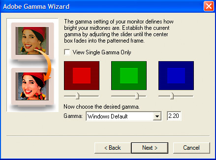
There are a variety of methods for calibrating your monitor. For those using Adobe Photoshop or Photoshop Elements, the free included utility called Adobe Gamma will help you adjust your monitor. It doesn’t provide a high degree of accuracy because it relies upon the subjective judgment of your eyes rather than a calibrated sensor.
For a more accurate adjustment without the expense of a sensor, you can use DisplayMate software. At a cost of $69, this software is less expensive than purchasing a sensor package, and can be downloaded from their website at www.displaymate.com. This software guides you through the process of adjusting your monitor settings using a series of test images. Before displaying the test image, it provides an explanation of exactly what you will see and how to use that display to adjust your monitor. While still relying on your own evaluation of the display, that evaluation is based on well-designed test images that allow for consistent results.
The best way to calibrate your monitor is to use a sensor with special software to actually read the display of your monitor with a calibrated sensor. The end result is a custom profile for your monitor that allows the display to be adjusted so that it is very accurate.
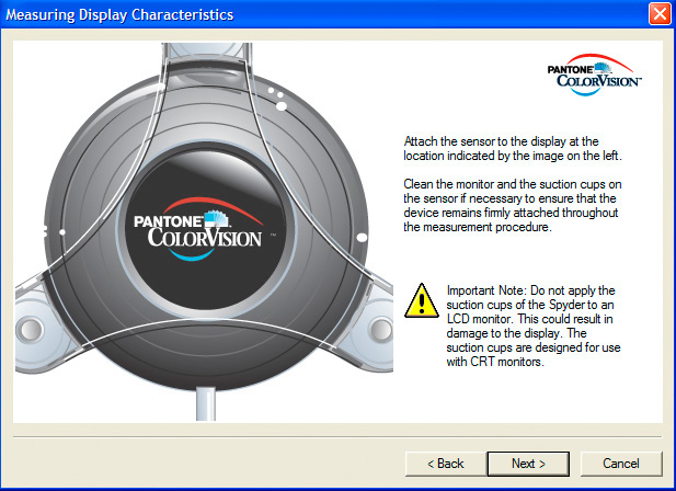
I recommend the Monitor Spyder sensor with PhotoCal software from Color Vision (www.colorvision.com). It is relatively inexpensive at $288, and offers a way to achieve a consistent and accurate display on your monitor.
Working Space
The color space you edit your images in plays a role in the potential final output. Using a consistent working space simplifies your workflow a little, and using an appropriate working space insures you’ll get the best results possible. I recommend the Adobe RGB (1998) color space as the best working space for images that will be printed on photo inkjet printers, and for editing just about any photographic image that will be re-purposed for different output.
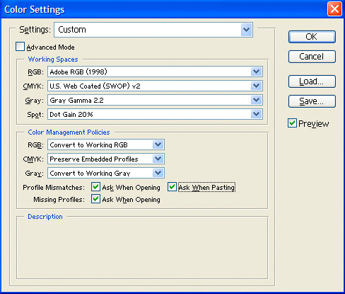
The Working Space for RGB images can be set in the Color Settings dialog box in Photoshop (Edit > Color Settings). I recommend setting the Working Space for RGB to Adobe RGB (1998), with the Color Management Policy set to Convert to Working RGB. I also recommend checking the boxes to provide warnings if there are profile mismatches or images with no profile assigned.
Printer Settings
Once your monitor is properly adjusted (and preferably profiled), you can edit the image with confidence, knowing that what you see on the monitor matches the information in your digital image file. Proper printer settings are the final step in getting the best output.
Your printer will include a profile that should produce relatively accurate results. It is important to read the manual that comes with your printer to determine the best output settings. If your image-editing software allows you to specify a profile for the printer, be sure to select the correct profile. This profile may be specific to the type of paper you are using. Within the printer properties, it is also important to set the correct paper type, as this will affect the final output.
Each printer deals with output in a slightly different way. The key is to specify an output profile if available, and to use the correct printer properties to produce the most accurate results with the best quality.
To get the absolute best results, a custom profile created for your specific printer, ink, and paper combination can be used. This is generally not critical, but will ensure the most accurate output. You can have a profile created that is specific to your printer configuration with services provided by such companies as ProfileCity.com (www.icscolor.com).
A Starting Point
Color management can be a complicated and confusing topic. A basic color managed workflow starts with calibrating your monitor and using appropriate printer settings. I am currently wrapping up work on a small book that will explore the depths of color management for photographers working in the digital darkroom. Stay tuned to www.timgrey.com for upcoming announcements regarding the availability of this book.
Tim Grey - NPN 019
Comments on NPN digital photography articles? Send them to the editor.
 About Tim Grey...
Tim enjoys sharing information about digital imaging as much as he enjoys learning it in the first place. Tim publishes an almost-daily Digital Darkroom Questions (DDQ) e-mail service that provides a forum for photographers to have their questions related to the digital darkroom answered. He is editor of The Digital Image, a quarterly journal published by George Lepp. He also teaches courses to help photographers master the digital darkroom at the Lepp Institute of Digital Imaging.
Tim can be contacted at tim@timgrey.com.


|