Walker, Ansel and Joel Hate Velvia
or
A Book(s) Review of Photography by Evans, Adams, and MeyerowitzText Copyright Mark Hobson. Images Copyright Joel Meyerowitz. All rights reserved.
Many of us simply are not ready, willing, or able to commit to taking on the rigors and challenges, physical and aesthetic, of winter photography. Some use the time to organize and clean equipment. Others catch up on darkroom (digital or analog) work. Still others sit around and dream of past hits and of those still to come.
But, no matter how you slice it, the silver lining in this dark cloud of winter dusk and doldrums is indoor time that can be spent, with what for me has always been a primary source of learning; viewing and reading books on photography. Recent books provide rich visual pleasure, inspiration and insight from three very diverse, but acknowledged masters of the medium; Ansel Adams, Walker Evans, and Joel Meyerowitz. Despite what one might think, at least with Adams and Evans, much of what these books have to offer is all about color.
Brooks Jensen wrote that “lots of photographers will claim that a photograph that needs a caption is an inferior photograph. This is silly and denies the obvious fact that all photographs are made, seen and interpreted against a social background that influences their appreciation and understanding.”
The posthumous book, Walker Evans Polaroids, clearly demonstrates Jensen's point. The polaroid SX-70 photographs are presented without text or title, however, the brief 3-page introduction by Jeff Rosenheim, describing the circumstances surrounding the creation of the photographs by Evans, layers a sublime sense of poignancy upon what is a substantial body of work - 179 photographs selected from more than 2,650 SX-70 photos taken between September 1973 and November 1974, just before Evans’ death in April 1975.
With this body of work, Evans returned to the themes of his earlier depression-era photography for the FSA, the American landscape, architecture, signs, and people. The photographs are reproduced actual size, 3-1/8 inches square, one per elegant, all white page. The photographs, complimented by their presentation, have the simplicity, directness and intimacy of a family album, but these “miniature” studies of color and form, photos of American life and place, pack a visual and emotional punch that their size belies.
Working with the peculiar and subdued color palette of Polaroid SX-70 film, Walker Evans created photographs of compelling intellectual and emotional potency. The photographs, primarily through the use of SX-70 film, stand in contrast to Evans’ earlier work presenting a “softer” more mysterious take on his subjects. Whether this was due, intentionally or not, to his advanced years (wiser, not senile) is unknown, but, true to his photographic roots, the photographs reveal Evans’ “nominal” subjects in a direct and honest manner without artiness or artifice - the ordinary transformed by personal artistic vision.
Personal artistic vision is obviously one of the hallmarks of Ansel Adams’ photography, albeit inexorably linked to B&W photography. It comes as quite a surprise to many that Adams took over 3,000 color photographs during a 40 year span. He also wrote quite a bit about color photography, both published and in private correspondence to friends. Near the end of his life he stated, “were I entering photography now as a young man I undoubtedly would deeply concern myself with color.” If the collection of Adams’ color photography and selected writing in Ansel Adams In Color is any indication, Adams certainly approached color photography as more than a passing fancy.
Ansel Adams, like most of his peers, considered color to be a “flawed” medium. The color materials of the day (primarily Kodachrome sheet film for Adams) were judged by most to be lacking in color “reality.” Color was rendered distorted and garish. When writing about color, Adams remarked that “the Creator did not go to art school and natural color, while more gentle and subtle, seldom has what we call aesthetic resonance.” Adams was also less than enamored by the fact that he could not exercise total control over the process. Kodak’s early slogan, "You push the button, We do the rest" cut no mustard with Adams.
Against this backdrop, Adams produced some color photographs of remarkably “gentle and subtle” quality, especially considering his primary subject, the colorific American West. He described one image (Vertical Cliff, Zion National Park, Utah, 1946, pg. 79) of detail of a colorful cliff as "the G-Damdest, SOBchen wonderful thing I ever did...WOW!"
Despite the technical and aesthetic film issues with which he struggled, Adams created photographs that seduce and enrapture with luxurious color that is refreshingly free of the “over-the-top” Velvia-style color found in the preponderance of contemporary color photographs of the same area. As much as the early process would allow, Adams lets nature speak for itself. He avoids assuming the role of God’s art director and gives primacy to the subject, not himself.
Considering that most of the 44 photographs in the book, selected by the noted photographer Harry Callahan, were taken over 50 years ago, the notion that they are still “refreshing” is a noteworthy achievement. The fact that Adams, through the remarkable legacy of his color photographs and writing, can be relevant and instructive to the current generation of color photographers is no less remarkable.
During the 1980s, Ansel Adams was aware that there was considerable work being done in color photography that was being accepted by the photography art world. In his late seventies, Adams updated his short list of those whom he considered to be accomplished color photographers. On the list was Joel Meyerowitz.
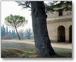
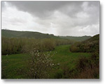
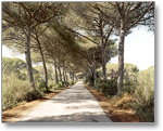
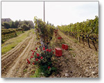
Joel Meyerowitz, who made the switch from 35mm predominantly B&W “street” photography to 8x10 large format color photography in the early 70s, takes color photographs of remarkable subtlety, refinement and emotion. His photographs express a delightful sense of the subtle nuances of color that can often only be appreciated upon successive viewing. This characteristic is as true of the early work in his first book, Cape Light, as it is of his most recent photography in the new book, Tuscany Inside the Light.
In the interview that appeared in Cape Light, Meyerowitz expressed admiration for paintings done of the Cape by Edward Hopper of “nominal subjects” - everyday things. Paintings about which Meyerowitz states, “...the feelings are large and have a lasting quality to them, which is why they speak so clearly, without sentiment.”
Beyond question, Meyerowitz’s photographs speak clearly. The “seeing” is pure, honest and direct. Sentimentality never interferes. His prints (on the printed page) evoke a sense of place, light and air. To view a Meyerowitz photograph is to experience the feel of light and air as it caresses your skin and senses. The atmosphere is palatable. Everything just seems right and real. By the way, most of Meyerowitz’s work would be posted in Man & Nature on NPN.
Many other considerations aside, a primary reason the photographs speak clearly and without sentiment, is Meyerowitz’s choice of color negative material to record his subjects. Color negative materials have long been considered “inferior” to transparency film. The film’s lack of the color saturation and vibrant/electric hues of the “chromes” creates photographs that lack the initial “punch” associated with the Velvia Effect. This less flamboyant characteristic of color negative film is a quality that Meyerowitz has been exploiting so successfully for over 30 years.
The color quality of Meyerowitz’s photographs feels completely “real” and natural. They are about the sensations, not the sensationalizing of color. There are no strident or screeching eye sores comprised of what Walker Evans called “...a bebop of electric blues, furious reds and poison greens.” Meyerowitz’s landscapes gently settle upon the eye with a slow graceful emergence from the surfaces of his prints free from the “tornado of color” that Ansel Adams so feared was coming. It’s not surprising that Meyerowitz made Adam’s short list.
So, what’s it all mean? Well, color wise, it’s about subtlety. Understatement, at least as compared to Velviaesque overstatement, as a visual vehicle for the long haul. Brooks Jensen states that “at least 9 times out of 10, there is a conflict between marketing potential and artistic value.” If you’re in it for the commercial bucks, it’s a wise aesthetic choice to use Velvia (or one its wannabe brethren). It caters (panders) best to the publics’ desire for instant gratification with a wallop. Think of Velvia as the French Connection car chase of color film. Again, to quote Jensen, "if you want to sell a lot of photographs, use color and lots of it.”
On the other hand, if you lean more to the art side (were there are also bucks to be had), there is photographic wisdom to be gleaned from the photography of Evans, Adams, and Meyerowitz. These Photographers (with a capital P) have mastered the art of “speaking” softly. Their photographs gently captivate and gradually reveal their narrative to the viewer who is willing to “get involved.” Evans, Adams, and Meyerowtiz have created photographs with which one can build a relationship. The photographs will stand the test of time.
If you are willing to take time out from the staple of today’s “screaming color” nature images, here are three intriguing books of photography that definitely represent “schools” of color photography vastly different from the nature photography “norm.” Each book is a worthy addition to anyone’s photo library. With thoughtful viewing, each book offers a distinct lesson to be learned about color, and, unlike cod liver oil, these lessons are good for you and a rich and rewarding experience to boot.
PS - I have not spoken to Walker, Ansel, or Joel regarding their views on Velvia, but I think their opinions on the subject are eloquently expressed in their photographs.
About the Images
Images copyright Joel Meyerowitz. Thumbnails are links to larger images. View more of Joel Meyerowitz's work on www.joelmeyerowitz.com.
Comments on NPN landscape photography articles? Send them to the editor.
MH-NPN 1196
 MARK HOBSON is a family guy lucky enough to be living in his favorite place on earth, the Adirondacks. A former agency creative director and commercial photographer, Mark has brought his love of the wilderness and photography together to form Nessmuk & Stoddard Trekking.
Mark's photography has been used by Fortune 500s such as Kodak, Xerox, Heinz, PPG, and Bausch & Lomb. As a creative director he has produced campaigns for clients such as; I LOVE NY, Lake Placid, The Adirondacks, Cooperstown and the Finger Lakes.
His Adirondack photography has been exhibited in galleries in the NE. He has won recognition as a repeat finalist in the Carnegie International Nature Photo Competition. Mark has also been a judge for the Kodak International Snapshot Competition as well as the Kodak Camera Club.
Be sure to visit Mark's website at www.adirondacklight.net.
Comments on NPN nature photography articles? Send them to the editor.


|