Introduction
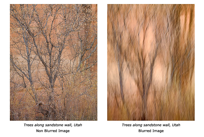
In the fall of 2008, I started working on a series of images where the main characteristic involved moving the camera while taking the photograph. This is a process I had tried in Paris in the early 1980s under the guidance of Scott McLeay with whom I was studying photography at the time. Unfortunately, at that time my attempts had been unsuccessful for reasons we will see shortly.
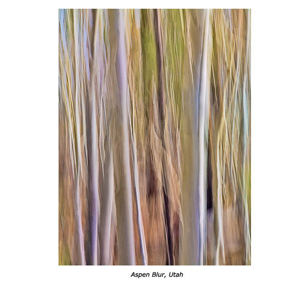
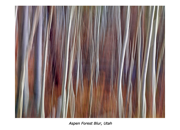
This essay details my experience using this approach I call “Landscape Blurs,” because landscapes are my subject and the images are blurred. They are artistically blurred, mind you, but blurred nevertheless. Finally, this is part one of a two-part essay. In part two I will go over the specific conversion and processing steps that I use in Lightroom 2.0 and in Photoshop CS4 to convert and optimize these images. These steps are different from the steps I follow with my non-blurred images.
From Film To Digital
Moving the camera while taking the photograph is a process that needs digital capture to be done successfully. My teacher in Paris, Scott McLeay, taught us this process in the early 1980s. Scott was using a Hasselblad V camera, the same camera I am using today for this process. However, Scott was using film (digital capture did not exist yet) and that was one of the main problems.
Scott was using this approach himself for his color work. With film, however, he was limited to 24 exposures per roll maximum (if using 220 film) and even with multiple holders loaded and ready to go, he had to limit the number of exposures. For example, with 4 holders loaded with 220 film, he would be limited to 100 exposures. Few people had 4 Hasselblad 220 holders, so the actual number of photographs he could take before having to stop photographing was usually much smaller. Of course, he then had to unload the holders and reload them with new film. This was not only unpractical, but it also stopped the flow of things and interrupted the creative mode, literally.
With digital, things are much better. Right now I use 16 gb cards which makes the process both easier and smoother. I can shoot 200 or 300 exposures per card, and changing to a new card takes no time at all. This means I can focus on the process totally without having the fear of being interrupted by the necessity to unload and reload film holders.
Also, developing film took time and was expensive. With digital, I can see the results immediately on the LCD screen just minutes or hours later by converting the images on my computer.
Finally, there is the issue of printing these images. Scott and I agreed that these images look great on matte or watercolor paper. Scott used the Fresson process to print his images Fresson prints are made on watercolor paper using a charcoal process that creates sophisticated tones and colors.
Fresson is a small printer located near Paris, France who selects the clients he wants to work with personally. His unique process uses charcoal to print both color and black and white images. The Fresson process delivers beautiful prints but it is slow, complicated and expensive. The good news is that the look of a Fresson print is not unlike that of an archival inkjet print on Fine Art matte paper. However, the cost of an inkjet print is much more affordable than that of a Fresson print and there is no wait time since you can make this print yourself in your own studio.
All this means that creating images while moving the camera and printing them on matte papers has become much easier with digital than it was in the days of film. This provides a much easier access to a process that had been practiced before but was made difficult and exclusive by the limitations of film.
Equipment
Like Scott, I use a Hasselblad V with Zeiss Lenses and I move the camera during long exposures. The difference is that instead of film I use a Phase One P45 digital back.
Being successful with this process is in large part due to developing the necessary experience. It literally takes hundreds if not thousands of shots to get a single good one. It is also important to spend time learning and finding out which subjects work and which subjects do not work.
The P45 gives me more colors and dynamic range than other cameras. This is important because this series is all about fine nuances of color, and high contrast is something I want to avoid at all cost. I want soft contrast with as much variation of color as possible. The P45 gives me that.
The Hasselblad is also important because of the way it is held. I need to work handheld because there is no other way to move the camera the way I want (a tripod does not work for this type of work). The Hasselblad makes holding and moving the camera easy because it is held at waist level, or slightly higher if you look through the top viewfinder with one hand positioned below the camera and the other hand positioned on the side. The position of the camera does not change when you go from a horizontal to a vertical framing because the back can be positioned vertically or horizontally. This means you can develop an ideal way of holding the camera, one that gives you the results you want as far as movements, whether you do horizontal or vertical photographs. This is an ideal solution since finding the best way of holding and moving the camera is largely responsible for making this approach successful.
Quality Of Light
The type of light you use is very important. I work mainly outdoors (in fact almost always outdoors) and with natural light, so choosing the best time of day or weather conditions is very important.
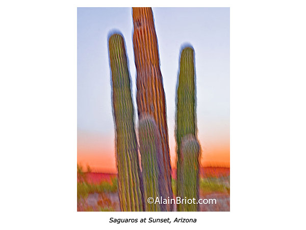
Light is what creates the color in the scene. For this reason I prefer open shade, overcast light, or sunset/sunrise light. These are the types of lighting conditions that work best for my work. The soft light found in overcast or open shade conditions gives me soft, saturated colors that I would not get if the scene was lit by direct sun. In direct sun, I would get mixed shadows and highlights which creates a jumbled landscape with washed out colors and confusing areas of lightness and darkness.
When you move the camera, either a lot or a little, you mix not only the colors but also the light that falls on different areas of the scene. In effect, you merge the boundaries of objects that have different colors to them and different types of light falling on them. The success of the image rests on doing this well, which most of the time means finding a scene in which you can control how many colors and how many different types of light are present.
Very often (most of the time in fact) I will select a scene because of the specific mix of colors and light found in it. Similarly, I will reject scenes that have a mix of colors and light that I do not like. Explaining exactly how I make this choice is difficult, but mainly I look for scenes that have a pleasant mix of light and colors. Mostly, I look for scenes in which the colors are harmonious, where the colors look good together and do not clash. I avoid scenes that have competing colors (the way brilliant green and brilliant red do for example) instead of blending with each other. I keep in mind that this clash of colors will be emphasized when they are mixed together through the process of moving the camera.
Lenses
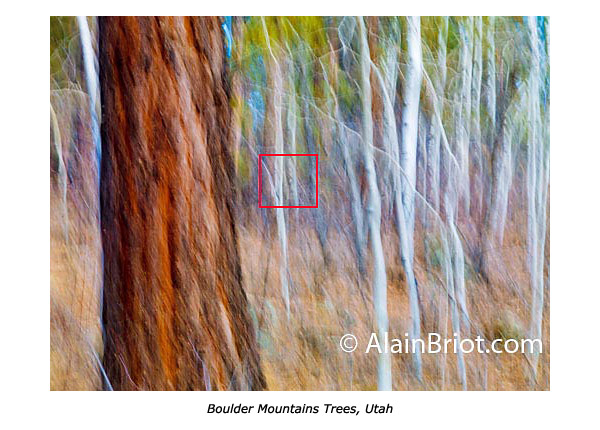
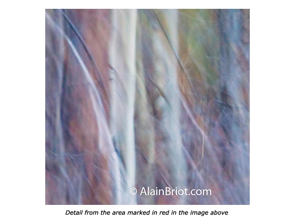
The choice of lenses is also very important. For one, I find it very difficult to crop these images, which means that using a lens that gives you the composition you want in the field is very important. It is hard to say why precisely, but I just do. I think it is because these images are somewhat complete as they come out of the camera. This is true for the composition and for the colors (more about this later when I talk about processing). In other words, I have a difficult time isolating a composition within the composition that I created in the field. I prefer to move to a different capture when I don’t like a specific image. It seems that the results are “all or nothing”. It seems that an image either works or does not work. Therefore, it is difficult to fix it by cropping off part of it if it does not work. So far I have not cropped a single image in this series.
Processing
I capture the images in raw format and I process them in Lightroom. When converting, I found that a number of approaches make things much easier and straightforward in processing images in this series.
First, I learned that setting the grey point (grey balancing) precisely is crucial to the success or failure of these images. As I said these images are very responsive to the quality of light. This continues in raw processing where color balancing the light properly is the continuation of selecting a specific type of light to photograph under.
Very often I find that I get the finest colors if I can find a neutral area in the scene and click on it with the color balancing eyedropper in Lightroom. This area does not necessarily have to be middle grey, it can also be white or black. It can also be a light or dark grey. All that is needed is an area that, once color balanced, is neutral in color. That is, an area that should not have color in it, no matter how light or dark this area might be.
Color balancing on a neutral area usually reveals the true colors in the scene and makes the photograph come to life. When that is found, I usually copy the color balance settings for this image and paste them to all the other images captured in the same light. This helps make the process more effective.
I also found that making presets for the setting combinations used for specific images is also very helpful. The specific settings used for each image can get very complex, and remembering them is not easy. Saving them under a specific name (I usually use the name of the photograph as the name of the preset) makes reusing them a breeze. It also allows you to build a library of presets that you can later reuse with other images. This gives you a good start to converting images for which you may not be sure which settings to use. It also helps give a feeling of consistency to the work, since the same settings are used from one shoot to the next, even if these settings are only a starting point and are modified later on.
One thing that is important to mention is that good processing is crucial in this series. Because these images retain little details to “clue us in” about the nature of the scene, we depend on the color and contrast of the image even more than with images that are not blurred.
For this reason, setting black, white, and grey points properly is essential, as well as the knowledge of how to do so. Also, proper sharpening and contrast enhancement in Photoshop is just as crucial.
Finally, I use Lightroom to convert my images but complete the optimization process in Photoshop through the use of adjustment layers. I could not complete this process working in Lightroom alone.
Lightroom Presets
I found that saving the image adjustment settings for specific images as presets in Lightroom to be very useful. The reason for that is simply the complexity of the adjustments I make to each image. It is very difficult to remember exactly what those are when you go from one image to another. It is when you want to use previous settings on a new image that the presets come in handy. Using presets is very simple, all you need to do is click on a specific preset and the settings saved in it will be applied to the image you are working on. I usually name each preset after the photograph they were originally designed for since this helps jog my memory about what each preset does. In case of doubt, or to quickly check what a preset looks like, all you have to do is pass the mouse pointer over the list of presets and the effect of each preset will be applied to the large thumbnail in the preview window. Once you find one you like simply click on it and the preset will be applied to the image you are working on.
Conclusion
I often say that fine art photography has two aspects: technical and creative. This process addresses both of these aspects. It is important to have good technique when moving and processing these images. However, it is equally important to be creative when selecting the subject and the light and when making processing choices in regards to color balance, color harmony, contrast, color palette and so on.
I believe that this process has a lot of potential, and that what we have seen done with it so far is only the tip of the iceberg, so to speak. It is tempting to think that it is limited to certain subjects, such as trees. However, this is not true. This approach can be used with any subject, be it trees, mountains, deserts, waterscapes or others. In fact, it can be used with subjects other than landscapes. Just because my personal preference is photographing landscapes does not mean that it has to be limited to this subject alone.
What can be done with it can only be known by trying it yourself with the subject of your choice. Don’t be afraid to make mistakes. Mistakes are part of the creative process. Furthermore, what may seem like a mistake may in effect be a great photograph. You won’t know until you try. Just go out and give it a go. You will be glad you did.
Stay tuned for part two of this essay in which I will describe the specific conversion and processing steps that I use in Lightroom 2.0 and in Photoshop CS4 to convert and optimize these images.
Comments on NPN landscape photography articles? Send them to the editor. NPN members may also log in and leave their comments below.
Alain Briot creates fine art photographs, teaches workshops and offers DVD tutorials on composition, printing and on marketing photographs. Alain is also the author of Mastering Landscape Photography. This book is available from Amazon and other bookstores as well as directly from Alain. You can find more information about Alain's work, writings and tutorials on his website at http://www.beautiful-landscape.com.
You can also see a new online portfolio of Alain’s Landscape Blurs at this link: http://www.beautiful-landscape.com/Portfolio-Blurs.html.