In the previous installation I described some so-called “rules of composition” you may want to be aware of as you explore a scene. In this article I will take things a step further from the technical aspects of applying rules and identifying patterns, and discuss conceptual issues and ways of thinking about composition.
E Pluribus Unum
|


Many of you using American currency are no doubt familiar with this phrase. It means “out of many, one”. This concept touches on the most literal meaning of Composition – the arrangement (and therefore existence) of multiple elements. Hence, the first thing to keep in mind is to not lock your vision on to just one element – make a conscious effort to not only capture your main subject, but to create a relationship between various elements (more on this below).
The second important concept contained here is that the composition, though comprising of multiple elements, needs to stand on its own as a whole: out of many [elements], one [composition]. A successful composition will contain all the elements it needs to achieve the desires effect on the viewer and, conversely, contain nothing that may distract their attention, obscure, or over-complicate things to a point where the viewer is left wondering what it is they are supposed to see.
The Meaning
All images have a meaning. Most images have multiple meanings. Whether we do it consciously or not, we assign values to everything we see – we like something or we don’t like it or we may be undecided, we understand it or we don’t understand it, we find it beautiful or ugly or anywhere in between, it inspires us or bores us etc. The meaning is created by any one of us – whether the photographer at the scene or a random viewer at any point in time. Meanings change as we become more educated and gain life experiences.
Now think of the role of the photographer in creating this meaning. As a photographer you may want to take an active part in communicating or prompting the viewer towards your personal meaning, or you may decide to leave the interpretation up to them. Whichever way you go, certain implications follow: if you want to communicate your own meaning, you will need to be very deliberate in guiding the viewer and pointing them to what you find interesting and valuable about the image. You need to decide what impact you want the image to have – do you want to inspire? to arouse interest? to shock? Whichever it is, make sure to ask yourself whether your composition, as it appears in the viewfinder, communicates the meaning effectively.
If, on the other hand, you prefer to leave the meaning to the viewer, define to yourself who your viewer is. Who is it that you want to reach and engage in determining a meaning for an image, and why? A random viewer will likely not even bother pondering a meaning unless your image engages them in some way. Ask yourself what it is about your composition that will make someone stop and think.
Relationships
Always keep in mind that the various elements in your composition relate to each other in different ways. At the simplest level they either enhance each other or distract from each other. In the process of composing an image, first identify those elements you want enhanced, then maximize the effect of the enhancing relationships and mitigate or eliminate the distracting ones. Rather than free-form experimentation of various angles and lenses and techniques - work with a goal – know what effect you wish to achieve and work your way to finding the optimal arrangement for it.
Relationships can be complimentary (as in colors, contours, shapes) or opposite (as in colors, lines, direction), they can lead to or away from, be simple or complex, obvious or subtle. Your role as a photographer is primarily to understand these relationships and the effect they will have on your viewer, then work with them to maximize the effect you are after.
Complexity
As thinking beings, we are drawn to challenges. We try to identify and resolve and understand on a deeper level than what’s right in front of us. This is the underlying concept of composition – an image that prompts the viewer to follow lines, to identify relationships, to make connotations, to understand a context etc. will almost always achieve a more profound effect than placing the ultimate result in plain view right in front of them.
This explains why an image shouldn’t be too simple. On the other hand, it should also not be too complex. This is the result of yet another, albeit less favorable, human trait – short attention span. The image should be complex enough that a viewer will be drawn to resolving it, but not complicated to a point where they need to spend a lot of time and juggle a large number of parameters before any meaning presents itself.
As a photographer you need to strike the balance. Err on either side and your image will lose its intended effect.
Consider the two main elements in Photo 1 – the colorful leaves clearly take center stage for attention, but are enhanced by the underlying grasses which add texture, color, and direction, without distracting from the main subjects.
Singularity and Uniformity
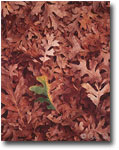
Previously I mentioned several techniques and consideration for emphasizing and enhancing your “main” subject. These usually assume there is one prominent element, and all others are used to guide the viewer towards it – through leading lines, placement in the frame, relationships with other surrounding elements, etc. This is not always the case. In many situations your most interesting element will actually be in great abundance and isolating just one instance of it may detract rather than help. Such situations include forests, abundant with trees, foliage rich in leaves or needles, seashells on the beach, mud cracks, ridges and mesas in the Grand Canyon etc. These are the kind of subjects that can benefit from “strength in numbers”. Consider the decaying aspen leaves in Photo 2 – any one of them could make for a “good” subject on its own, but throw a bunch of them together and the effect is enhanced – simple enough to understand and follow, yet offering endless room for exploration. What makes this possible? Uniformity – the even arrangement of interesting elements throughout the frame explicitly prevents drawing attention to any one element. A condition for success though is that each element should be interesting enough to hold the viewer’s attention. Keep in mind that uniformity is quickly broken by the presence of anything that stands out. Even a small patch of plain dirt breaking the leaf pattern would have yielded a far less powerful image.
Breaking the Pattern
Uniformity works when each element is interesting in its own right, but a uniform pattern of less-interesting elements can greatly enhance an “odd one out” element juxtaposed against them. Consider the half-turned leaf in Photo 3 – neither it nor the background leaves would make for a very interesting element on their own, but thrown together the effect is altogether different.
The Power of Perspective
Perspective is the visual relationship between the scene portrayed and the point from which it is viewed. Perspective can be enhanced by other optical effects (like the sweeping view of a wide lens or the compressing effect of a longer one) but more importantly it is, as Ansel Adams stated, about knowing where to stand.
The old gas pump in Photo 4 and the building it is attached to offered me an endless array of options – lines in every conceivable direction - uniform, intersecting, straight and curved, a multitude of textures and patterns. I could easily have produced a series of distinct images of this one scene that would each emphasize a different aspect of it. Still, I am not a big fan of series (strictly a personal preference) and always try to distill a scene into the one take that works best to my eye. The perspective I chose allowed me to utilize everything that I found interesting about the scene – the pump and insignia on it are in plain view, the various lines in the building (straight and intersecting) and the curvy hose, are all represented and arranged so that the most interesting ones to me (the pump and hose) take center stage and all others are used to enhance and complement the composition without competing for attention.
What Else?
Like any creative artist, I can go on and on about concepts I employ in my work; some more straightforward than others, but all eventually building on experience. Learning to see is primarily about learning to think in a way that is conducive to visual expression. Out of thinking and analyzing come guidelines and principles, some universal and others personal. Having shared some from either end I hope I have instilled in you a desire to learn more. If there is one thing I could suggest to assist you in your quest it’s this – think before you shoot: look at a scene and think about what options it presents, and what meanings it might hold. Look at your composed image in the finder and think about what you hope to achieve with it and whether it indeed lives up to the challenge. Make every image count.
Comments on NPN nature photography instructional articles? Send them to the editor.
About the author...
Guy Tal is a landscape photographer based in Salt Lake City, Utah. Guy creates fine art prints for gallery exhibits and private collections. He also conducts photography field workshops in partnership with fellow photographer Michael Gordon. For information and to see more of his award-winning images, visit his web site at www.ScenicWild.com.