The Essential Landscape: The Prison that was Color Film. |
Sometimes we do not fully appreciate the good things we have until they are gone. The same, however, can also be said about some bad things. Sometimes we do not realize how confined and limited we are until the barriers are lifted, the doors swing open, and a new world of possibilities presents itself.
Writing can be an enlightening exercise at times; forcing you to explore and ponder things that up to that point may have been taken for granted. While working on my upcoming black-and-white landscape book I was reminded of the days of B&W film. The old adages rose from the recesses of my brain: expose for the shadows, develop for the highlights. I remembered zone placement in the days before histograms, scribbling notes after each exposure in the days before EXIF, denoting the time and place, exposure decisions and required development: N, N+1... I remembered experimenting with different developers, different processes, different development times and temperatures. And when a darkroom was not available I could take my film in to a pro lab, knowing that as I handed over my film the inevitable next question would be how I wanted it developed.
At the time it didn't seem unusual to have such a degree of control over how my images were developed and printed. The lab had no way of knowing if I did not tell them. There was no one "right" way to do it. Exposure and development were two sides of the same creative coin, linked together by the same decision - my decision. "Foreground rock in Zone 3" had real implications for camera settings in the field and timer setting in the darkroom. Get one wrong and printing becomes an exercise in damage control, if it is even possible.
It was easy to admire those who mastered the chemical darkroom. Their developed film was a thing of beauty in itself: perfect density in every zone and fine detail even in the darkest of the darks and the brightest of the whites. And the prints ... oh, the prints ... silvery and luminous and sharp and smooth. More than just exquisite creations, to someone familiar with all the things that could possibly go wrong in their making, they were downright astonishing in their precision and beauty.
Color film changed all that. Drop an exposed roll in a paper bag and hand it to the clerk. No special instructions needed and no questions asked. Development was always the same: automated C41 for negatives, E6 for most slide films, or a lengthy wait for Kodachrome to arrive from the proprietary service center. The only variance possible was costly push/pull processing, requiring a separate batch to be run after everyone else's film was done.
Admittedly, it seemed convenient at the time. This is not surprising as we are biologically predisposed to laziness. I don't say this with prejudice. It's a logical outcome of the ancient need to conserve calories and expend the minimal amount of energy in order to sustain life. Still, art transcends mere physical survival. Art is that which nourishes the spirit and the rules of laziness do not apply. For two hundred years a photographer had the freedom to decide the exact shade they wanted each element in their images to be. But now, if I wanted cerulean blue instead of Velvia can't-look-away blue - tough luck! The film decides. Praise be to the film.
Instead of an infinite array of choices, the selection was narrowed down to a menu of available emulsions. In hindsight, it was like going from a well-stocked kitchen where I could prepare and flavor (or ruin) my food any way I wanted, to staring at the neon menu in a fast food restaurant, trying to decide which option most closely matches my hankering. I never walked away hungry, but I never had a perfect meal, either.
I gave up on Velvia after about a year. I remember a friend asking me, "Who doesn't like Velvia?" Well, it wasn't that I didn't like Velvia. I also don't dislike hamburgers, but I don't want to have them for every meal every single day. And, as my palette became more sophisticated I wanted a photographic taste to match, and so began the great journey of testing every emulsion on the market.
There were some films I liked better than others. During some periods I carried as many as 4 or 5 different emulsions with me just because I preferred the Provia blues to those of Astia; or the E100SW yellows over those of RSX. It worked well enough but it was still limiting.
Many preached selecting one or two films and becoming very familiar with them to be better able to visualize the outcome. That was never the problem for me, though. My problem was that I wanted an outcome with Provia blues, Astia reds, and greens that no film seemed able to reproduce.
Around that time, photography became quite popular. This was a wonderful trend, though it came at catastrophic timing. Many of those who grew up on the limited menu of color film options began to think of them as inherently sacred. If a print did not match the arbitrary palette and latitude of the chrome, it was a bad print. The chemistry in the emulsion became the measure of nothing less than reality itself. If that's how it was rendered on film then by God that's how it WAS and woe be unto anyone who dared question or deviate from the commandments of the hallowed chemistry.
When digital photography finally caught up to the quality requirements of working professionals, it was met with skepticism. Arguments for and against focused on image quality, economy and other matters that were of little interest to me. As a large format photographer at the time, it was easy to look down on pixels with disdain. I already had a medium capable of capturing the equivalent of dozens of megapixels. What was the big deal?
The big deal was RAW! The jail of prescribed palettes, color temperature, balance and contrast came crumbling down and nobody seemed to notice. In a moment of clarity it finally came to me: I could, once again, decide for myself the exact way I wanted the elements in my image rendered, and develop each of them differently to match its unique qualities and interpretive intent. This is what photography was always about EXCEPT for the dark ages of color film.
I watched in amazement at the skyrocketing popularity of early "digital Velvia" scripts. Let's face it; applying a digital Velvia script to a carefully thought out RAW capture is like pouring ketchup over a platter of fine sushi. Sure, it will be more palatable to some but at the cost of destroying the fine balance of flavors, aromas, textures and presentation: a testament to the chef's honed skill and personal touch rather than a factory-packaged dish engineered to meet a low common denominator.
Psychologists who study prison inmates sometimes speak of "post-incarceration syndrome" whereupon a released prisoner had become so used to the prescribed routine and limitations of prison life that they are unable to cope with newfound freedom, options and independent decision-making; often ending in severe social problems and recidivism. Similarly, hoards of photographers, once released from the creative shackles imposed by chemical engineers, found themselves struggling to embrace a world of choices and opportunities.
Some chose the comfort of continuing to relinquish creative control to anonymous engineers by sticking with JPEG capture. Some chose to remain among the familiar and comforting walls of the film prison even as the doors before them flew wide open. Some jumped at the opportunity for the proverbial fifteen minutes of fame by climbing on soapboxes and declaring the demise of photography. Somewhere out there, they still gather to worship the divine gelatinous chemistry that alone knows how to render the appearance of the heaven and the (flat) Earth.
To those more creatively and artistically inclined, though, RAW capture was the new renaissance. Once again, we were in the driver's seat. Once again, we had control. Once again, a mix of dyes conceived in a laboratory did not dictate what amounted to "reality" nor did us the dubious favor of creating the image on our behalf.
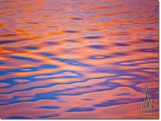
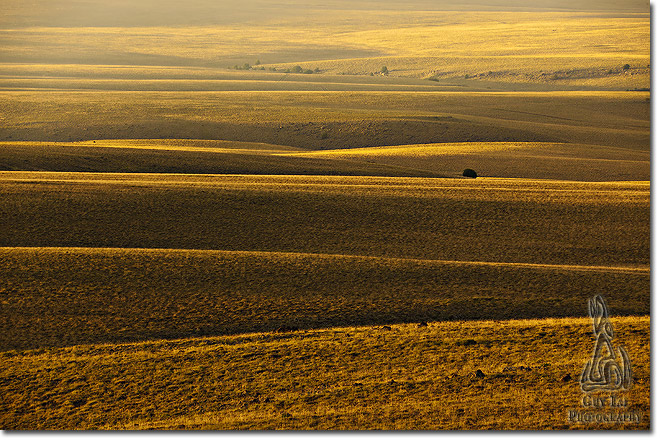
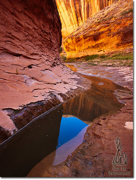
Personally, I never thought of chemistry as being inherently more romantic or truthful than electronics. Both are ways of solving the logistical problem of capturing and fixing photographic images. With that done, the medium, whatever it is, should get the hell out of my creative way and let me express my own vision. I don't care how a Canon engineer sees the dusky blue/gray of sagebrush, or how a Nikon programmer wants to render sandstone glowing in reflected light in the depth of a canyon they've never seen. I never again want to ask myself, "Will Velvia do a better job on this sky than Astia?" I want to do the job myself!
Comments on NPN nature photography articles? Send them to the editor. NPN members may also log in and leave their comments below.
 Guy Tal is a professional photographer and author residing in the state of Utah, in the heart of a unique and scenic desert region known as the Colorado Plateau. Guy teaches and writes about the artistic and creative aspects of photography and guides private workshops and individuals seeking the beauty and solitude of the canyon country. More of his works and writings can be found on his web site and blog at guytal.com. You may also follow Guy on Facebook or Twitter.