Editor's note - Many NPN members have found Tony Kuyper's luminosity masks useful in their post-exposure processing in Photoshop. He published the original luminosity masks tutorial in November 2006. This new tutorial on luminosity painting builds on the masking techniques described in that tutorial. Readers not familiar with luminosity masking are encouraged to read Tony's first tutorial at http://www.goodlight.us/writing/luminositymasks/luminositymasks-1.html to better understand the concepts behind luminosity masks, how to create them, and the terminology used in this tutorial. - Richard Bernabe, Editor-in-Chief.
The Burn/Dodge Layer
Luminosity painting is a convenient and controllable method to adjust brightness and contrast by painting on a layer in Photoshop. As its name implies, it uses the luminosity masks discussed in the Luminosity Masks tutorial to achieve its end result.
The painting occurs on a pixel-containing layer, which is a relatively straightforward process in Photoshop. The pixel-containing layer is called a Burn/Dodge layer. It's created in the following manner:
- Create a new, empty layer as the topmost layer in the layer stack (Shift-Alt-Ctrl+N).
- Change the blending mode at the top of the Layers palette to Soft Light.
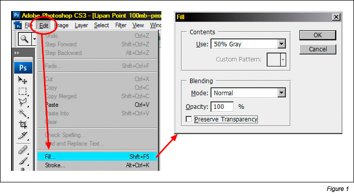
- Fill the layer with 50% gray (Edit > Fill > Use: 50% Gray, Mode: Normal, Opacity: 100%) as shown in Figure 1.
- Rename the layer "Burn/Dodge."
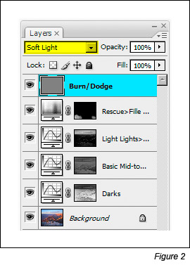
When finished, the Burn/Dodge layer should resemble the top layer in Figure 2.
For convenience, the link below will download an action that will make this layer for you.
Burn/Dodge Layer ActionHow to Use the Burn/Dodge Layer
Soft Light mode darkens or lightens the color below it in proportion to how much darker or lighter the color is than 50% gray. The fill color of 50% gray is totally neutral. It neither lightens nor darkens the colors below it, so when the layer is filled with 50% gray, it has no effect on how the image looks. Painting black or white on this layer, however, will have an effect. White is lighter than 50% gray, so anything beneath the white paint will be lightened. In the darkroom, this procedure is called "dodging." Painting black on the Burn/Dodge layer causes all colors below the paint to darken. This is called "burning." So simply painting white and black on the Burn/Dodge layer allows brightness or darkness to be painted into specific areas of the image.
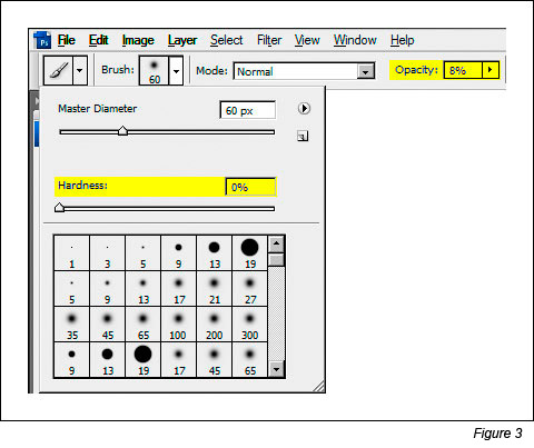
When burning and dodging by painting on a Burn/Dodge layer, a feathered brush is generally used with the brush size scaled appropriately for the area being painted. The brush's opacity is usually set to less than 10% (Figure 3). Even small amounts of paint applied to the Burn/Dodge layer can produce significant changes, so using a low-opacity brush insures that it's not carried too far too fast. It's ideal to make several passes with the brush to slowly build up the effect. If burning or dodging does go too far, simply use the opposite color to paint over the area. This moves the color back toward 50% grays and reverses the effect.
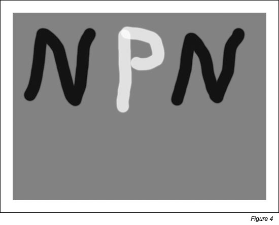
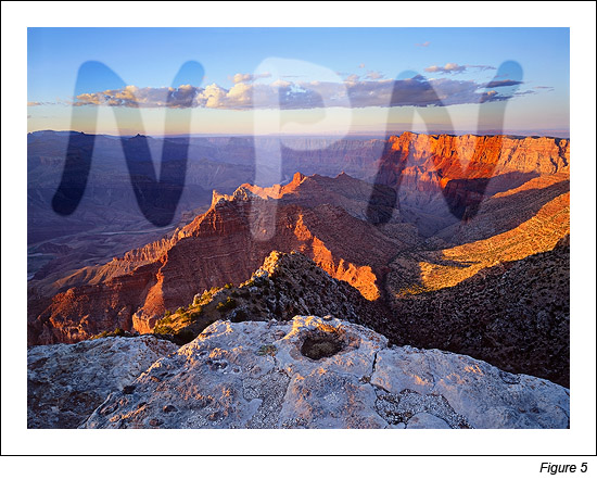
To get a sense for how the Burn/Dodge layer works, simply take a few swipes with a high-opacity brush and observe the effect on the image. Figure 4 shows a Burn/Dodge layer that has had a few strokes with a 75%-opacity brush using black and white paint.
The effect on this layer in Soft Light blending mode is shown in Figure 5. The white paint clearly lightens (dodges) the image and the dark paint darkens (burns) it. Because the layer is in Soft Light blending mode, all the details in the image can still be seen through the paint, just the brightness of the underlying pixels is changed. By using a lower opacity brush and choosing the correct brush size, burning and dodging can be achieved in a gentler and highly controllable manner.
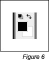
When burning and dodging an image in Photoshop, it's helpful to use the "D" and "X" keys. Typing "D" resets the foreground and background colors to their defaults for pixel-containing layers�black foreground and white background. Figure 6 shows how it looks on Photoshop's Tool bar. The foreground color is the color used for painting. Resetting the colors before painting on the Burn/Dodge layer is a good idea to insure that painting doesn't occur with a colored brush, which can change the color of the image.
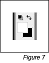
Typing "X" reverses the foreground and background colors (Figure 7). Often, when working on the Burn/Dodge layer, there is a need to flip back and forth between burning and dodging. The "X" keyboard shortcut makes switching brush color very convenient.
Two other keys that are useful in burning and dodging are the left bracket ( [ ) and the right bracket ( ] ). The left bracket decreases brush size and the right bracket increases it. These two bracket keys make changing brush size very easy compared to opening a dialog box and adjusting a slider. Tapping one of the keys multiple times sequentially increases or decreases brush size. The right brush size insures that paint is applied just where it is needed.
Luminosity Painting
Luminosity painting is a specialized form of burning and dodging. While it utilizes the Burn/Dodge layer, it does so by painting black and white through an active luminosity mask selection. The selection controls how much paint is deposited on each pixel, and, because the selection is based on an image's tonal values, painting trough a luminosity selection confines the paint to specific tones in the image. In this way, not only is image brightness controllable with luminosity painting, so is contrast. The contrast control is particularly exciting. Properly used, luminosity painting creates a contrast brush. It's possible to use it to add or remove contrast simply by painting on the Burn/Dodge layer. While adjustment layers are probably the best way to change global brightness and contrast, luminosity painting is an excellent method for managing it in specific areas of an image.
A recent image had three areas where luminosity painting was used to good effect. Figure 8 shows the final image and includes the luminosity painting. Roll the computer mouse over the image to see how it looked before luminosity painting.
(NOTE�Depending on the speed of your Internet connection, the rollover image may take a few seconds to appear.)
Can you see the difference? The final image (no rollover) contains three areas where luminosity painting was used to improve brightness and contrast:
- The sunlit edge near the center of the foreground rim was burned darker (rollover is too light).
- The large shadow area on the right just below the rim was lightened and the details in the shadows were enhanced (rollover is too dark and lacking detail).
- The cloud was made darker and has more contrast (rollover is lighter with less contrast).
The process for luminosity painting is as follows:
- Create a Burn/Dodge layer.
- Create the desired luminosity mask selection. The Luminosity Masks tutorial explains how to do this. It's often useful to make selections of several similar masks and save them on the Channels palette in order to experiment with which works best.
- Type Ctrl+H to hide the marching ants that define the selection. Hiding the marching ants makes it easier to see what's happening as painting occurs on the Burn/Dodge layer. It's important to understand that after typing Ctrl+H the selection is still active and is controlling how much paint gets applied to each pixel.
- Paint the appropriate color (black to burn, white to dodge) onto the Burn/Dodge layer until the desired level of brightness and contrast is achieved. The opacity of the brush may need to be set considerably higher than what is needed for regular burning and dodging. All luminosity selections will block the paint from being deposited on the Burn/Dodge layer to some degree. Higher opacity settings for the brush are often needed to force enough paint through the selection to have the desired effect. A stroke or two of the brush will provide quick visual feedback for adjusting the brush's opacity. Don't forget that it's best to build the effect gradually with multiple strokes instead of trying to paint in the effect in just one pass and be sure to use a feathered brush.
- Deselect (Ctrl+D). The absence of the marching ants can make it easy to forget that there is an active selection. After painting, deselecting turns off the hidden selection so that it won't influence subsequent steps in the workflow of the image.
A couple examples from the image will help illustrate how the process works.
Darkening Highlights
Figure 9 shows the area of the rim before and after it was luminosity painted. Brightness and contrast of the lighter areas were pulled down, but the mid-tone and darker values are barely affected.
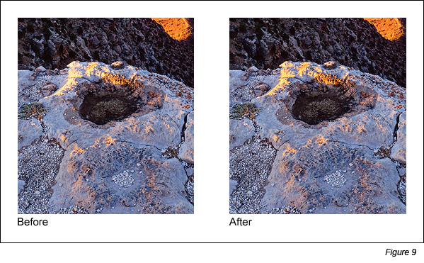
To achieve this, black paint was applied to a Burn/Dodge layer through a Light Lights selection at first, but when this was seen to be also darkening the mid-tones too much, a Bright Lights selection was used instead. Figure 10 shows the Bright Lights selection that was painted through and what the Burn/Dodge layer looks like after painting on it with black paint.
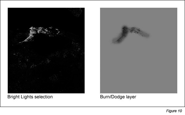
What's immediately noticeable here is that the tonal pattern of the rock is clearly visible on the Burn/Dodge layer. That's because the black paint was applied through a luminosity mask selection, and the mask itself is based on the tones in the print. The Light Lights and Bright Lights masks were the selections that were painted through. These selections, especially the Bright Lights, only show the lightest tones; dark tones are very dark or black. When black paint is applied through the Bright Lights selection, only the light areas allow paint to be deposited on the Burn/Dodge layer; the black areas block it. Black darkens the colors below it, so by painting black through a selection of light tones, the light tones are preferentially darkened while the dark tones are not affected. The end result is that the too-bright highlight is nicely toned down while the surrounding darker rocks hardly change. Brightness and contrast have been decreased simply by painting on the Burn/Dodge layer.
Opening the Shadows
The shadow area on the right just below the rim is a completely different situation. Here the problem is that the area is too dark and lacking in detail. The desired remedy is to increase brightness and contrast in a controlled fashion so that there is greater detail, while at the same time preserving the blackness of the darkest elements to avoid a washed-out look that too-light shadows can have. Figure 11 shows the area before and after luminosity painting.
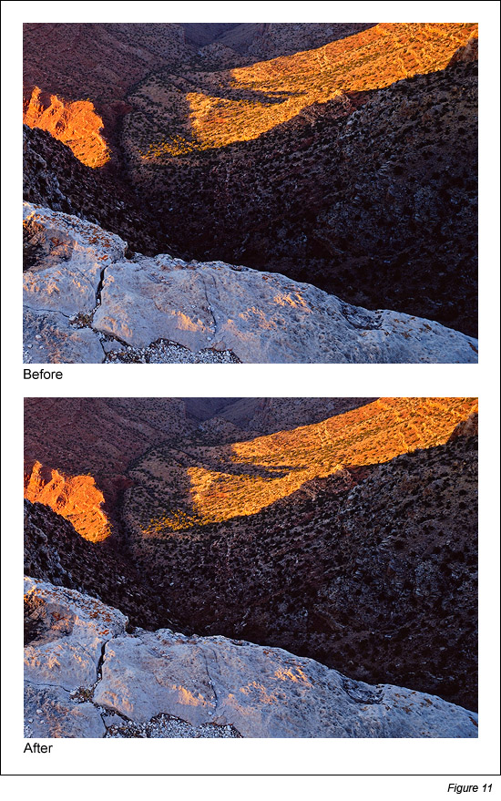
Figure 12 shows the selection that was painted through, in this case the Lights selection, and the resulting Burn/Dodge layer that created this effect.
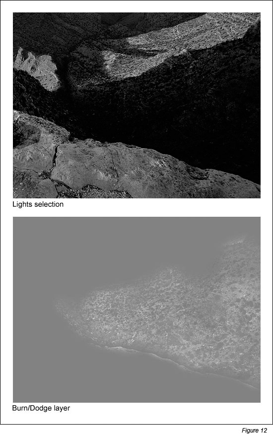
Once again, the tonal outline of the area is clearly visible on the Burn/Dodge layer. That's because white paint was applied to the layer through the Lights selection. Like in the first example, painting through a luminosity selection will lay down paint in proportion to the brightness of each pixel creating an outline of the image. But since there are almost no light tones in this shadow area, it's reasonable to wonder if painting through a Lights selection will have any affect on the dark tones? The answer is "Yes." Even though this area is quite dark to begin with, there is still tonal separation. The Lights selection partially and properly selects the darker pixels in proportion to their level of brightness. Several passes with a high-opacity brush (75% in this case) can still force some paint to be deposited onto the Burn/Dodge layer through these weakly selected pixels. Since painting through the Lights selection causes lighter pixels to get more paint, painting white into the shadows through this selection exaggerates the small degree of tonal separation that does exist. White paint on a Burn/Dodge layer dodges or lightens the colors beneath it. The gradient of white paint established by the Lights selection therefore opens up the shadows quite nicely as it creates the visible "imprint" of the scene on the Burn/Dodge layer.
Which color? Which selection?
With different luminosity selections to choose from, it's always possible to find one or more that will work. The Lights selection turned out to be a particularly effective choice for opening up the shadows. The very darkest values in the shadow area appear to have remained 50% gray on the Burn/Dodge layer in Figure 12 even when brushed with white paint several times using a 75%-opacity brush. This means they weren't lightened by the white paint and will remain unchanged in the image. This helps preserve the richness that comes from solid dark values in the shadows. An Expanded Lights selection probably would also have worked and required fewer strokes or a lower opacity brush, though it might have lightened the darkest pixels just a bit. The Light Lights, Bright Lights, or Super Lights selections would not have been good choices to paint through since dark pixels aren't even partially selected with these selections and it would have been nearly impossible to separate the dark tones in the shadows using them.
At first it might seem a little confusing as to whether to burn or dodge and which luminosity mask selection to paint through. To help figure it out, ask two questions. Start with "Does the area need to be lightened or darkened?" This determines which color to choose for painting. Choose white to lighten and black to darken. The second question to ask is "Does the area need more contrast or less contrast?" If it needs more contrast, choose a luminosity selection to paint through that reveals tones of the painting color, e.g. one of the "Lights" selections if painting with white. This is what was done in the example of opening up the shadows (white paint through the Lights selection increased constrast). If less contrast is need, choose a selection to paint through that conceals tones of the painting color, e.g. one of the "Lights" selections if painting with black. This is what was done in the example of darkening the highlights (black paint through the Bright Lights selection decreased contrast). The table below summarizes the different combinations, but after working it out a couple of times with actual images, the right combo is quickly obvious.
| If you want to... | And... | Paint... | Through a... |
| Increase brightness | Increase contrast | White | "Lights" selection* |
| Increase brightness | Decrease contrast | White | "Darks" selection** |
| Decrease brightness | Increase contrast | Black | "Darks" selection ** |
| Decrease brightness | Decrease contrast | Black | "Lights" selection* |
* "Lights" selections: Expanded Lights, Lights, Light Lights, Bright Lights, and Super Lights
** "Darks" selections: Expanded Darks, Darks, Dark Darks, Shadow Darks, and Super Darks
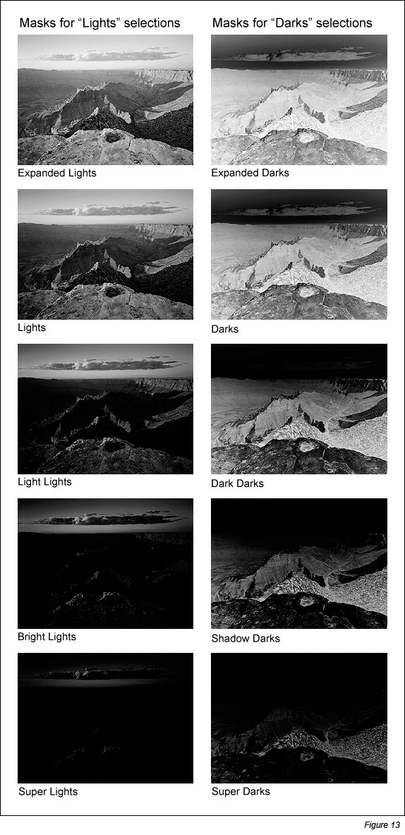
Figure 13 shows what the masks of the various selections look like in order to give an idea of how painting through a particular mask will deposit paint on the Burn/Dodge layer. The lighter the area on the mask, the more paint that will be deposited on the layer. Again, the Luminosity Masks tutorial explains how to make these different masks.
Expanding Muddy Mid-tones
Another situation that responds particularly well to luminosity painting is muddy mid-tones. These are areas of an image where the highlights are too dark and end up looking more like a mid-tone than a highlight, or, on the opposite side of the spectrum, where shadow areas are too light and look more gray than black. Sometimes it's an entire image that has a preponderance of mid-tones and ends up feeling a bit lifeless. Luminosity painting is even easier to understand when it comes to correcting muddy mid-tones. The goal is to only increase contrast on both sides of the tonal spectrum, so just the two combinations that increase contrast in the table are used:
Paint white through one or more of the "Lights" selections to lighten the highlights and paint black through one or more of the "Darks" selections to darken the shadows.
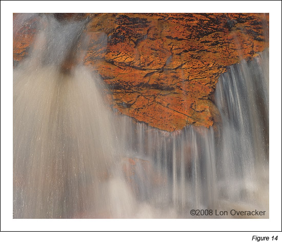
Lon Overacker (www.lonoveracker.com) has a water image that he let me borrow to illustrate the process. Water images work particularly well for this technique. The original digital file he sent had good solid blacks, but with a narrow tonal range that was concentrated at the dark end of the spectrum. The exposure was increased with an adjustment curve that didn�t change the tonal range and Figure 14 was the result. It has good detail throughout with no clipping at the ends of the histogram, but it also has lots of muddy mid-tones. The highlights aren't crisp and the blacks aren't solid.
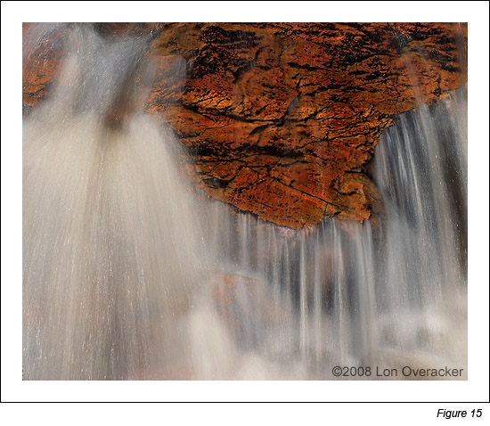
A significant amount of luminosity painting was applied. White paint was applied through Light Lights and Bright Lights selections to bring out the highlights in the water, and black paint was applied through Dark Darks and Shadow Darks selections to darken the shadows. The result is shown in Figure 15.
The Burn/Dodge layer used for the luminosity painting is shown in Figure 16. As in the previous examples, because all the painting occurred through selections of a luminosity masks, the tonal imprint of the image is clearly visible on the layer.
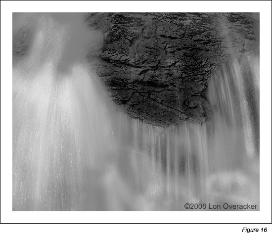
By now it should make some sense what the Burn/Dodge layer is doing. White paint applied through any of the "Lights" selections (Light Lights and Bright Lights in this case) increases contrast. Doing so over the light-colored water preferentially brightens the scene's natural highlights and separates and lightens the lighter tones. The result is water with improved highlights. Painting black through any of the "Darks" selections (Dark Darks and Shadow Darks in this case) also increases contrast. When black is painted through these selections in dark areas of the image, like the rocks, the darker the color the more it will be darkened by the paint. So the dark cracks along the rock edges get more paint and end up much blacker. A few strokes of black paint were also applied to the water so that the dark spaces between the highlighted streams would also look more solid. Since one of the "Darks" selections was controlling the flow of black paint for these strokes, there was no worry that the white highlights would be pulled down towards gray. The active "Darks" selections insured that the highlights didn't receive any paint. That's one of the nice things about luminosity painting. If the right luminosity selection is in place, the correct tones get the paint and other tones aren't affected. Even broad brush strokes still put the paint on exactly the right pixels. There are also still a few areas of the layer that did not receive any paint and remained 50% gray, so their underlying colors are unchanged. The result is an image with much brighter highlights and more solid shadows.
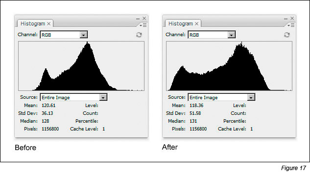
Because luminosity painting was applied to a significant area of the image, it might be instructive to look at how the painting changed the histogram for the image. Figure 17 shows the histogram before and after luminosity painting. The histograms confirm that the painting had the desired effect of pushing the shadow values lower and pulling the highlight values higher thereby increasing the overall tonal range of the image.
There are many tools, techniques, plug-ins, and stand-alone software to help photographers manage the light in their images. Luminosity painting is probably not the easiest of the lot, but it can offer some distinct advantages. One is the fact that since it is painted on, it can target specific areas of the image depending on where paint is applied on the Burn/Dodge layer. As such, it's a nice "finishing" technique to add the final touches to give an image just the right light and contrast. A single Burn/Dodge layer can be added near the end of image processing and can have both black and white paint applied to it through several different luminosity selections to address brightness and contrast in more than one part of the image. Adding some strategic highlights with luminosity painting near the end is a good way to bring out the natural highlights in a scene and to create stronger tonal separation to differentiate the various elements. Flowing water and foliage pictures are good examples where this is often useful.
Another advantage of luminosity painting is that it can be added to the image in whatever degree the photographer chooses. Instead of being limited to the effect of an adjustment layer, the brightness and contrast can be painted in as intensely or as lightly as the image demands or the photographer desires, and it can be applied variably to different parts of the scene. By switching to the opposite color paint, the effect can also be reversed. There is a lot of control possible with luminosity painting, and both subtle and dramatic changes can be achieved.
Lastly, while this tutorial explored the basics of luminosity painting, there is a lot more to be discovered in how it can be used. The Burn/Dodge layer in Figure 15, for example, seems to almost be a picture in its own right. Could the technique be used to actually paint a black and white image from a color one? What about combining luminosity painting with luminosity masking, that is, adding a luminosity mask to a Burn/Dodge layer before or after painting on it. This seems like it might offer an even greater control for luminosity painting since the layer mask would do even better job of confining the brush strokes to specific tones. And don't forget about color. While painting with black and white is the traditional way to use the Burn/Dodge layer, there's no rule barring the use of a colored brush. Painting color through one of the luminosity selections would allow color to be added to specific tones with a significant degree of control. Luminosity painting and luminosity masks offer many options and possibilities. I hope you'll explore them and post the results in your favorite NPN forum.
Comments on NPN Photoshop and digital nature photography articles? Send them to the editor.
Tony Kuyper lives and works on the Navajo Reservation in northeastern Arizona. He mostly photographs local areas, which happen to be the geologic wonders of the Colorado Plateau, and uses Photoshop to give his images a distinctive look. His portfolio and additional tutorials can be found on his website, www.GoodLight.us.