Thin Is In! |
There’s no doubt about it: thin is in. Even outside the world of glamour and fashion, it can be fun and creative to break the bounding box of your camera’s aspect ratio by deliberately creating long, skinny, panoramic images.
While there are no restrictions on how long you can stretch the image frame, there are a few guidelines that will help keep the viewer interested in your photograph and continuing to look at your photograph. Perhaps the most important guideline is that the normal rules of composition still apply! Obviously, with an elongated rectangle, your biggest hurdle will be maintaining a connection from one end of the frame to another. We all know photography can’t always be puppies and rainbows, so ensuring your long and skinny image is balanced or has dynamic tension will help connect the various areas of the photograph.
Here are several key compositional devices I use to compose my skinny stitches.
Use Of Points And Counterpoint
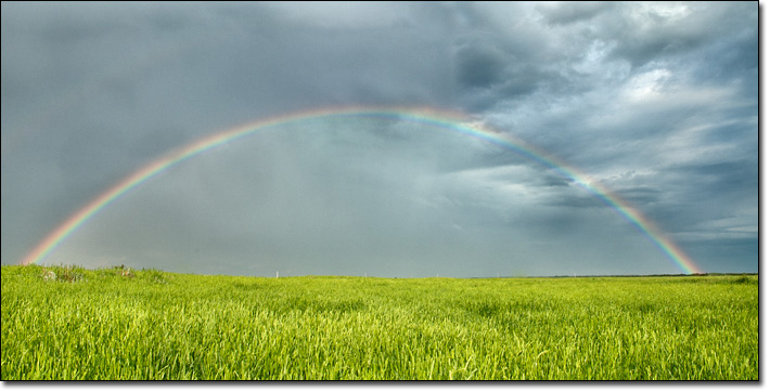
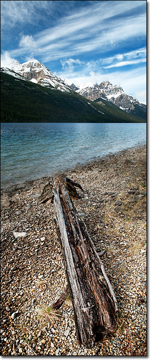
The easiest way to tie two ends together in a photograph is with the use of points as in the two examples below. A point is a relatively small area of tonal or colour contrast in comparison to the area around that point. Points can be regularly or irregularly shaped (they do not have to be circular, for example) but do have to be small in comparison to the space around them. A point has a great deal of visual weight because humans tend to readily perceive points. We are predisposed to notice things that are different from their surroundings, and a small object surrounded by a larger space is quite different.
But a point placed in one corner of a long panorama may start to feel unbalanced, especially if it is close to the edge of the image frame. This is because all the visual weight will be on one side of the image, a situation which hardly encourages the viewer to look at the rest of the image space. To get around this, use a counterpoint placed some distance away in the opposite direction as the main point. Usually, although not always, humans will look at the larger or brighter point first and the smaller, secondary point after. A visual hierarchy is created by differentiating the size of the points slightly. Also, because now there is a point in each opposite corner, there is a slight gravitational pull or friction occurring between the two points as both vie for the viewer’s attention. This extra layer of tension adds a spark to the image as well as rounding it out compositionally.
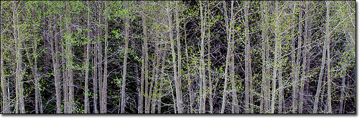
Get Rhythm!
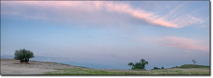
A second way to ensure continuity in your skinny panorama is to establish a rhythm across the image space. Rhythm is a perception of movement across a space. By repeating a visual element across the image frame, the viewer is encouraged to move along with that visual element and so cross the space within the picture. For example, in the image below, the repeating lines of aspen trunks fill the space within the frame with a repetitive pattern that begins to take on a sense of movement. When using pattern or rhythm to fill your skinny stitch, make sure you continue the repeating shape or line across at least two edges of the frame without break or your continuity will begin to break down.
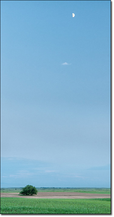
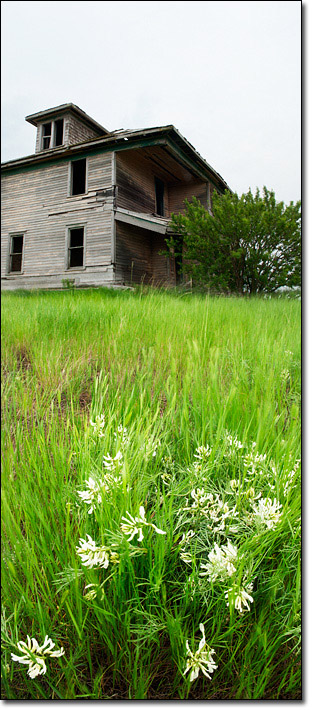
Suggest A Path
If you’re going to provide a big forest for the viewer to play in, then you may want to help them explore it. You can do this by linking similarly-sized objects across the image frame, or by setting up a visual hierarchy within the elements being photographed. If your panorama is a vertical, for example, the classic ‘S’ curve can be employed to link various elements from foreground to background. Another effective variation is the use of diagonal lines to lead the viewer’s eye through the image space as in the image below/left.
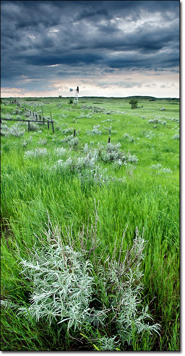
When you are setting up your path, remember that humans tend to look at things that are big or a point within a larger area. They are also drawn to look at objects that are colourful or sharply in focus. Using your knowledge of how humans perceive the world around them will help you organize the elements of visual design to create your visual hierarchy. Depending on your talent at blending two images together, any subject matter can be worked into a thin stitch. So get out and experiment with the skinny stitch!
Comments on NPN landscape photography articles? Send them to the editor. NPN members may also log in and leave their comments below.
 Samantha Chrysanthou was born in Lethbridge, Alberta. After moving for a period of time to northern Alberta, she returned in 2000 to southern Alberta to pursue a law degree in Calgary. After becoming a lawyer, Samantha began to realize her heart was more engaged in capturing the beauty of the landscape around her than debating the nuances of legal arguments in court. She has since left law to pursue writing and photography full-time. She particularly enjoys shooting the prairies, foothills and Rocky Mountains within an hour or so of her home in Cochrane, Alberta. Visit Samantha's website to view more of her work at www.chrysalizz.smugmug.com.