Tricky Contrast Concepts |
There are two elements of visual design that are seemingly simple at first glance but become more complicated when the concept of contrast is introduced into the equation. These two elements are tone and colour. When we use contrast in tone or contrast in colour (or both) as compositional devices, interweaving them within one image, well, things can get tricky. Often we compose our images without much conscious effort and almost on instinct. But when we start to consciously think about why we include some elements in our composition and eliminate others, it can be difficult to put words to what we do subconsciously. Or at least that is my experience in my online course here on NPN when I ask students to tease out the differences between these two elements. Tonal contrast and colour contrast are powerful elements of visual design. In this article, I will describe these concepts and reveal why every photographer should have a firm understanding of them and how to use them to translate your photographic vision.
Tonal Contrast – The Devil You Know
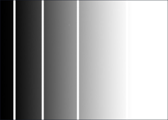
Tonal contrast is perhaps the most intuitive concept to understand, once the word ‘tone’ is described, anyway. Tone is the strength or intensity of a particular shade or colour. It can also be understood in terms of density – a dark tone can be perceived as dense or impenetrable while a pale tone can be perceived as light or insubstantial. Tonal contrast is a comparative idea: when two tones of different densities are next to each other, there will be contrast in the strength or intensity between the shades. Our ability to differentiate between varied tones is why we are able to perceive lines, shapes, texture and patterns. For example, in the graphic below, a wash of tone is broken up by thin slivers of white tone. We perceive the white parts as a line because of the contrast in tone between the shades. Note where the white stripe is adjacent to the whiter tones, no line is perceived because there is no tonal contrast to set off the perception of a line. Another point to note is that the perception of a line is greatest where the tonal contrast is strongest.
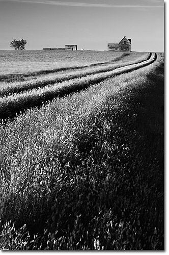
This can be fairly academic without a real world example. In the image below, the deep ruts caused by the old tire tracks are seen as dark lines reaching back toward the house. We know there is not really a set of parallel lines scratched into the prairie, but it looks that way because of the low sidelight carving deep shadows on the earth. Tonal contrast is easily seen in monochromatic images such as this rural scene, but tonal contrast is a part of colour images as we’ll see in a moment.
Colour Contrast – Triggering Emotional Responses
Colour is at once completely understandable and simultaneously baffling. Although everyone can perceive colour in the refraction of light waves bouncing off an object, the psychological impact that colour has on human perception and emotion is profound. Colour is a bit of a catch-all term that usually replaces the more accurate word ‘hue’. Hue describes which wavelength, or combination of wavelengths, dominates in a range of wavelengths bouncing off an object such that the human eye perceives a colour at that wavelength. Colour does not exist independent of perception; to see a hue, there must be light, an object and a viewer.
There are two main components of a hue: saturation and tone. Saturation refers to the purity of a colour or the dominance of one wavelength over others in a range of wavelengths coming off an object. For example, a plastic red ball will have a narrow range of wavelengths that are perceived as a red hue by the human eye. Tone is recognized by the density, or lightness and darkness, of a hue. For example, violet is darker in tone than yellow. Things get tricky when there are different shades of a hue: the colour of cheddar cheese is usually darker in tone than the colour of the skin of a lemon.
Colour has a strong impact on human emotion and perception. Humans react differently when viewing different hues, and they react differently when different hues are adjacent to each other. For example, hues that are adjacent to each other in a photograph but are ‘opposites’ due to their placement on a circular graph called a colour wheel invoke feelings of excitement or tension. There is a high degree of contrast perceived by humans when these wavelengths ripple off adjacent objects. On the other hand, hues that are neighbours on the colour wheel, such as red and orange, or green and blue, are seen in more harmonious terms. Most of us are familiar with the division of all colours into three camps: warm, cool and neutral. And of course most of us know that we feel differently when we enter a room filled with warm reds, oranges and yellows than a room filled with blue and violet furnishings.
The Photographer’s Take Away
So, why is all this relevant to photography? Both tone and colour are highly influenced by the quality and direction of light, and light is the photographer’s paintbrush. A good photographer is a master at observing light. By extension, a good photographer is adept at noticing the changes in tone and colour that varying light conditions create and uses this knowledge to compose an image that conveys the subject. As well, tone and colour are the primary elements of design: all other secondary elements such as line, shape, texture, pattern and perspective are comprised of one or both of these fundamental elements. When you understand these concepts fully, you can deliberately create specific moods, impressions or stories to translate to your viewer.
Let’s look at some examples. What do you notice first in the following images? Are any emotional responses invoked? How do the images compare to each other? Thinking consciously of the answers to these kinds of questions helps you appreciate the power of tonal and colour contrast.
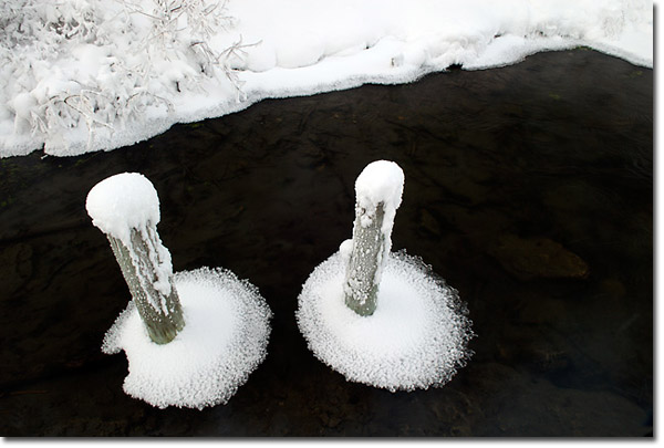
High Tonal Contrast
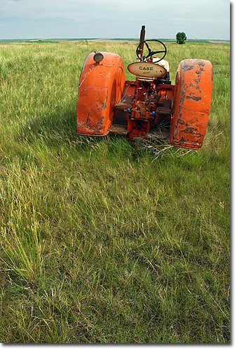
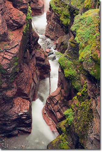
High Colour Contrast
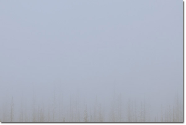
Low Tonal Contrast
Low Colour Contrast
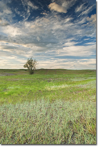
High Tonal Contrast, Low Colour Contrast
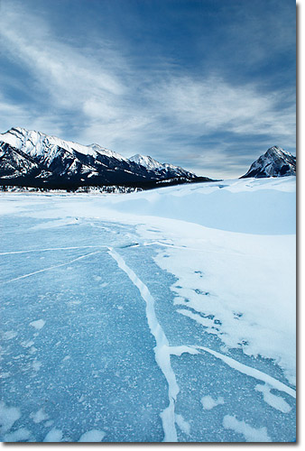
High Tonal Contrast, High Colour Contrast
If you’re up for a self-assignment, then here’s a challenge! Head out with your camera and see if you can shoot an image that has low tonal contrast but high colour contrast. (Hint: think of colours that have the same density.) Have fun!
Comments on NPN nature photography articles? Send them to the editor. NPN members may also log in and leave their comments below.
 Samantha Chrysanthou was born in Lethbridge, Alberta. After moving for a period of time to northern Alberta, she returned in 2000 to southern Alberta to pursue a law degree in Calgary. After becoming a lawyer, Samantha began to realize her heart was more engaged in capturing the beauty of the landscape around her than debating the nuances of legal arguments in court. She has since left law to pursue writing and photography full-time. She particularly enjoys shooting the prairies, foothills and Rocky Mountains within an hour or so of her home in Cochrane, Alberta. Visit Samantha's website to view more of her work at www.chrysalizz.smugmug.com.